The North Face ditches atom logo after fierce dispute
Brand accused of copycat design by street artist Futura.

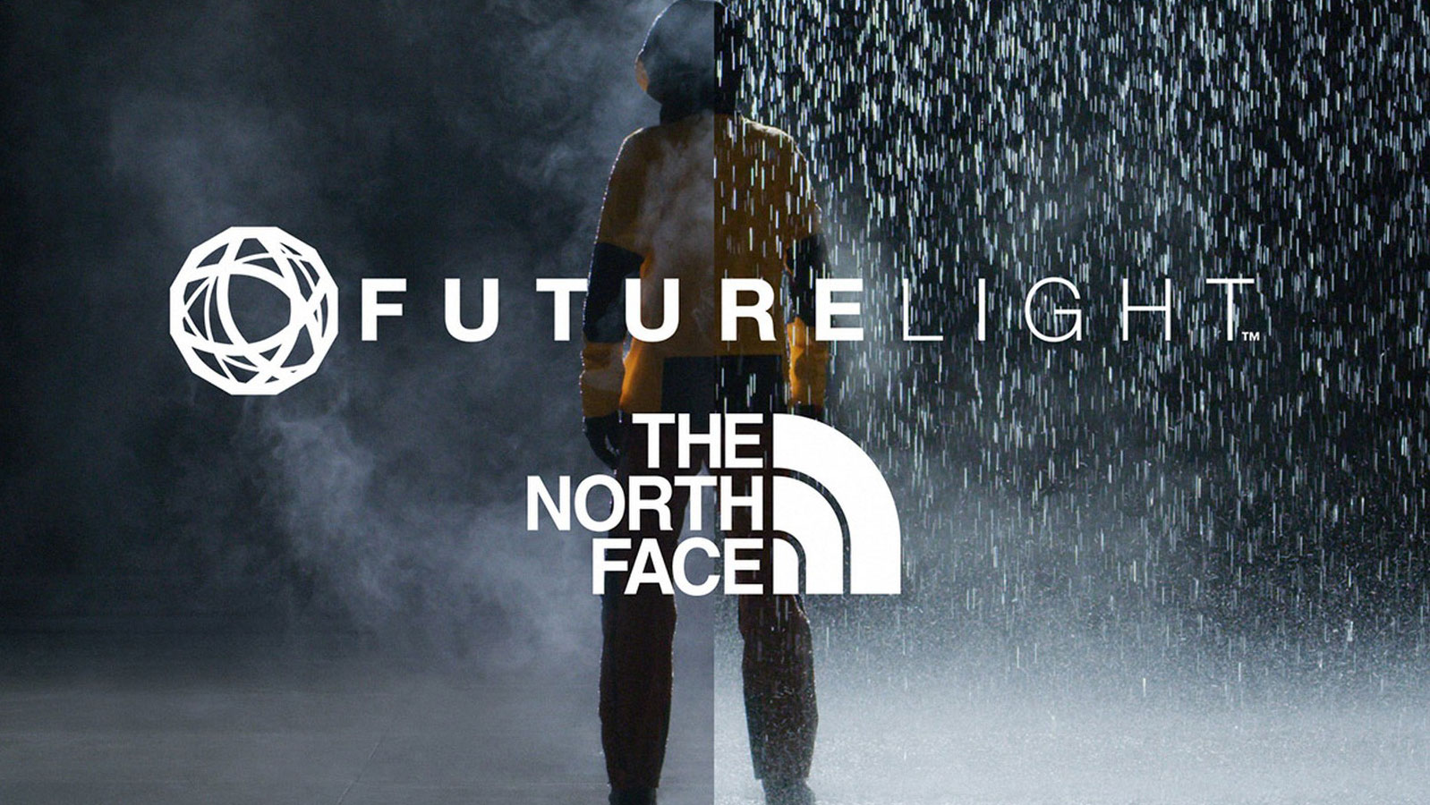
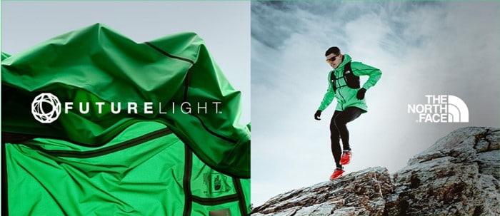
Apparel brand The North Face has discontinued its use of the atom-like motif that was hotly contested by street artist Futura in January of this year. The controversial design formerly appeared on The North Face's 2019 range of waterproof clothing, named 'FUTURELIGHT', not to mention in a $20 million advertising campaign.
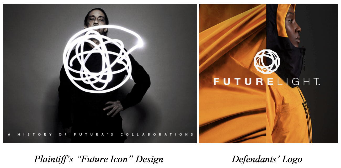
According to the lawsuit filed by Futura, the North Face's choice of name and 'almost identical logo', 'purposefully invoked [Futura] in order to suggest an association with him'. Perhaps The North Face should have looked elsewhere for logo design inspiration, because the brand has now ditched the design out of "respect to the artist".

The NorthFace released a statement on its website to explain the decision, stating that "while The North Face is confident there has been no infringement in this case, we are committed to supporting creative artists and their communities.
"As a sign of that commitment and a sincere gesture of goodwill, we will begin to phase out and discontinue the use of the FUTURELIGHT™ circular nanospinning logo design out of deep respect for Futura and his work."
The move came after Futura put out the following statement:
A post shared by FUTURADOSMIL (@futuradosmil)
A photo posted by on
Though The Northface asserted that "the logo was also inspired by the shape of the geodesic dome tent, which has been a key icon of The North Face brand for nearly 50 years," and "any resemblance to Futura's signature atomic element design was entirely coincidental and not part of our internal design team’s inspiration," there's no denying the designs are uncannily similar.
A post shared by FUTURADOSMIL (@futuradosmil)
A photo posted by on
The basic shape is the same, with the external line providing the point of difference between a standard atom and Futura's stylised design (though sometimes this does not appear so clearly in Futura's design). The use of colour is also replicated in this instance, with the stark white showing up against a darker background.
Get the Creative Bloq Newsletter
Daily design news, reviews, how-tos and more, as picked by the editors.
Of course, due to the street art style of the motif in some applications (such as above), the designs do often differ in their overall impression, with the FUTURELIGHT logo presenting sleek, blocky lines rather than a spray painted, slightly wild effect (compare above and below). And the external boundary of the atom is a totally different shape in the FUTURELIGHT version, more structured and angular.
The North Face FUTURELIGHT - Made to Defy https://t.co/O8UQzBOAco pic.twitter.com/AAifAvXOxTOctober 1, 2019
But The North Face's logo has even picked up on that thicker internal swirl, which appears in many of Futura's iterations, and the angles of many of the atom's lines are almost replicated in its own logo. Plus, there's the use of the word Future, solidifying the similar impact.

With 2021 providing a flurry of legal action, many cases were hard to call (we wonder what will happen with this Kanye West vs Walmart dispute, for one). But with such similar designs, we aren't surprised at this decision.
Read more:

Thank you for reading 5 articles this month* Join now for unlimited access
Enjoy your first month for just £1 / $1 / €1
*Read 5 free articles per month without a subscription

Join now for unlimited access
Try first month for just £1 / $1 / €1

Georgia is lucky enough to be Creative Bloq's Editor. She has been working for Creative Bloq since 2018, starting out as a freelancer writing about all things branding, design, art, tech and creativity – as well as sniffing out genuinely good deals on creative technology. Since becoming Editor, she has been managing the site and its long term strategy, helping to shape the diverse content streams CB is known for and leading the team in their own creativity.
