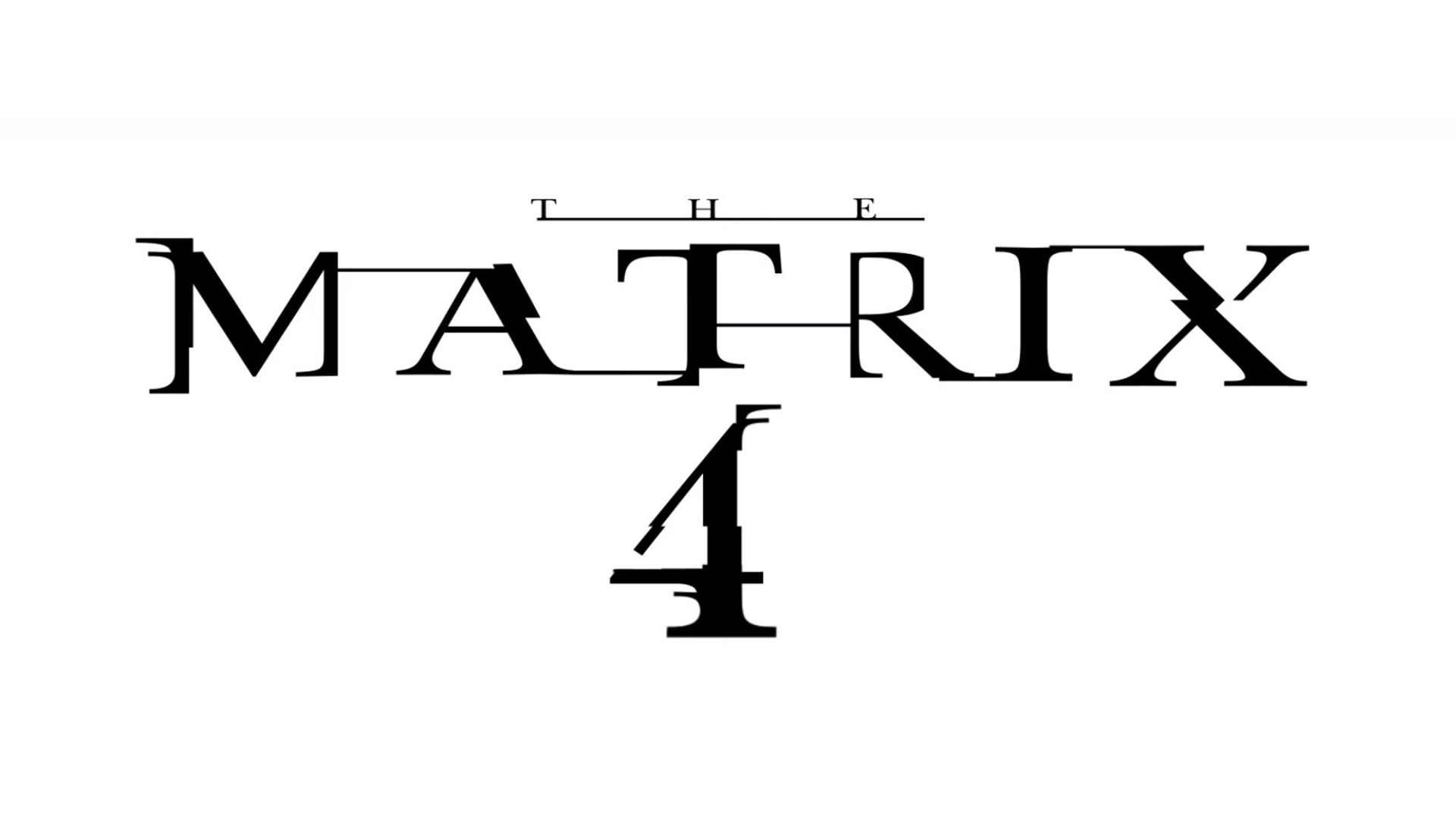
Brand new Matrix 4 logo revealed (and it's the same but different)
Neo and co. are back next year.

After the nightmare that has been 2020, you'd be forgiven for wanting to take the blue pill and escape into the blissful ignorance of the Matrix. And soon you'll be able to – sort of. The fourth Matrix film is due for release next year, and Warner Bros. has just revealed a brand new logo.
In an unprecedented announcement yesterday (below), Warner Bros. declared that all of its 2021 films will hit streaming service HBO Max at the same time as cinemas. Among them is The Matrix 4, with the new logo appearing alongside more familiar designs for the studio's other films such as Dune and Wonder Woman 84. (Looking for more logo inspiration? Our logo design guide has you covered.)
I got you something ✨nice✨ this year:🎁 The biggest movie premieres🎁 In theaters and on HBO Max the exact same day🎁 Beginning December 25 with #WonderWoman1984#HBOMax #WBPictures https://t.co/BZgFFRrrg2 pic.twitter.com/J2KBdWd9TfDecember 3, 2020
At first glance, the new Matrix logo (below) looks almost comfortingly familiar. That same grungy, cyberpunk typeface is present, suggesting that rather than getting a 2020s revamp, The Matrix 4 will share the same universe and aesthetic of its three late nineties/early noughties predecessors. Our best free fonts is the place to be if you're looking for more typographical inspiration.

But on closer inspection, there are some interesting new touches to be found. For a start, the Matrix's traditional white-on-black colour scheme has been reversed to a more striking black-on-white. This makes the logo particularly stand out among Warner Bros's other film titles in the announcement video. Could this be hinting at some kind of flipping of worlds in The Matrix 4? Could the Matrix really be the real world? Perhaps we're looking into it a little too deeply – but we reserve the right to say we were right if we're right. Right?
The logo also appears to reveal that 'The Matrix 4' is the first film in the series to be given a numerical title. Rather than following the 'Re' trend of 'Reloaded' and 'Revolutions' (The Matrix Resurrected? The Matrix Refurbished?), it seems the studio is plumping for a simple (and slightly underwhelming) '4' this time around.
But even if it isn't the wildest or most exciting departure from previous Matrix logos, fans are certainly excited to see it appear in the announcement from Warner Bros:
18 year wait and my hands literally shaking over a logo cannot wait for the trailer matrix 4 here we comeDecember 3, 2020
WAIT THE MATRIX 4 LOGO IM CRYIN https://t.co/MoUdbB10ssDecember 3, 2020
That said, one Twitter user has already shared their own 'fixed' version of the logo (below), replacing the 'A' of the title with the number 4. And we have to admit that after seeing this slick fan-made effort, that floating 4 in the official version suddenly looks a little rough.
Get the Creative Bloq Newsletter
Daily design news, reviews, how-tos and more, as picked by the editors.
The Matrix 4 logo fixed. pic.twitter.com/5xN6VerXh3December 3, 2020
With the film not due for release until 22 December next year, it's possible Warner Bros. is planning to reveal a new logo (and possible even title) for The Matrix 4. In the meantime, while not the most thrilling new logo ever, we're enjoying the nostalgia of seeing the original typeface back in action. If you're looking for more Matrix goodness, this Wachowskis-inspired working from home setup is here to make you jealous.
Read more:

Thank you for reading 5 articles this month* Join now for unlimited access
Enjoy your first month for just £1 / $1 / €1
*Read 5 free articles per month without a subscription

Join now for unlimited access
Try first month for just £1 / $1 / €1

Daniel John is Design Editor at Creative Bloq. He reports on the worlds of design, branding and lifestyle tech, and has covered several industry events including Milan Design Week, OFFF Barcelona and Adobe Max in Los Angeles. He has interviewed leaders and designers at brands including Apple, Microsoft and Adobe. Daniel's debut book of short stories and poems was published in 2018, and his comedy newsletter is a Substack Bestseller.
