The Guardian redesigns with new logo and font
The newspaper's switch to a tabloid format comes with a new masthead and new look online.

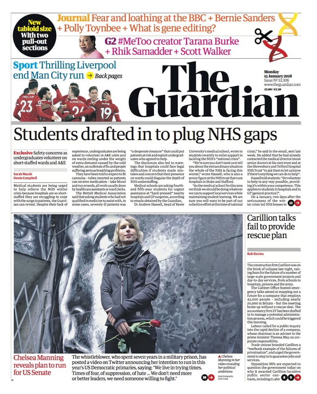
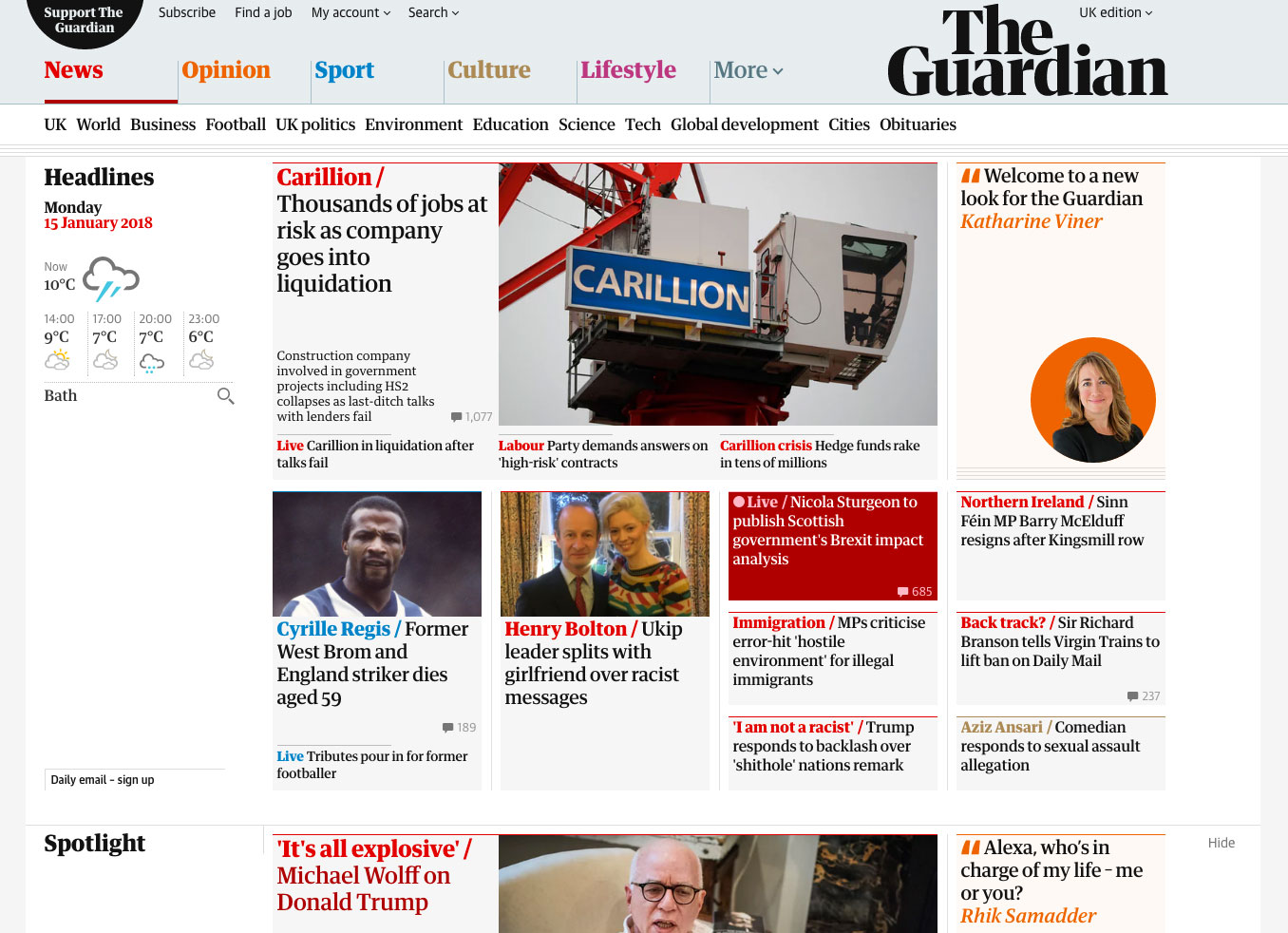
Today sees the launch of The Guardian's redesign across print and digital formats. The newspaper's new look sees both The Guardian and The Observer switching from a Berliner to a tabloid size in print, complete with a redesigned typographic masthead that will also appear on the titles' updated digital platforms.
Created by a team led by The Guardian's creative director Alex Breuer and senior editors and designers, the paper hopes that the redesigned look will appeal to its global readership online and generate millions in savings by switching to tabloid printing.
The Guardian's editor-in-chief Katharine Viner said that the guiding principles behind the redesign have been the "hopeful themes of clarity and imagination". These principles are summed up in the newspaper's new typographic masthead, which introduces the new font called Guardian Headline.
Guardian Headline was created in collaboration with Commercial Type, the design experts behind the paper's former blue and white masthead and the accompanying font, Guardian Egyptian. The new font is designed to be easier to read, while also appearing confident and impactful.
The new monochrome wordmark doesn't mean that the newspaper is waving goodbye to its vibrant character, though. "We’re using a range of energetic colours, and the much-loved Guardian visual wit and style remain at the heart of the look," explains Viner.
Speaking on The Guardian's site, Alex Breuer adds that: “With a more flexible page layout in print and online and enhanced use of photographic journalism and graphics, our new design is simple, confident and stylish – providing readers with the best possible experience across all our platforms.”

With The Guardian's focus on arts and culture, it's no surprise that it's a favourite with creatives. Earlier this year the paper even featured in the works of Turner Prize 2017 winner Lubaina Himid.
Get the Creative Bloq Newsletter
Daily design news, reviews, how-tos and more, as picked by the editors.
So how has the redesign been received by designers? Jack Davey, creative director at Studio Bolt, thinks that the change of paper format is a reflection of the times we live in. "It entirely makes sense to ditch the more expensive (though admittedly a bit special) format, when the majority of its readership accesses the paper online," he says.
"I’ll be fascinated to see how the new look, particularly the new typeface (and an apparent restrictive use of colour) roll out across the Guardian’s other publications and formats," Davey adds. "The old look and feel – built around the Guardian Egyptian typeface, really sings with the bold punchy colours used across the Guardian’s supplements, and colour really helps drive navigation on the site – so I can’t imagine it will be going too monotone."
It entirely makes sense to ditch the more expensive format, when the majority of its readership accesses the paper online
Jack Davey, Studio Bolt
Responding to the redesign's teaser video (above), Davey was amused to spot its similarity to Droga5's ad for the Pixel phone from a couple of years ago. However he's not concerned that this is a sign of a decline in originality.
"I, like a lot of the Guardian's readership, usually access the paper’s content through the app or a browser, so the change in physical printed format ultimately shouldn’t directly impact me, unless the paper’s journalism evolves to match its new tabloid format – which thankfully seems unlikely!
"Like a lot of people in the creative industries, I have a soft spot for the Guardian and its understanding and embracing of design culture, so I'm excited to see where this new direction takes the paper."
The new tabloid format and digital platforms are available to read and explore now.
Related articles:

Thank you for reading 5 articles this month* Join now for unlimited access
Enjoy your first month for just £1 / $1 / €1
*Read 5 free articles per month without a subscription

Join now for unlimited access
Try first month for just £1 / $1 / €1

Dom Carter is a freelance writer who specialises in art and design. Formerly a staff writer for Creative Bloq, his work has also appeared on Creative Boom and in the pages of ImagineFX, Computer Arts, 3D World, and .net. He has been a D&AD New Blood judge, and has a particular interest in picture books.
