The best and worst national football team logos
Who wins the World Cup of badges?
Every football team has its own badge and logo. We often discuss club football teams, from Real Madrid to Real Salt Lake – but national football teams all have their own logos, too.
Some of them are excellent; instantly recognisable, timeless classics or ingenious fresh designs that rival the very best logos of all time. Others, however, aren’t quite so good. Maybe they’re too simple or derivative, or just not easy on the eye. (Aston Villa, anyone?)
I’ve brought together some of my favourite – and least favourite – national football team logos. With 211 members of FIFA right now, we could be here all day, so I’ve limited my selections to those teams that appeared in the most recent World Cup, in 2022.
England
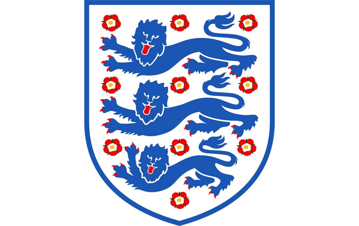
Look, I promise I’m not biased. It’s just that, no matter which way you look at it, England’s badge is a classic. The iconic three lions date back to the 12th century, when they formed part of the emblem of King Richard I, while the ten Tudor roses represent each regional branch of the Football Association.
It’s topped off with a star to represent the country’s World Cup win, in 1966. Obviously, I’d prefer there to be another star or two on there, but this is a truly brilliant logo.
Switzerland
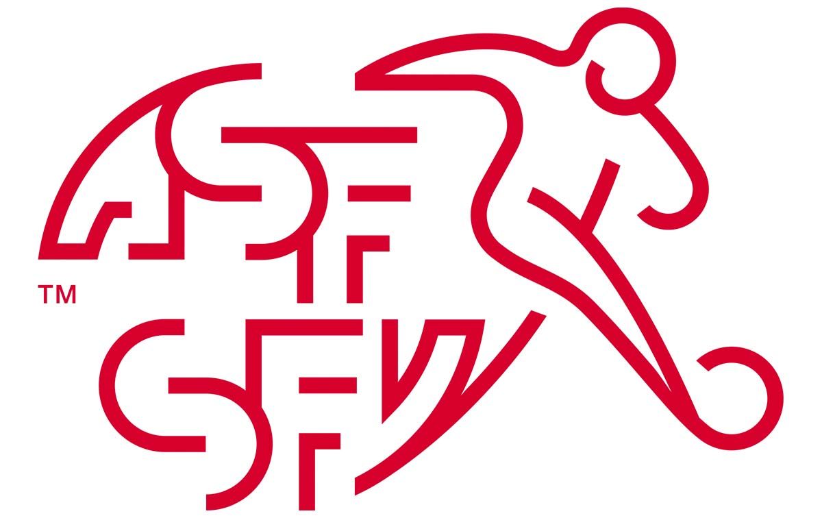
In some ways, this badge is cleverly done, with both German and French – two of Switzerland’s four national languages making it on, with apologies to Italian and Romansh, as it incorporates the name of the Swiss Football Association in both languages.
However, I find it quite bland, and the figure of the footballer to the right of the lettering looks a tad amateurish, as if a child has conjured it up or it’s the logo of a local Sunday league team. The red and white is understandable, given the country’s colours, but it’s still a bit boring.
Get the Creative Bloq Newsletter
Daily design news, reviews, how-tos and more, as picked by the editors.
Brazil
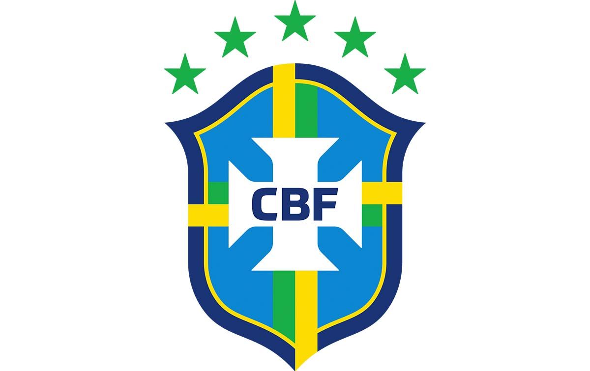
The Seleção’s badge is simple, and there’s not too much going on here that it gets confusing, but it certainly keeps your attention with some great use of colour. The blue, green, and yellow combo indicates Brazil straight off the bat, and those five green stars at the top, indicating Brazil’s record five World Cup wins, have some serious prestige.
They’ve had some variation of this logo since the start of the 1970s, barring the 1980s, and if you see this badge you know you’ll be seeing football magic. Ronaldo, Jairzinho, Zico, Ronaldinho, Neymar… they all sported a design like this one.
USA
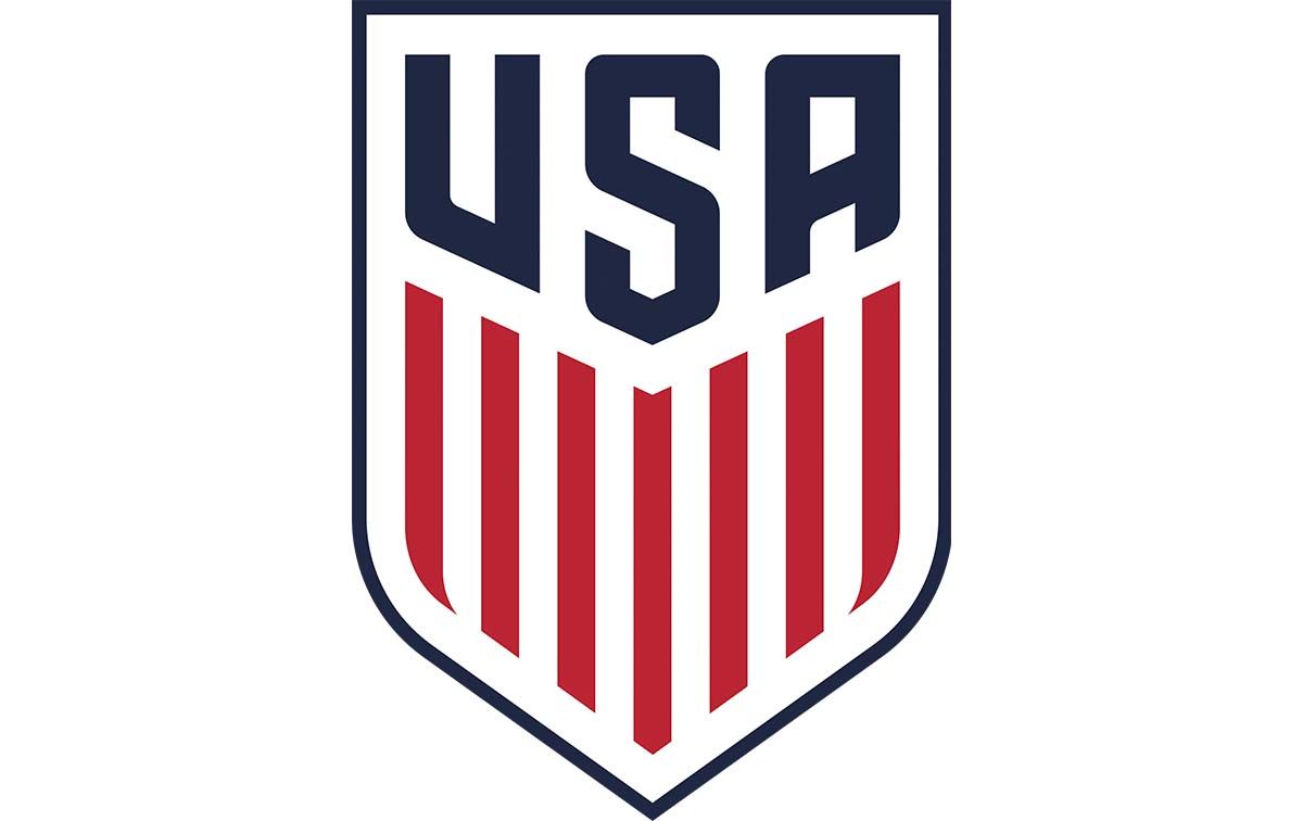
This has been the US emblem since 2016, with the United States Soccer Federation describing it as uniquely American. It’s uniquely American because no other national team will have a massive ‘USA’ taking up half of their badge, granted, but it’s just a little bit boring.
It’s not that it’s ugly to look at, or anything like that. Rather, it’s just a bit simplistic, and there isn’t enough going on. However, it does lend itself well to alterations, and the rainbow logo sported by the team’s training facility in Qatar in 2022 as a response to the country’s anti-LGBTQ legislation, is seriously cool.
Netherlands
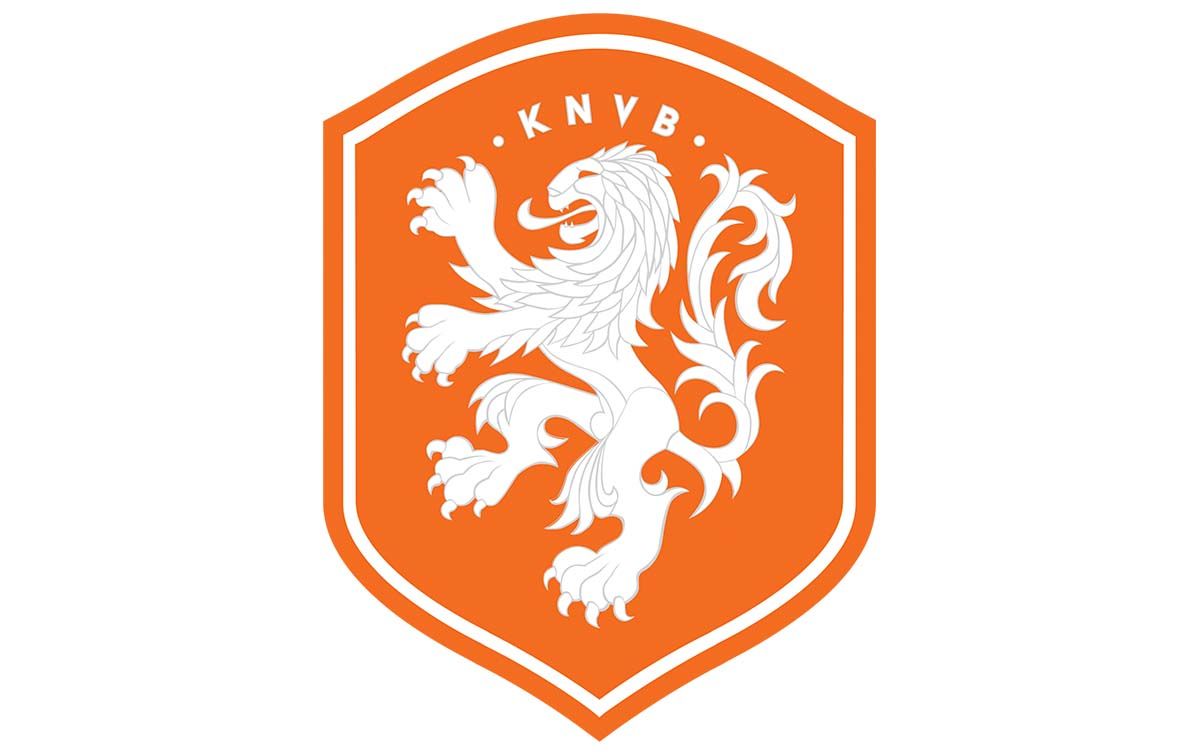
The Dutch team have a delightfully classy badge, featuring the country’s heraldic lion, the Netherlands’ national animal. The use of orange and white together makes the badge look smart, and it lends itself well to the team’s blue away shirt too.
The lion has been on the crest since 1907, and conjures up images of iconic players like Johan Cruyff and Marco van Basten, but it – and the badge itself – has stood the test of time to remain one of the best national football team badges today.
Costa Rica
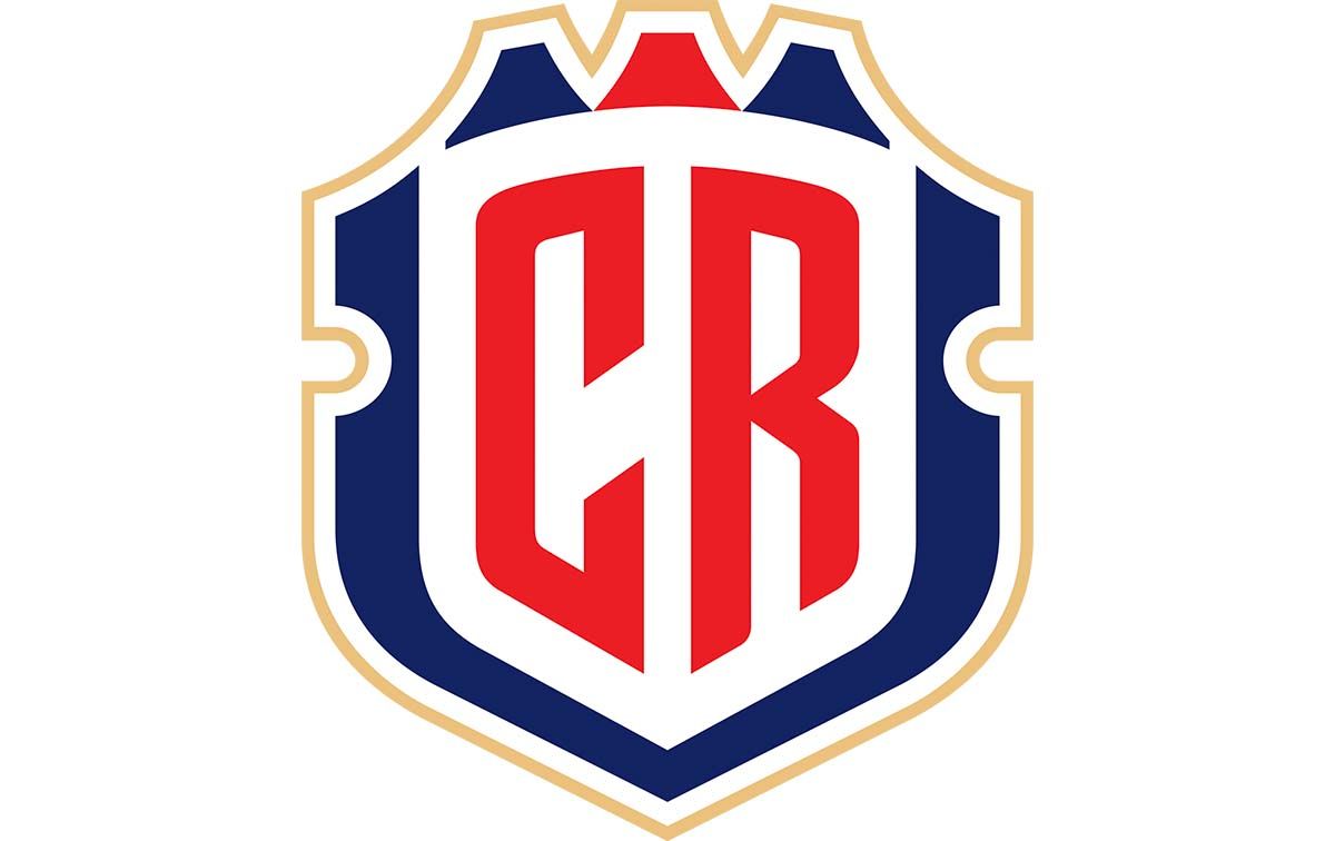
Los Ticos used to have a great badge, but this new design, unveiled by the Central American nation in 2021, just doesn’t look like the right badge for a football team to have. It’s too basic, too simple.
It features the red, white and blue of the country’s flag, but the ‘CR’ going across the middle makes it look like something designed online, for free. This is a dull design that doesn’t reflect the exciting football and dramatic moments Costa Rica has contributed to world football over the last decade or so.
Senegal
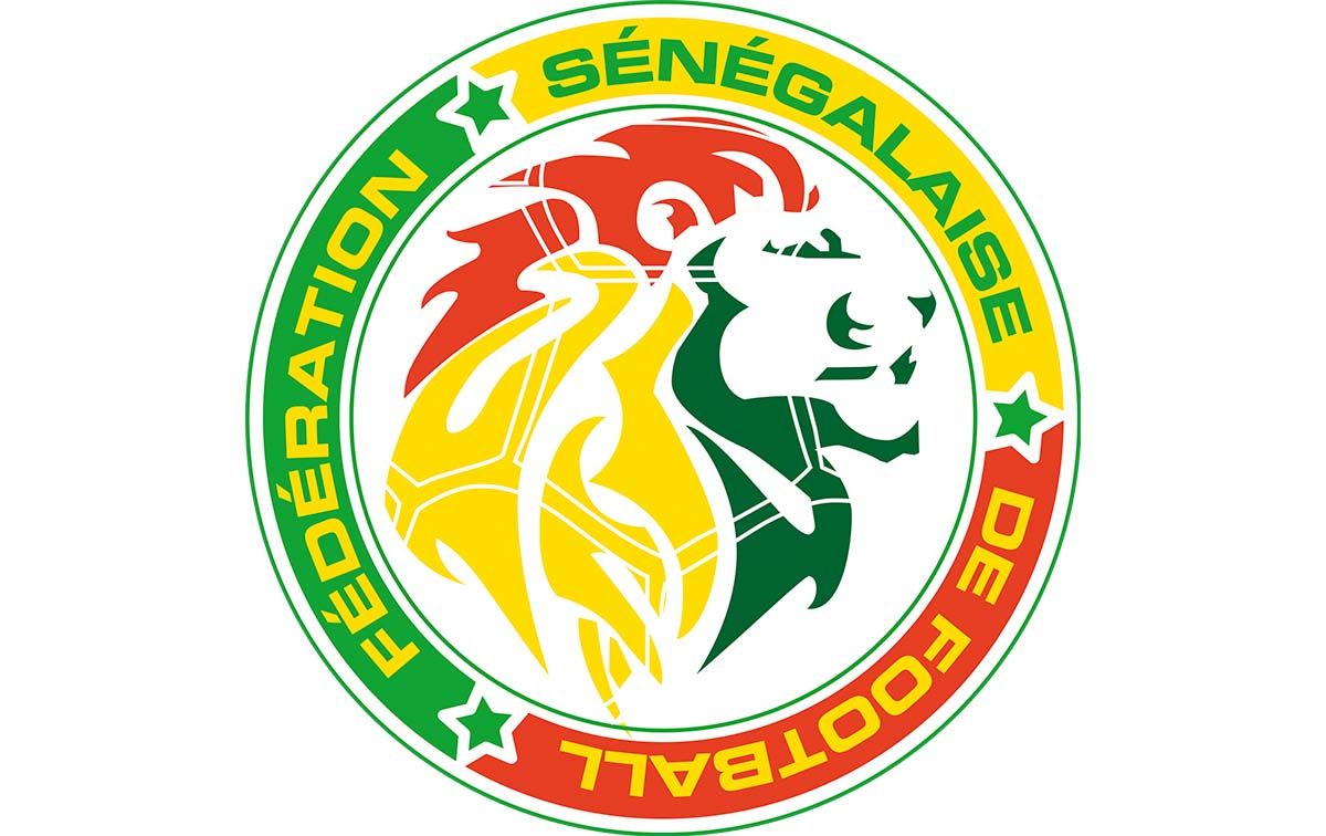
The reigning African champions have got a lovely badge. Like the Senegalese flag, the badge features the Pan-African colours of red, yellow, and green, as well as a lion. The African lion is the country’s national animal, and the team is known as the Lions of Teranga. The lion is designed to resemble a football, too, which is a great touch.
It’s a vibrant, exciting badge, and a great example of how to best utilise your country’s colours. It looks great, and suits the team’s white and green shirts too.
Iran
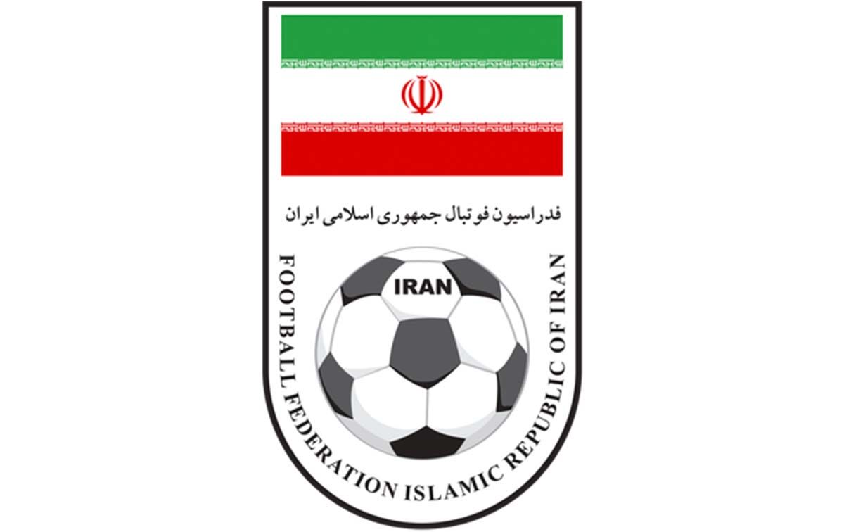
There’s a real lack of imagination with Iran’s badge. At the top sits Iran’s flag, which makes sense, and a traditional black-and-white football underneath it, with the country’s name sitting inside it.
It does the job, but surely they could be more imaginative, perhaps incorporating the flag’s colours into the football? It’s just boring.
Could we see more national football teams changing their badges in the coming months or years? Here are six reasons football clubs are changing their logos.

Thank you for reading 5 articles this month* Join now for unlimited access
Enjoy your first month for just £1 / $1 / €1
*Read 5 free articles per month without a subscription

Join now for unlimited access
Try first month for just £1 / $1 / €1

Adam is a freelance journalist covering culture and lifestyle, with over five years’ of experience and a Master’s degree in Magazine Journalism from Cardiff University. He’s previously written for publications including The Guardian, The Independent, Vice and Dazed, and was Senior Editor at DogTime.com from 2022 to 2023. When he’s not writing, he’s probably drinking coffee, listening to live music, or tinkering with his Apple devices.
