The best and worst movie posters of 2023
From the stunning to the substandard.
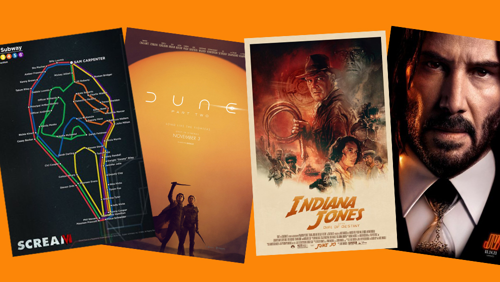
This year has seen some unforgettable movies. In the summer, the world was gripped by the ‘Barbenheimer’ phenomenon, as two vastly different yet similarly big-budget films came out on the same day in July. Then there was Disney Pixar’s Elemental, the supernatural horror Five Nights At Freddy’s, Marvel’s Guardians of the Galaxy Vol. 3, Wes Anderson’s retro-futuristic comedy-drama Asteroid City and cult teen comedy Bottoms.
And with so many huge movies come myriad movie posters designs. Some of the best movie posters were brilliant, but there were also plenty of less successful designs. Here we recap the hits and misses.
The best movie posters of 2023
Scream VI
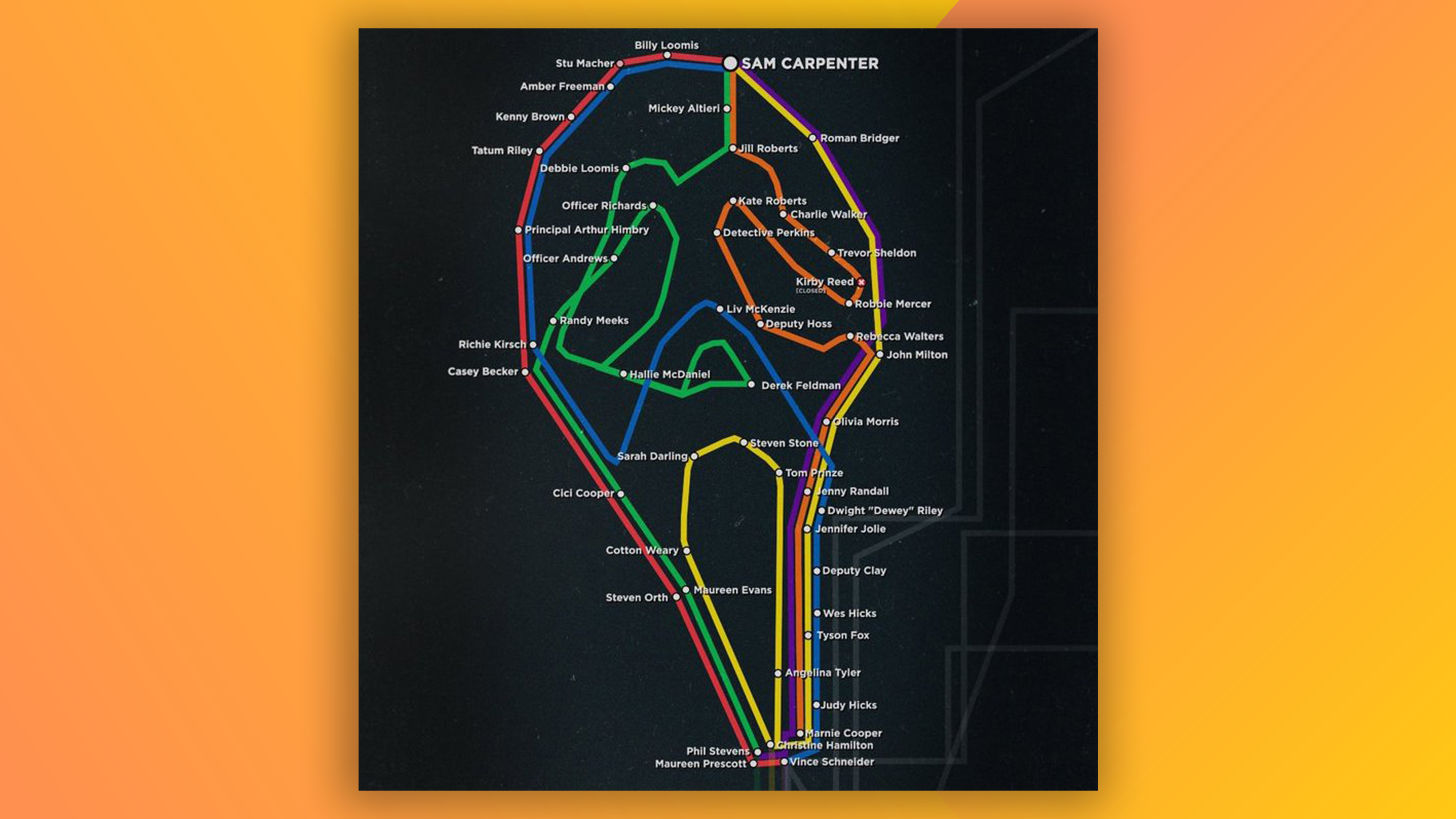
The latest release in the Scream series, Scream 6 was certainly well-received, but one of its posters might actually be one of the best things about it. This alternative teaser poster was something a bit different, but it’s surprisingly simple. It consists of a subway map that’s formed in such a way that it creates Ghostface’s mask, and all the of the ‘stops’ on the map are the names of victims from the entire franchise – yep, going back all the way to the first movie from 1996.
Wonka
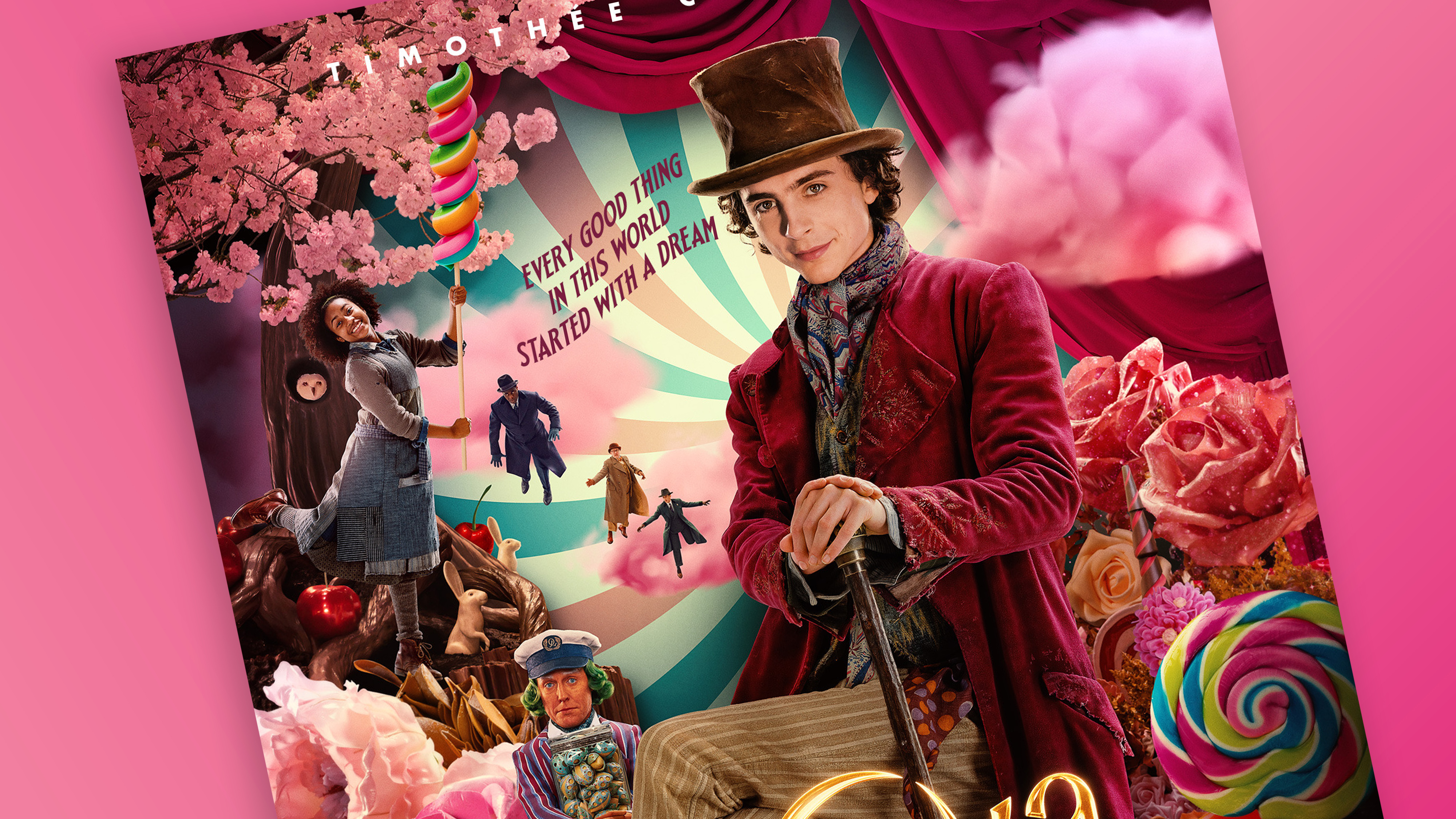
Lots of people are talking about Wonka right now – and the reviews have largely been positive. Yet, we aren’t so fond of the poster, and the rather wonky Photoshop that seems to have been employed in its creation.
Wonka, played by Timothee Chalamet, seems to be sitting down in the poster. But, as some social media users have pointed out, it’s clearly a photo of Chalamet sitting down – seated legs have been Photoshopped in retrospectively, and rather clumsily. It just doesn’t look quite right.
Poor Things
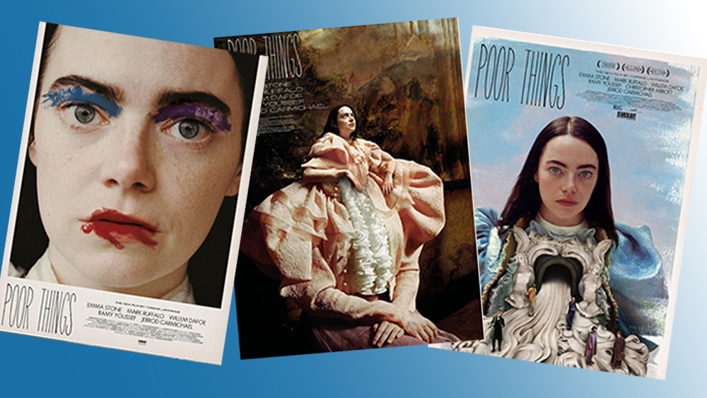
The posters for this steampunk black comedy starring Emma Stone and Mark Ruffalo were among this year's most artistic. Designed by Athens-based graphic designer Vasilis Marmatakis, they departed from the oft-used floating heads design formula to come up with posters that each convey the themes of Poor Things. They’re unique and showed that departing from the norm can often be so effective.
John Wick 4
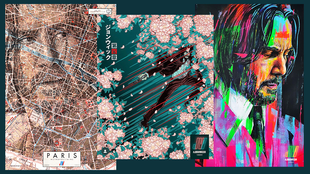
The main John Wick 4 poster is fairly par for the course for an action thriller, showing Keanu Reeves standing in front of the Eiffel Tower holding a gun by his side. But, the filmmakers also commissioned an ‘artist series’ of posters which are fantastically ingenious.
Get the Creative Bloq Newsletter
Daily design news, reviews, how-tos and more, as picked by the editors.
Take Ed Fairburn’s creation, which is hand-illustrated and takes the form of a map of Paris, yet depicts Wick’s face. Or the manga-influenced design featuring plenty of cherry blossoms designed by Yuko Shimizu – Wicks heads to the Japanese city of Osaka in the latest instalment.
There was also a poster featuring a clever optical illusion. At first glance, it looked like a simple headshot character poster, but closer inspection revealed Wick's tie to be an hourglass filled with bullets. There was a nice Easter egg in the logo too, with the numeral IV highlighted in the initials JW
Indiana Jones and the Dial of Destiny
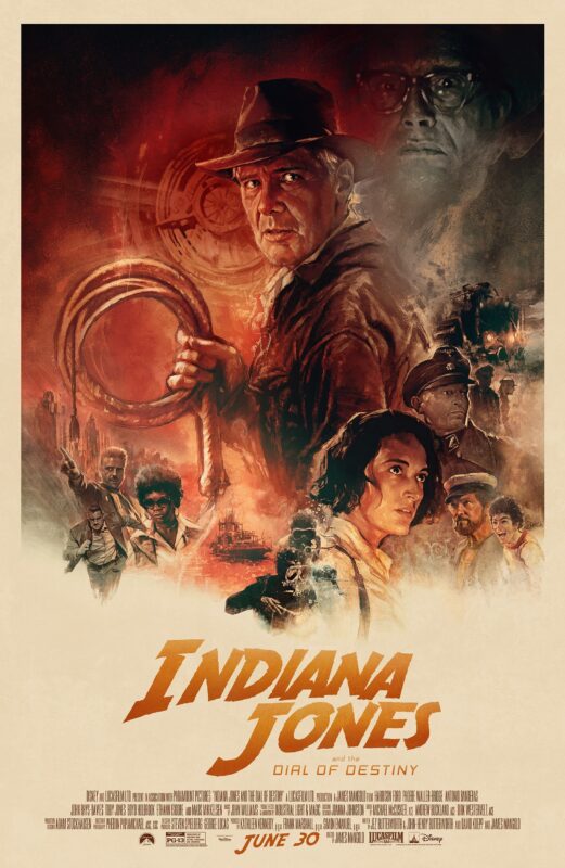
The Indiana Jones and the Dial of Destiny poster was a retro treat that felt like a gift for fans of the original trilogy. Illustrated by Tony Stella, its painterly textures and earthy colours hark back to the classic posters for Raiders of the Lost Ark and the Temple of Doom (illustrated by Richard Amsel and Drew Struzan, respectively).
The Killer
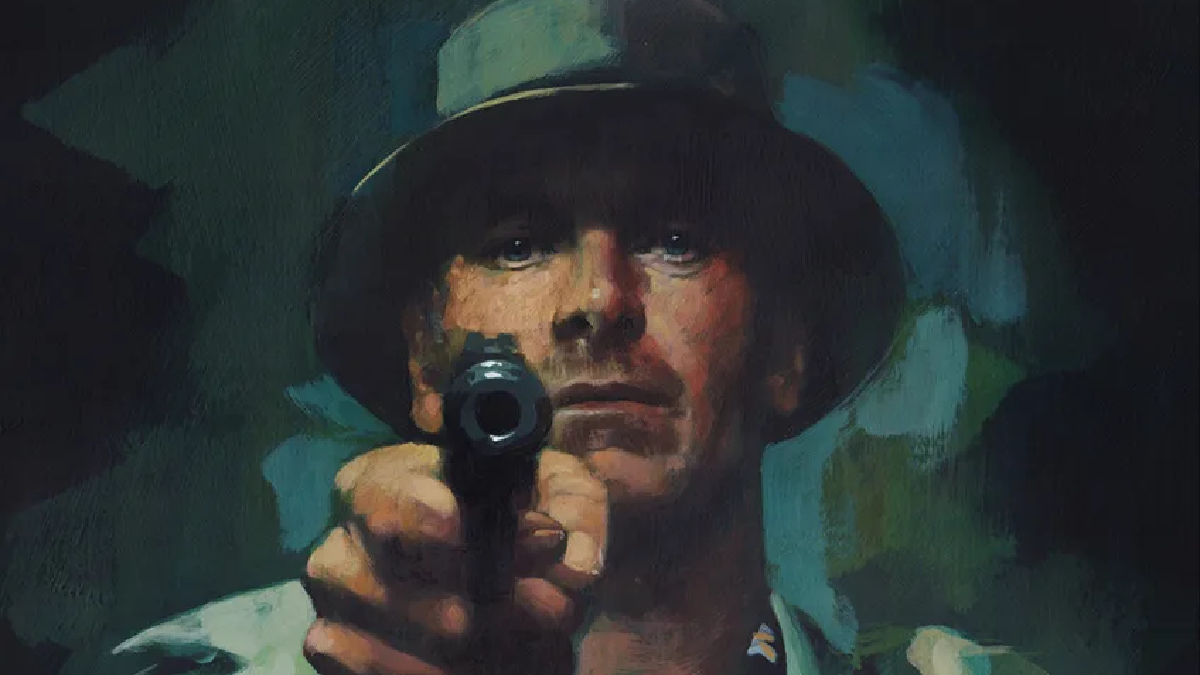
The premise for this movie’s poster is simple. Michael Fassbender, who plays the main character, points a gun at the poster’s viewer. Yet, the poster for The Killer – like we highlighted back in August – is handpainted, adding something different to what we might expect from a poster for an action thriller. It was a hit across social media, too. Some commentators described it as the poster of the year – and it’s not a stretch to say it’s among the contenders.
Dune: Part 2 poster
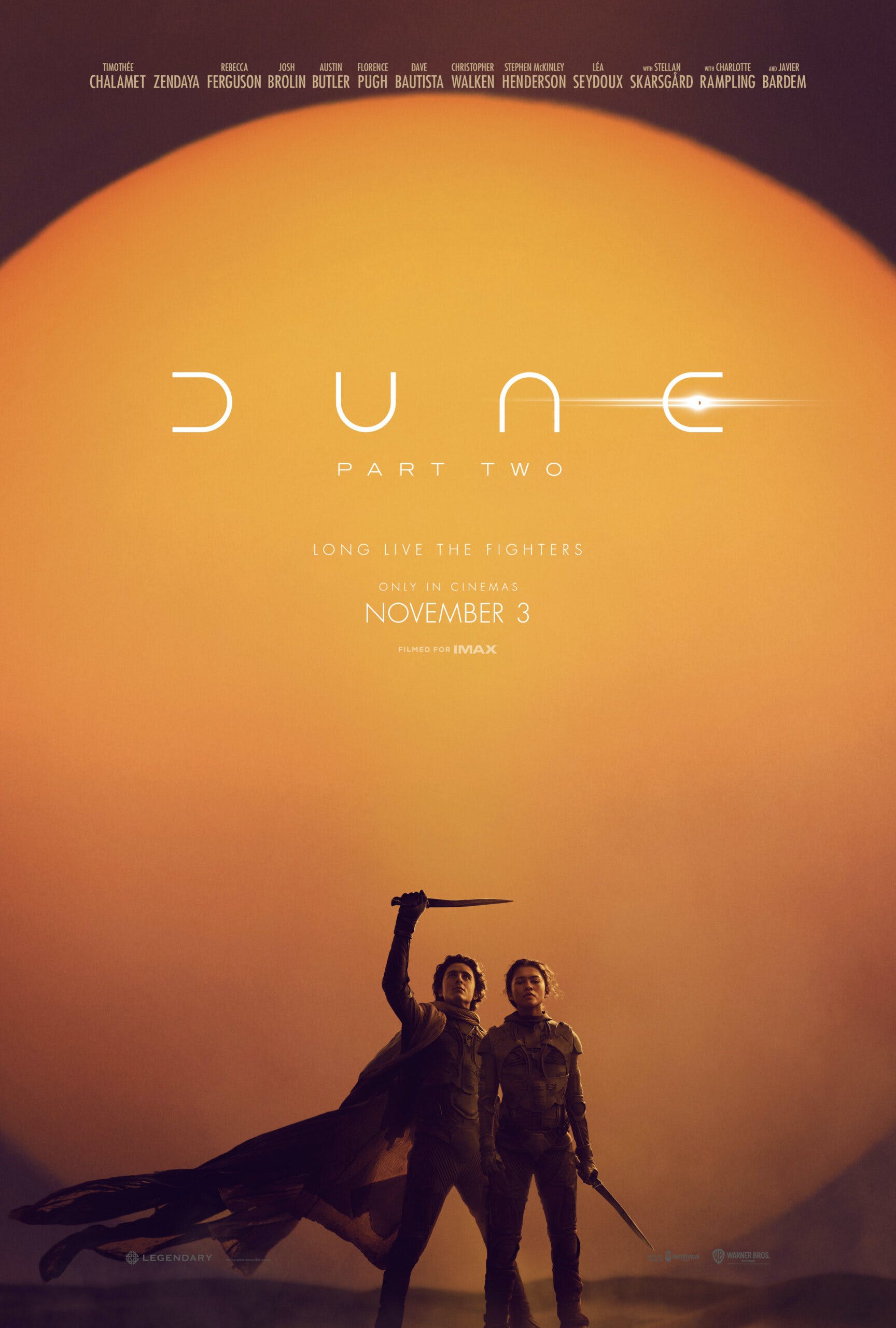
Simple but effective, and with no floating heads, the Dune: Part 2 poster shows Timothée Chalamet's Paul Atreides and Zendaya's Chani in front of a striking Arrakis sunset, whetting our appetite for the upcoming sequel, which is due for release on November 3.
The worst movie posters of 2024
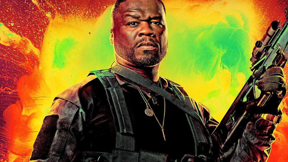
The Expendables 4
The main John Wick 4 poster was fairly par for the course for an action thriller, showing Keanu Reeves standing in front of the Eiffel Tower holding a gun by his side. But, the filmmakers also commissioned an ‘artist series’ of posters which are fantastically ingenious.
Take Ed Fairburn’s creation, which is hand-illustrated and takes the form of a map of Paris, yet depicts Wick’s face. Or the manga-influenced design featuring plenty of cherry blossoms designed by Yuko Shimizu – Wicks heads to the Japanese city of Osaka in the latest instalment.
There was also a poster featuring a clever optical illusion. At first glance, it looked like a simple headshot character poster, but closer inspection revealed Wick's tie to be an hourglass filled with bullets. There was a nice Easter egg in the logo too, with the numeral IV highlighted in the initials JW
Madame Web
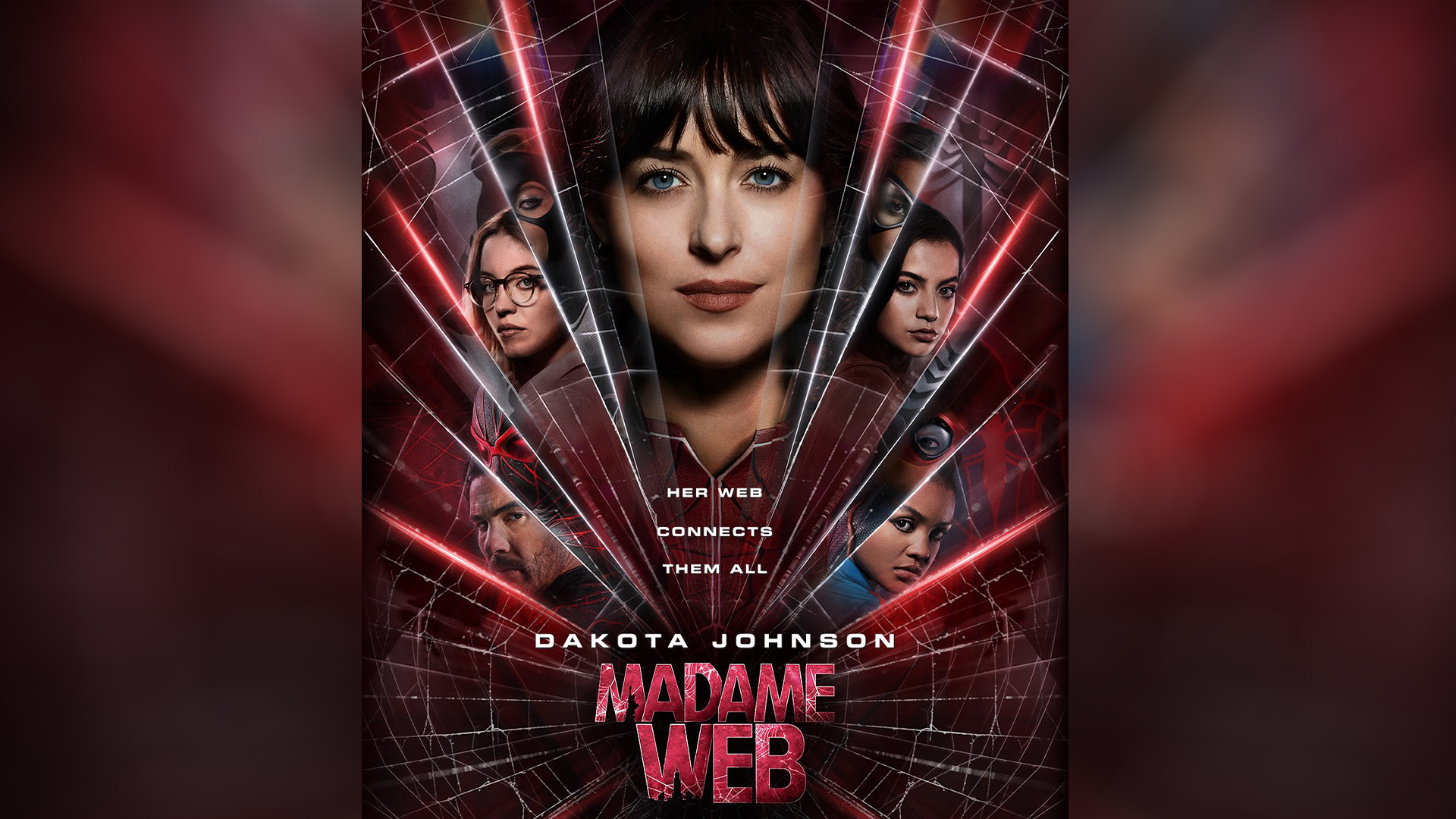
It’s safe to say that fans weren’t overly impressed with the posters for Marvel’s superhero movie Madame Web. They’re not the most exciting posters in the world, rather formulaic with the overused floating head design and a boring colour palette.
Dakota Johnson, who plays the titular character, takes centre stage in both posters but her expression doesn’t catch the eye. Overall, it’s not so much bad as just totally mediocre and forgettable.
My Big Fat Greek Wedding 3

Last of our list of contenders for the worst movie poster of the year is this offering for the third installation in the epic trilogy that is My Big Fat Greek Wedding (you mean you missed MBFGW 2? Us too; apparently, it was released in 2016). The design sticks with romantic comedy conventions: the couple in the foreground, and a bunch of floating heads in a column on the left.
But look closer, and you'll see that none of those heads appears to belong to the body it's been slapped on top of. What's more, each face appears to have a different light source, and there's an uncanny, dead-behind-the-eyes quality that's making a lot of people wonder how this wasn't generated by AI.
On that note, make sure you catch up on developments in AI with our review of how AI image generation changed art and design in 2023. For more design hits and misses of the year, see our roundup of the best and worst logos of 2023.

Thank you for reading 5 articles this month* Join now for unlimited access
Enjoy your first month for just £1 / $1 / €1
*Read 5 free articles per month without a subscription

Join now for unlimited access
Try first month for just £1 / $1 / €1

Adam is a freelance journalist covering culture and lifestyle, with over five years’ of experience and a Master’s degree in Magazine Journalism from Cardiff University. He’s previously written for publications including The Guardian, The Independent, Vice and Dazed, and was Senior Editor at DogTime.com from 2022 to 2023. When he’s not writing, he’s probably drinking coffee, listening to live music, or tinkering with his Apple devices.
- Joe FoleyFreelance journalist and editor
