The bizarre story behind The Beatles logo
The design's road to fame was long (and winding).
Unless you've been living under a rock, you've probably heard the news that The Beatles have just released a new song. Yep, a new Beatles number, right here and now in 2023. Using the power of AI, old and new recordings have been combined to create a studio version of Now and Then, billed as the 'final' Beatles song.
Alongside the music, there are a few visual flourishes the fab four are famous for. One is the hair, and another is the logo with its iconic 'drop T'. But what if we told you The Beatles logo isn't actually The Beatles logo? (For more design inspiration, check out the best logos of all time.)

Last year, a viral Twitter thread revealed that the design never actually featured on any of the band's albums. Indeed, until it was finally officially licenced in the 90s, it hardly showed up at all – except for in one very particular place. (Need a hand designing a logo as iconic as The Beatles'? Make sure you follow our 15 golden rules of logo design.)

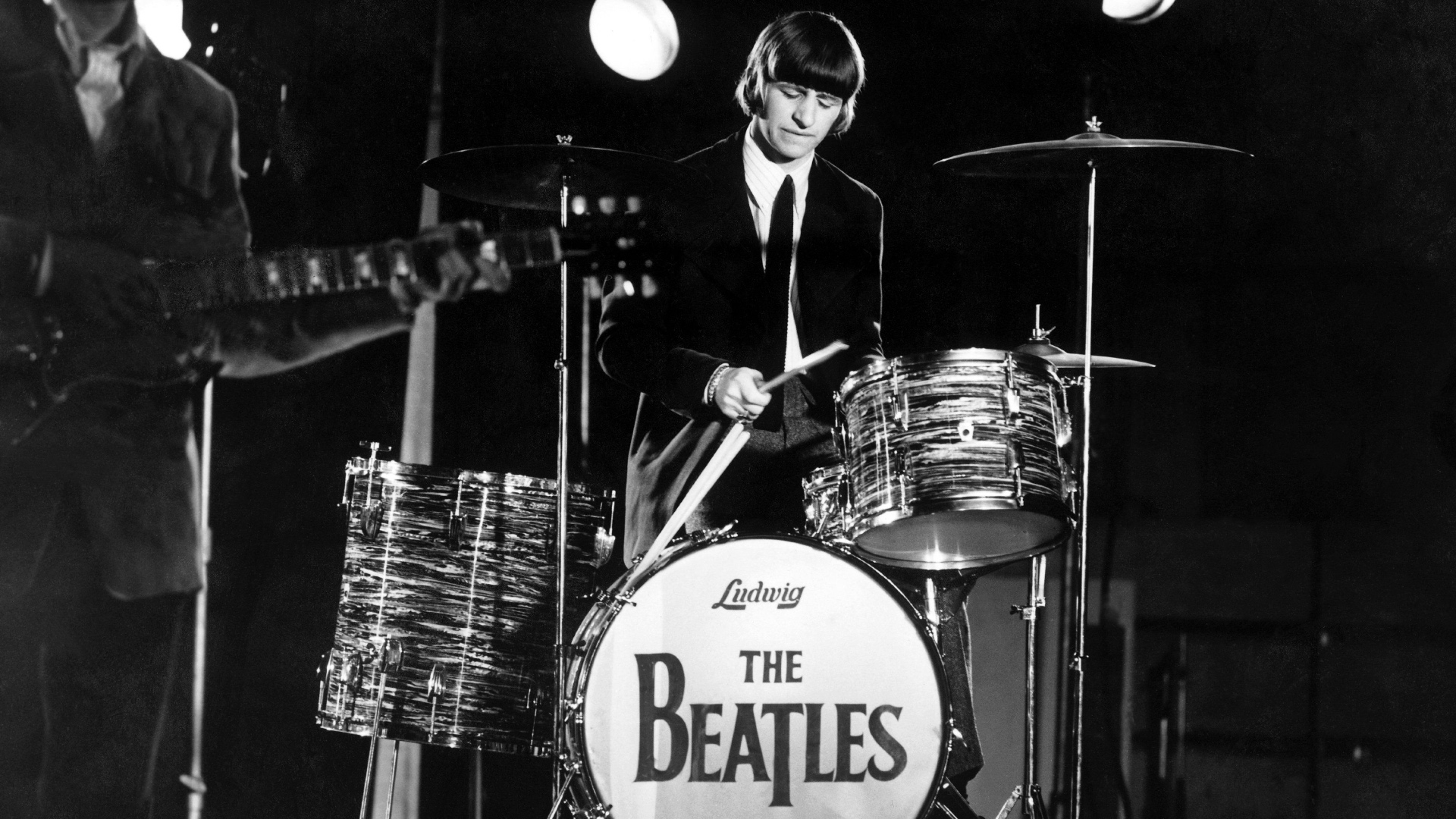
It turns out the 'drop-T' logo originates from the drum kit used by Ringo Starr (of Thomas the Tank Engine narration fame). In the Twitter thread, scriptwriter and novelist Eddie Robson shares that in April 1963 Ringo needed a new set of drums, so he and Brian Epstein went to Drum City on Shaftesbury Avenue to get some. As the exclusive supplier of Ludwig drums, the store wanted the Ludwig logo to be prominent. Epstein agreed – as long as The Beatles was also written on the kit. The shop's owner, Ivor Arbiter, sketched the drop-T logo on the spot: the larger B and T were to emphasise the word "Beat".
A THREAD on The Beatles' logo. Most people probably recognise it - a very simple design made distinctive by the drop "T" in the middle. pic.twitter.com/B8PWFqeShiJanuary 5, 2022

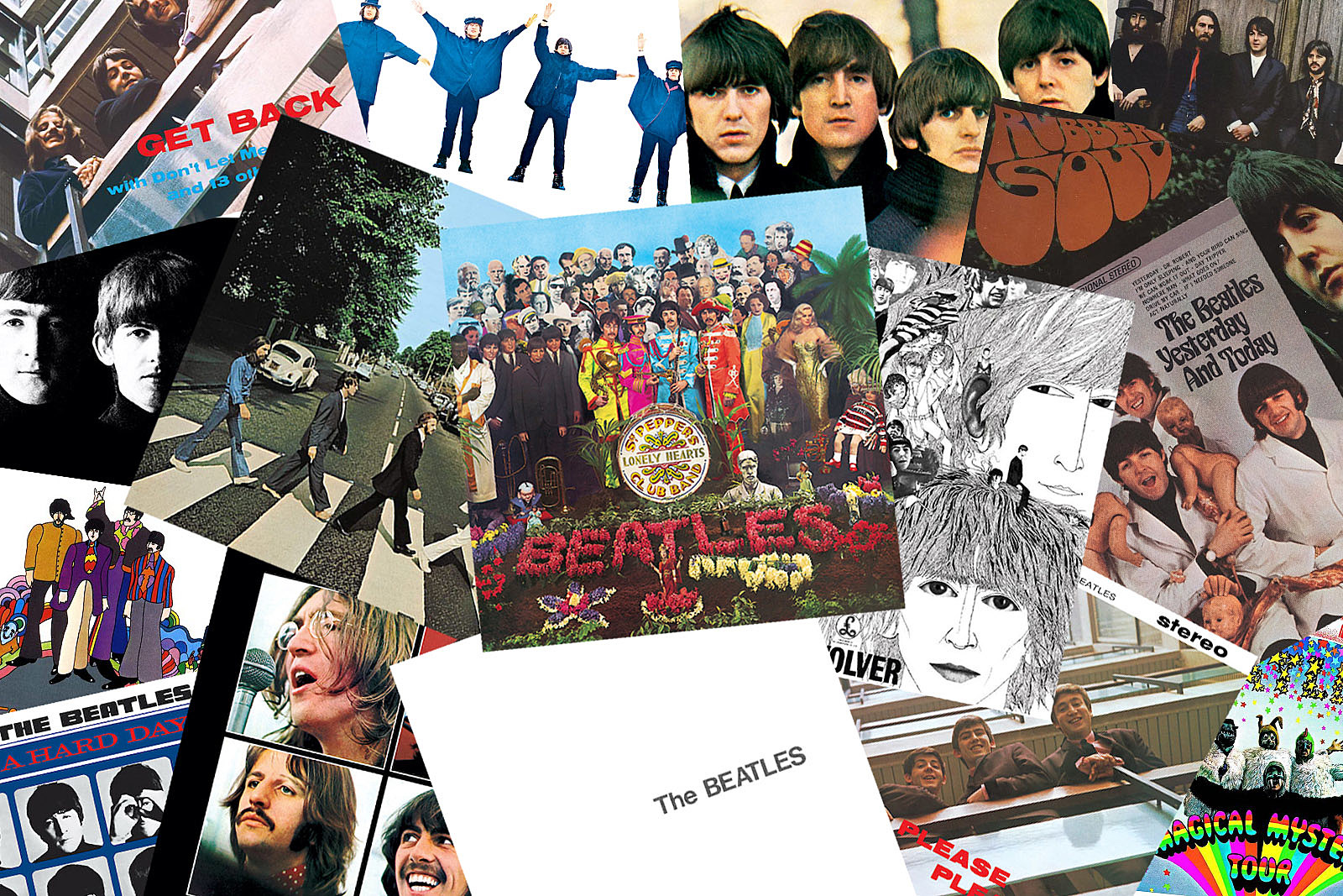
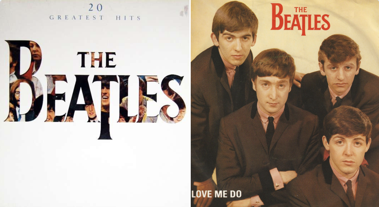
Indeed, that drum kit is the only place the logo appeared for a long time. It doesn't appear on any of the band's studio album covers – many of which don't even feature the name of the band. It was only in 1982, 12 years after the band parted ways, that the 'drop-T' logo appeared – on both a 'best-of' album and accompanying single (below).

But according to The Beatles Bible, it was over a decade later in 1994 that the logo was finally trademarked by Apple Records – and that's when it started appearing everywhere from album reissues to merchandise. As Robson says, this "signals a shift in attitudes at Apple, with a more coherent approach for managing the group's legacy."
Many Twitter users have shared their surprise at the revelation that such an iconic logo only retroactively became synonymous with the band. "I was literally wondering who made this logo a couple of days ago and the answer is even more interesting than I expected. Love this thread," one user comments, while another adds, "Interesting read, I’m surprised the drop T logo wasn’t trademarked till the 90s!"
Get the Creative Bloq Newsletter
Daily design news, reviews, how-tos and more, as picked by the editors.
From Lana Del Rey's hilariously bad album art to that Drake cover, we've seen plenty of examples to prove that contemporary artists could do with taking a leaf out of The Beatles' book when it comes to quality design.

Thank you for reading 5 articles this month* Join now for unlimited access
Enjoy your first month for just £1 / $1 / €1
*Read 5 free articles per month without a subscription

Join now for unlimited access
Try first month for just £1 / $1 / €1

Daniel John is Design Editor at Creative Bloq. He reports on the worlds of design, branding and lifestyle tech, and has covered several industry events including Milan Design Week, OFFF Barcelona and Adobe Max in Los Angeles.
- Amelia BamseyFormer staff Writer
