Thames & Hudson rebrand makes the old new again
And the results are wonderfully nautical.

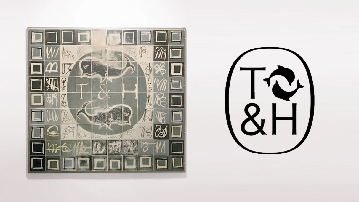
Illustrated book publisher Thames & Hudson has revealed a brand new visual identity designed by Pentagram. The rebrand includes a new cartouche (a frame around a design) in which the publisher's monogram and dolphin symbol are surrounded by an oval.
This new cartouche is both a modernisation and a nod to the publisher's heritage of over 70 years. As well as being designed to work in various sizes across digital and print, it was partly inspired by an original mosaic found in Thames & Hudson's London office (below). The mosaic features the two dolphins that represent the rivers the publisher is named after, in London (Thames) and New York (Hudson). If you haven't got an old mosaic hanging around, check out our logo design inspiration guide.

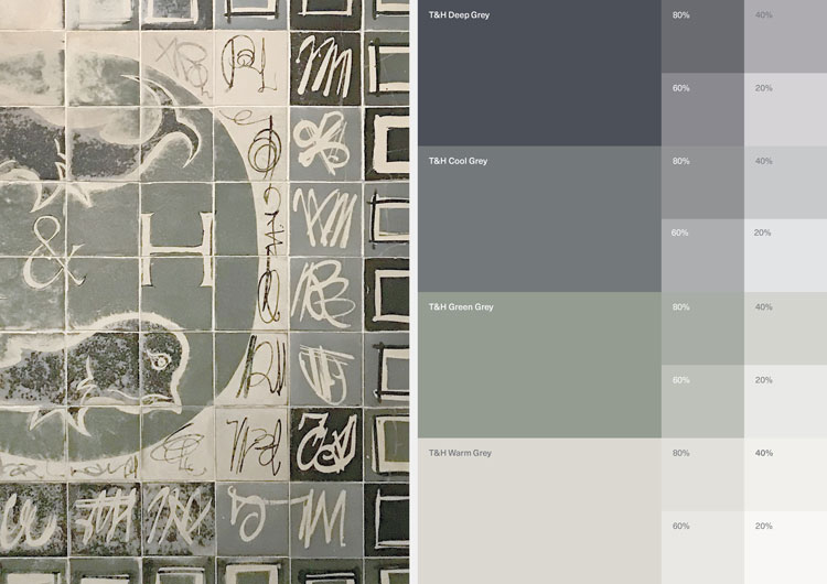
Pentagram isn't kidding when it says the new identity was inspired by the original mosaic. As well as informing the new cartouche, it has coloured the identity's palette of cool and warm greys. It's a nice touch of detail from the studio, and certainly fits the new ethos of bringing the publisher's heritage and digital future together:

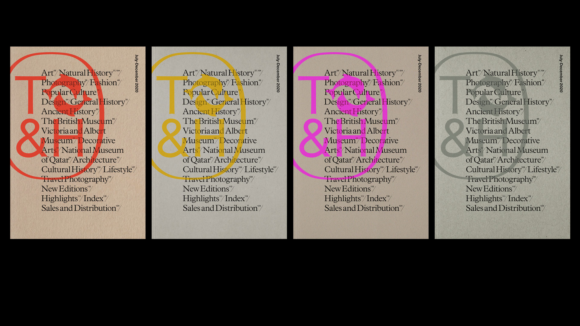
Demonstrating the new mark's flexibility is its application on Thames and Hudson's sales catalogues (below). The oversized, brightly coloured design sits off-centre behind bold typography, for a strikingly contemporary look. We'll be ordering a few of these.

Thames and Hudson has over 2,000 books in print, from fashion titles to children's books. It was founded in 1948 with a mission to make the world of art accessible to everyone. With an eye on both the past and future of the publisher, this is a rebrand that ought to keep most people happy.
Related articles:
- Subtle K-Y rebrand is a stroke of genius
- Fisher-Price’s new logo puts the fun back in branding
- The 10 best logos of all time
Get the Creative Bloq Newsletter
Daily design news, reviews, how-tos and more, as picked by the editors.

Thank you for reading 5 articles this month* Join now for unlimited access
Enjoy your first month for just £1 / $1 / €1
*Read 5 free articles per month without a subscription

Join now for unlimited access
Try first month for just £1 / $1 / €1

Daniel John is Design Editor at Creative Bloq. He reports on the worlds of design, branding and lifestyle tech, and has covered several industry events including Milan Design Week, OFFF Barcelona and Adobe Max in Los Angeles. He has interviewed leaders and designers at brands including Apple, Microsoft and Adobe. Daniel's debut book of short stories and poems was published in 2018, and his comedy newsletter is a Substack Bestseller.
