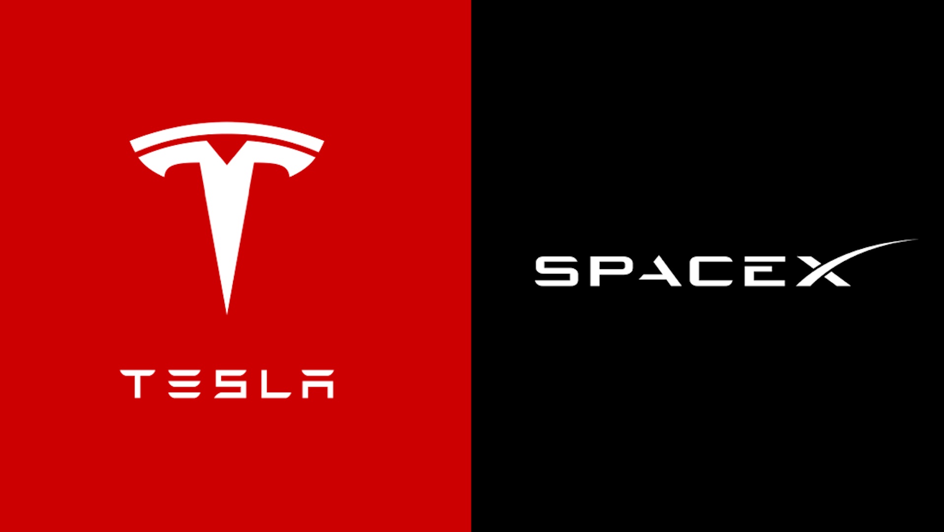
Turns out Elon Musk's SpaceX logo has a hidden message
Can you spot it?
Logo design can be a complicated business. Even the most apparently simple symbols can go through multiple transformations during the design process, and a dodgy line here or off-angle there will have kept a graphic designer up at night. And it seems not even Elon Musk is immune to the agony of chasing logo perfection.
Musk recently took to his favourite social media platform to offer some insight into the creation of two of his companies' most well known logos. And it turns out one has a secret message, while the other has undergone many subtle tweaks over the years. (Looking for inspiration? Check out our roundup of the best logos of all time.)

Responding to a fan who complimented the logo for SpaceX (Musk's contribution to the Billionaire Space Race), he revealed that the swoop of the 'X' is "meant to represent the rocket’s arc to orbit." Hardly an earth-shattering visual pun, but yeah, I can see it.
The swoop of the X is meant to represent the rocket’s arc to orbitAugust 28, 2022
In response to another fan, Musk tweeted that he "somewhat agonised" over the font design for the Tesla wordmark, particularly in relation to the use of negative space. He claimed that the design has received "many little tweaks over the years," but didn't elaborate on exactly what had changed. As font nerds, we'd certainly be interested to see what's been nipped and tucked over the years.

The SpaceX logo is by no means the only design out there with a hidden meaning. From the Bluetooth logo to the Toyota logo, we've seen countless logo 'secrets' emerge over the last few years. Not all of them deliberate, it's worth noting – speaking of Tesla, just wait until you see what some people think the 'T' symbol looks like.
Read more:
- Turns out the Walmart logo isn't what you think it is
- The Kia logo redesign is confusing even more people
- The PlayStation logo from behind is the most cursed image online
Get the Creative Bloq Newsletter
Daily design news, reviews, how-tos and more, as picked by the editors.

Thank you for reading 5 articles this month* Join now for unlimited access
Enjoy your first month for just £1 / $1 / €1
*Read 5 free articles per month without a subscription

Join now for unlimited access
Try first month for just £1 / $1 / €1

Daniel John is Design Editor at Creative Bloq. He reports on the worlds of design, branding and lifestyle tech, and has covered several industry events including Milan Design Week, OFFF Barcelona and Adobe Max in Los Angeles.
