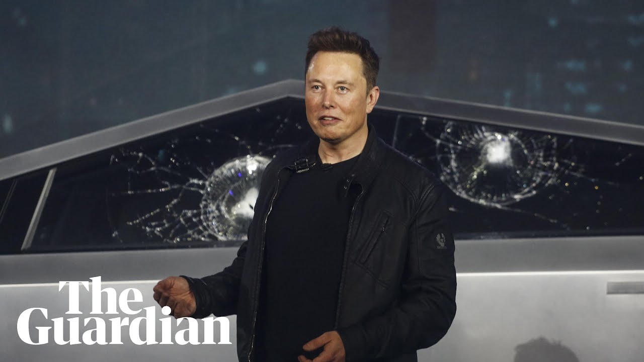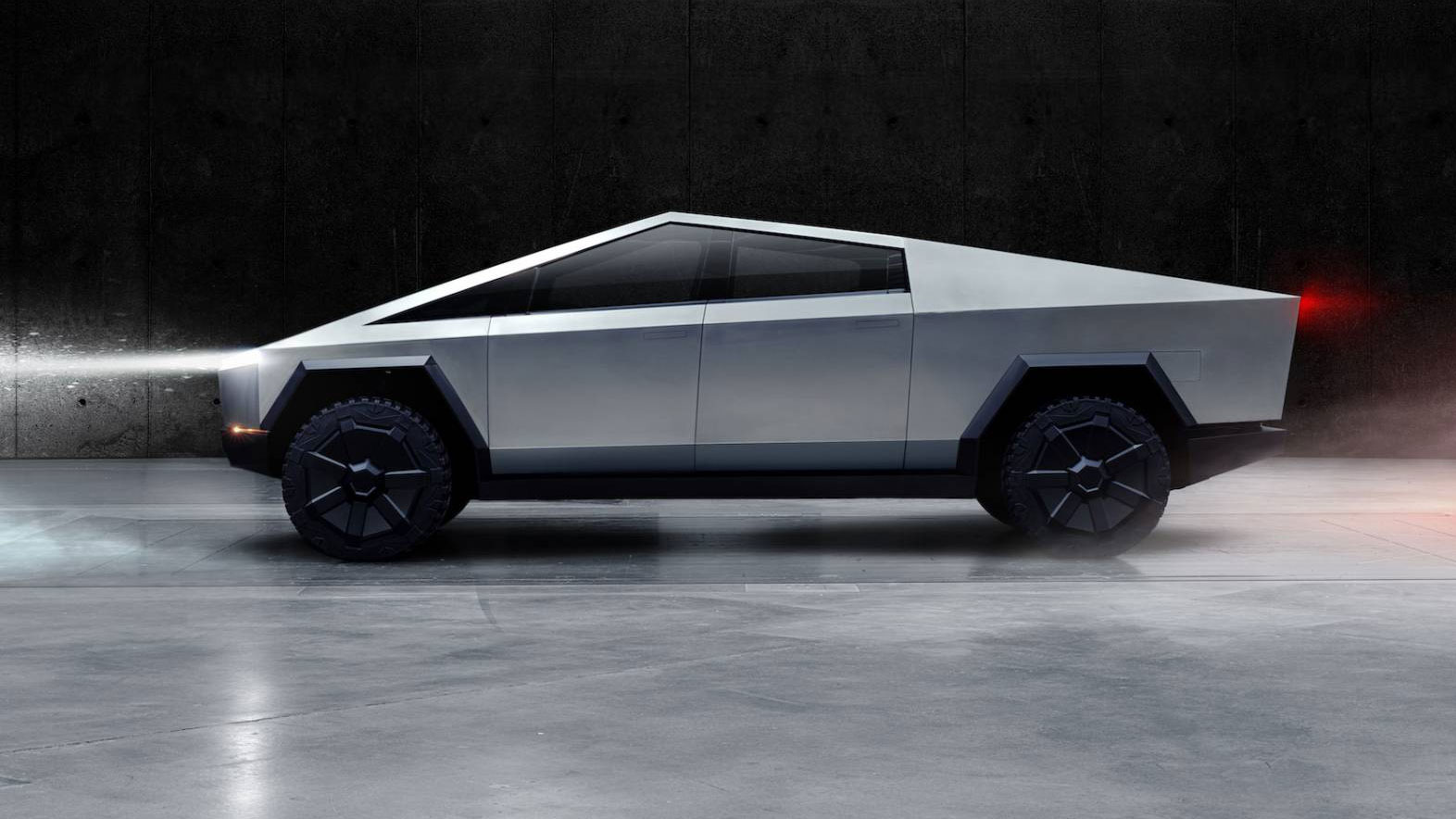
Whatever you think about Elon Musk, there's no denying that he's not averse to taking risks. He leapt from working on an online payment platform (PayPal) to blowing up millions of dollars worth of rockets in a quest colonise Mars, buying a social media platform to sabotage it and developing an expensive edgy retro-futuristic pick-up truck that doesn't seem to work very well.
But it seems that when it comes to the Tesla Cybertruck, the risk-taking may have gone too far. From a logo that looks like it's from a 90s video game to serious safety issues, Tesla may be paying the price for acting on apparent design whims. Even after years of delays, the Cybertruck is looking like a rushed job. As Musk insists it's not a problem is Tesla fails to sell cars – it will just pivot to cloud storage or something – we we recap on the long saga of Cybertruck design fails. For sounder motoring design inspiration, see our pick of the best car logos.
01. The entire Cybertruck concept
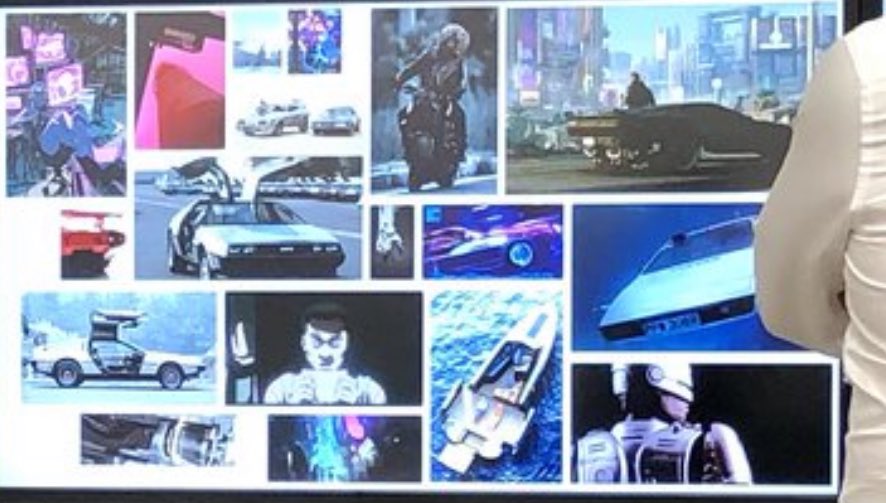
Perhaps things started badly with the Cybertruck concept itself. Anecdotes about the design process shared by Musk's biographer, Walter Isaacson, suggest it was always more about aesthetics than on function, with Musk keen to create an edgy design that would look futuristic... by taking inspiration from retro sci-fi movies.
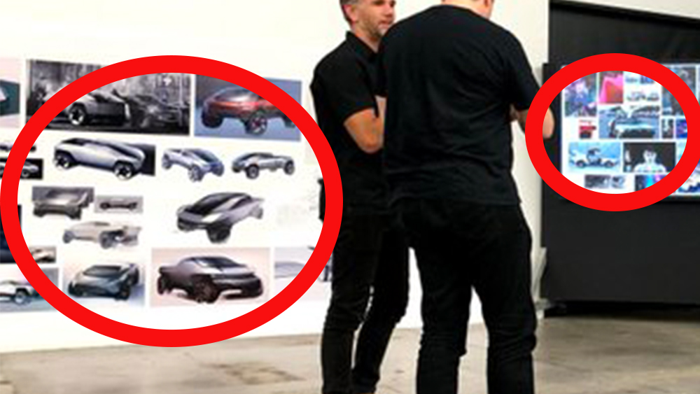
One image shows Musk standing in front of some early sketches for the Cybertruck and an inspiration board that includes a DeLorean DMC-12 of Back to the Future fame, James Bond's Lotus underwater in the Spy Who Loved Me and scenes from Robocop.
As for early sketches, many of them look tame compared to the Cybertruck's final design. We often see examples of designers starting with far-out ideas and then toning them down for the final product, but it seems like Musk went the other way with the Cybertruck. If the original sketches were angular, Musk had that dialled up to 11 for the final design with its triangle roof.
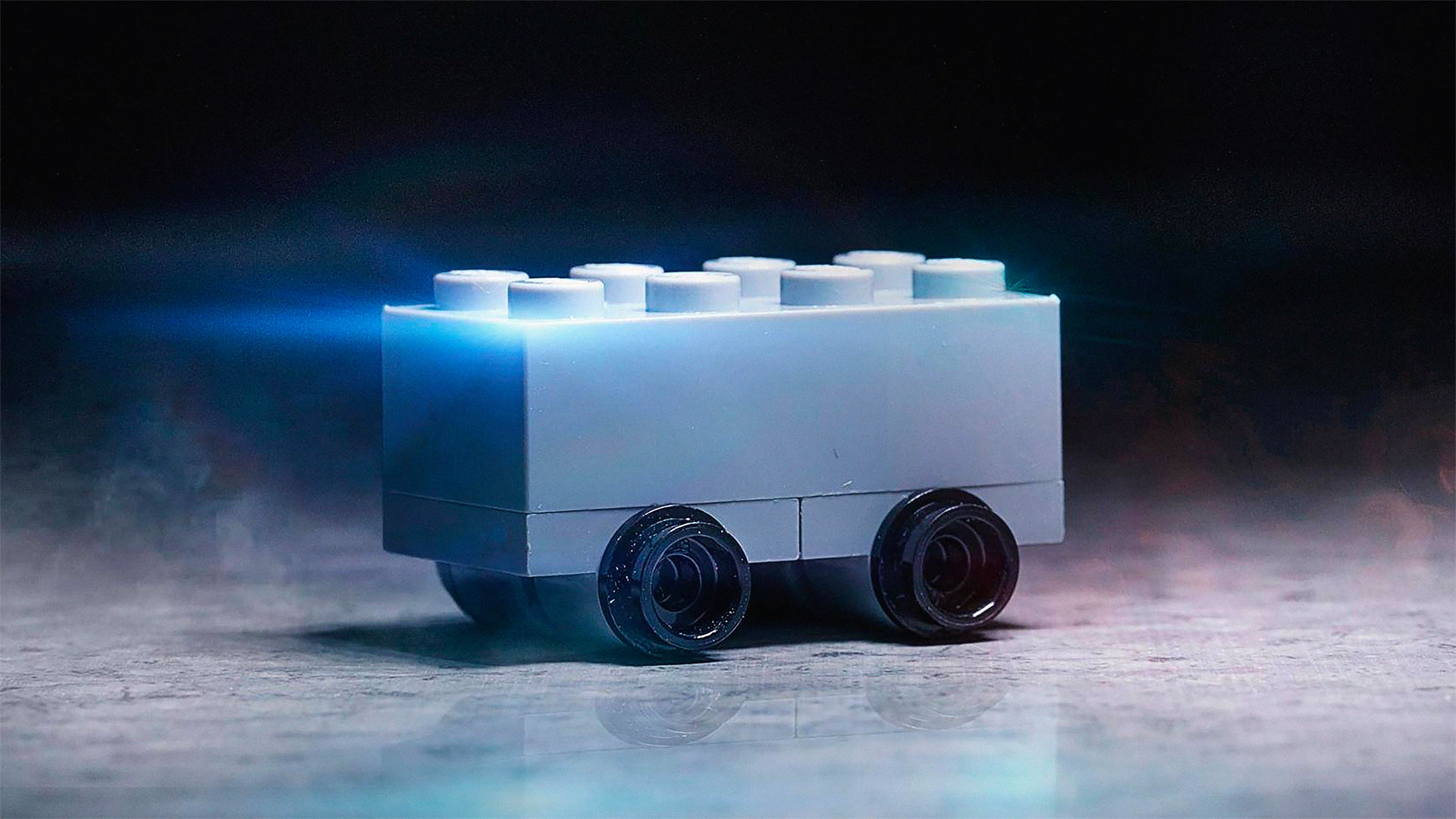
The insistence on making the Cybertruck from stainless steel meant straight planes and sharp angles, forcing the design team to explore ideas that were more jarring. The result is an electric pickup truck looks like an early piece of low-poly 3D art. Many were quick to scoff. "The future looks the way it does because some creative people created designs that looked out of their time. Then other ambitious/creative people who grew up thinking that that's what future held, built that future. Like a self fulfilling prophecy," pointed out nish on X. Even Lego took the Michael.
02. The Cybertruck logo and branding

Strangely for a such a successful businessman, Musk doesn't seem to spent a lot of time or energy on branding. Despite having said that he loves logo design, his company's logos often tend to look like rushed afterthoughts. He rebranded Twitter overnight, crowdsourcing a generic off-the-shelf logo for X, while the Tesla logo looks like an IUD.
Get the Creative Bloq Newsletter
Daily design news, reviews, how-tos and more, as picked by the editors.
Musk tends to follow personal whims, and he likes edgy design, or rather the kind of cringeworthy rich middle-aged man's idea of what edgy might look like. The Cybertruck name itself feels embarrassing, harking back to the 1990s, when adding 'cyber' to the beginning of anything instantly bestowed it with some hi-tech cool. A patented Cybrtrk logo looked like a concept for a 90s video game that got dropped (The Designers Republic has nothing to fear) and which could compete with the Kia logo in terms of legibility.

Tesla settled on an even less legible design that looks like it was scrawled by a school kid practising logo designs for a hypothetical death metal band he hasn't formed yet. A logo might seem like a minor factor when the car itself has had so many problems, but the Cybertruck branding may have further reduced the potential appeal of the vehicle, making it something a lot of people would be embarrassed to own and ensuring that the small target audience of tech bros who bought one would be laughed at.
03. Tesla breaking the Cybertruck's unbreakable windows
The epitome of the disaster-prone development of the Cybertruck came at the launch event when Elon Musk urged von Holzhausen to throw a metal ball at the vehicle's windows to demonstrate their unbreakability. They broke. Twice. There has been a suggestion that the windows may have broken because the were not completely closed. Whatever the reason, it wasn't a great sales pitch, and started questioning how heavy duty the Cybertruck was really going to be.
04. Messing up the basics
Tesla began taking Cybertruck orders in November 2019 with the aim of reaching production in 2021. It finally began delivering cars in November 2023 after pushing the launch date back several times and increasing the price tag by half along the way, the cheapest model rising to over $60,000. A leaked internal presentation from as late as January 2022 suggested some of the reason for the delays, revealing problems with braking, handling, noise and leaks.
Engineers were struggling to seal the truck against water – something that's been an issue in standard Teslas – and against noise, identifying 21 potential noise leaks. As for the brakes, the report notes excessive pedal travel, inconsistent power brake assistance and excessive pitch. Meanwhile, the truck's handling was suffering from “excessive mid-speed abruptness and chop” and “structural shake.”
An automotive engineer, speaking anonymously to Wired, said the flaws were “classic mechanical automotive engineering challenges that you have in pretty much any vehicle. I'm blown away that they would be struggling so much with the basics.” Tesla also seemed not to have thought ahead to potential launches in other markets, with commentators observing that the Cybertruck's design wouldn't be deemed road legal in the European Union due to the lack of pedestrian crumple zones.
05. The confusing Cybertruck brake light
The rear of the Cybertruck has been compared to everything from a dumpster to a VHS tape rewinder and a refrigerator. "5 decades of sci-fi illustrations depicting futuristic vehicles and this is what we got? Pathetic," one person wrote on X. But as well as being ugly, the Cybertruck's rear end also features a potentially dangerous design decision. The tail light occupies a single strip across the whole of the back of the vehicle. When the car brakes, this deactivates to reveal smaller brake lights that occupy part of the tail light and the corners where the indicators are located. The result is a braking light that's less noticeable than the tail light and requires drivers behind to fathom out the code.
06. Cybertruck accelerator issues
After the Tesla font debacle, the latest setback is the news that Tesla is recalling 3,878 Cybertrucks because of a defect with the accelerator pedals. In a rather terrifying blunder, the use of an "unapproved lubricant" caused the pedal to slip, keeping it stuck at full speed. This may be the kind of minor regulatory health and safety snag that Musk would view as part of a Marxist conspiracy to restrict western freedom (he seems to have done remarkably well under Communist autocracy) but sending potential death traps out on the streets is yet another dent to the credibility of a company that really needs to get things in order if it's going to retain investors' confidence.

Thank you for reading 5 articles this month* Join now for unlimited access
Enjoy your first month for just £1 / $1 / €1
*Read 5 free articles per month without a subscription

Join now for unlimited access
Try first month for just £1 / $1 / €1

Joe is a regular freelance journalist and editor at Creative Bloq. He writes news, features and buying guides and keeps track of the best equipment and software for creatives, from video editing programs to monitors and accessories. A veteran news writer and photographer, he now works as a project manager at the London and Buenos Aires-based design, production and branding agency Hermana Creatives. There he manages a team of designers, photographers and video editors who specialise in producing visual content and design assets for the hospitality sector. He also dances Argentine tango.
