T-Mobile's Odido is the messiest rebrand since X
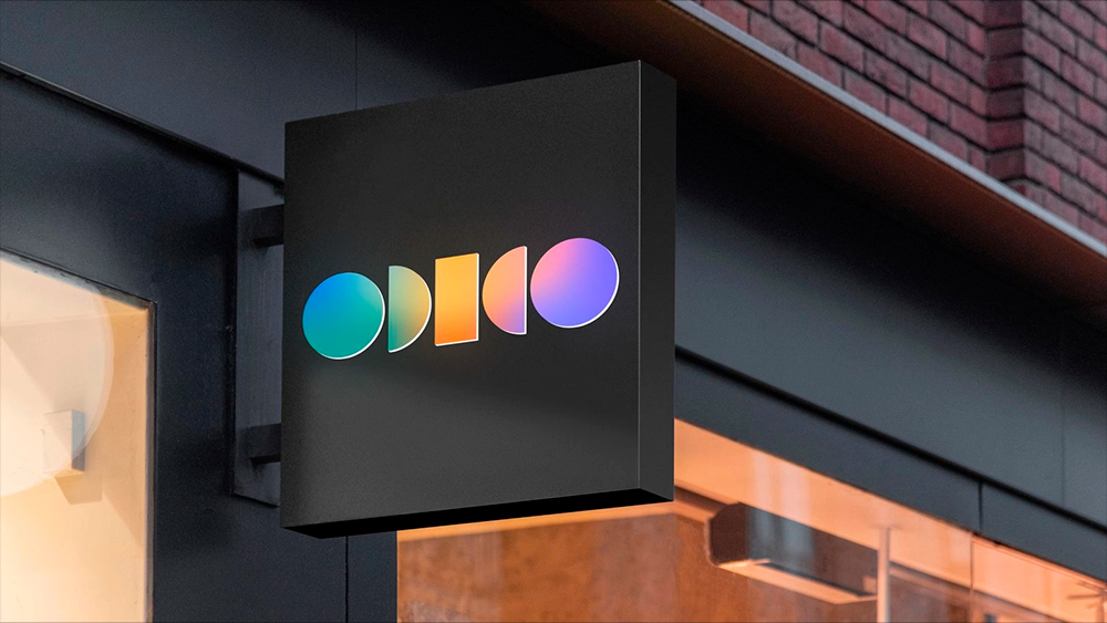
Odido is the new name for mobile operator T-Mobile in the Netherlands, and customers are confused. They're confused about what the new logo says, what the name means, why the name has changed and why they only found out about it from media reports.
All in all, it seems like it's trying to rival Elon Musk's rebrand of Twitter as X for the title of the year's messiest rebrand. And the brand manual doesn't provide much clarity (see our guide to how to design a logo for tips)
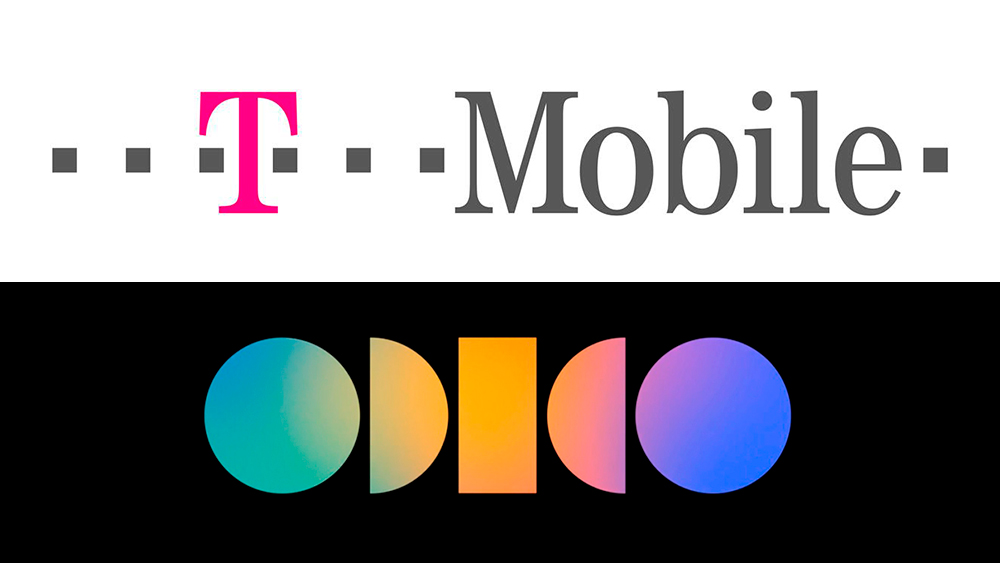
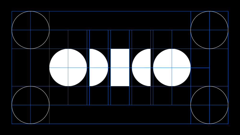
According to Odido's brand guidelines, it seems the new brand name doesn't mean anything and was chosen simply because it's a palindrome – so symmetry. "Our name stays the same no matter how you read it," the guidelines say, as if that says something about the brand. It goes to on say that the letters are "open, playful and unique characters on their own, but together create a strong unity. This mirrors our optimistic view of the world as a place of diversity and connectivity."
One could argue that such a description could apply to any random combination of vowels and consonants put together to invent a word. And there's nothing wrong with inventing words. Great poets have coined their own lexemes inspired only by how they sound and the shapes they form, but in branding, the approach can be a little perplexing for customers. "I don't understand the name. Feels a bit like a "which .nl domain is still available?," one person wrote on Twitter. Others have pointed out that Odido is chain of supermarkets in Poland.

To make things still more abstruse, the Odido logo spells out the meaningless name in code through a series of abstract shapes that might not be seen as a word at all unless it's pointed out to the viewer. "I just see this as circle - half circle - rectangle - half circle - circle," one person wrote. Others think the logo looks like 'play' and 'record' buttons, a depiction of the lunar cycle, a brochette or a DJ booth, while some suggest the design has borrowed heavily from the Dolby Atmos logo or Dico Diamond Company.
"Doesn't it just say 'Obido' instead of Odido? This is also the ugliest logo I have ever seen," one person wrote. "I see Odeco," someone else wrote. As for the colours, Studio Neboko says that it didn't want to settle on one colour like other Dutch telecom companies do, so it "chose all of them". But someone thinks they "just discovered the gradient effect in Photoshop."
#odido Zelfs het logo is gejat. pic.twitter.com/7DfOSTy2DkSeptember 11, 2023
Dit logo was al bezet. Ik lees overigens odico..... pic.twitter.com/uMLPof88exSeptember 14, 2023
But the aspect of the Odido branding that has most irritated former T-Mobile customers is not the name or logo but that they weren't told about it and only found out through media reports. "I have been a customer for years and have not received a letter, email or anything. I would have liked that a lot better. Has anything changed?" read one complaint on Twitter. "A decent company informs its customers in advance," someone else wrote.
Sign up to Creative Bloq's daily newsletter, which brings you the latest news and inspiration from the worlds of art, design and technology.
Perhaps revealingly, the company replied: "It was a surprise not only for our customers yesterday, but also for our employees. You will be notified by email just like all other customers. This concerns large numbers and that is why the emails are sent in batches!"
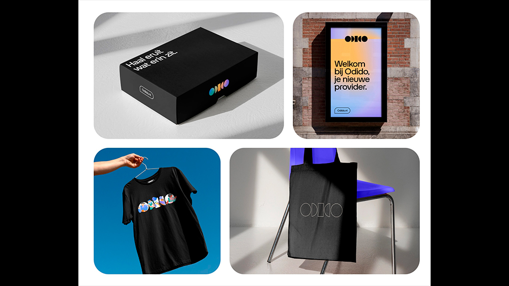
The brand also responded to people hating on the new logo. "Why the hate, Diana?," it wrote to one person, "I am extremely proud of our new brand and can guarantee that we will make something beautiful out of it, with or without you." "It's probably just a matter of getting used to it!" it told someone else. "We want to clearly show that we are 1 provider for Mobile, Fiber Optic and TV," finally offering a reason for the rebrand (although I suspect another reason is to stop having to lease the name from Deutsche Telekom).
The case serves as an reminder not to forget about their customers (or employees) in the excitement of a rebrand. People assume that there's a reason for a change, and if they're not told pre-warned and what the reason is, they may fear that the product or service is changing.
T-Mobile Netherlands previously belonged to Deutsche Telekom but was sold off last year. Deutsche Telekom AG still operates the T-Mobile brand in the US and Poland and is not involved in the Odido branding. For more recent rebrands, see the new Johnson & Johnson logo and the new Ford logo.

Joe is a regular freelance journalist and editor at Creative Bloq. He writes news, features and buying guides and keeps track of the best equipment and software for creatives, from video editing programs to monitors and accessories. A veteran news writer and photographer, he now works as a project manager at the London and Buenos Aires-based design, production and branding agency Hermana Creatives. There he manages a team of designers, photographers and video editors who specialise in producing visual content and design assets for the hospitality sector. He also dances Argentine tango.
