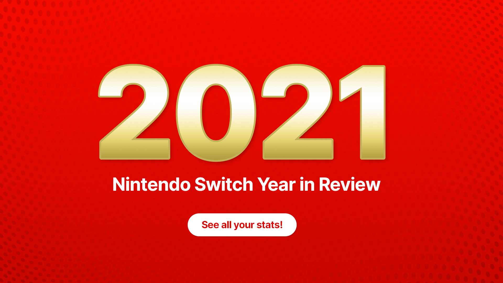
Why does the Nintendo Switch Year in Review look so terrible?
It exposes more than just your gaming secrets.

It has become a huge trend around this time of year for companies like Spotify, TripAdvisor and even PornHub, to release several yearly stats to the public for fun. And every year since 2019 Nintendo has been releasing its Year in Review which is jam-packed with a load of personalised stats for its gamers.
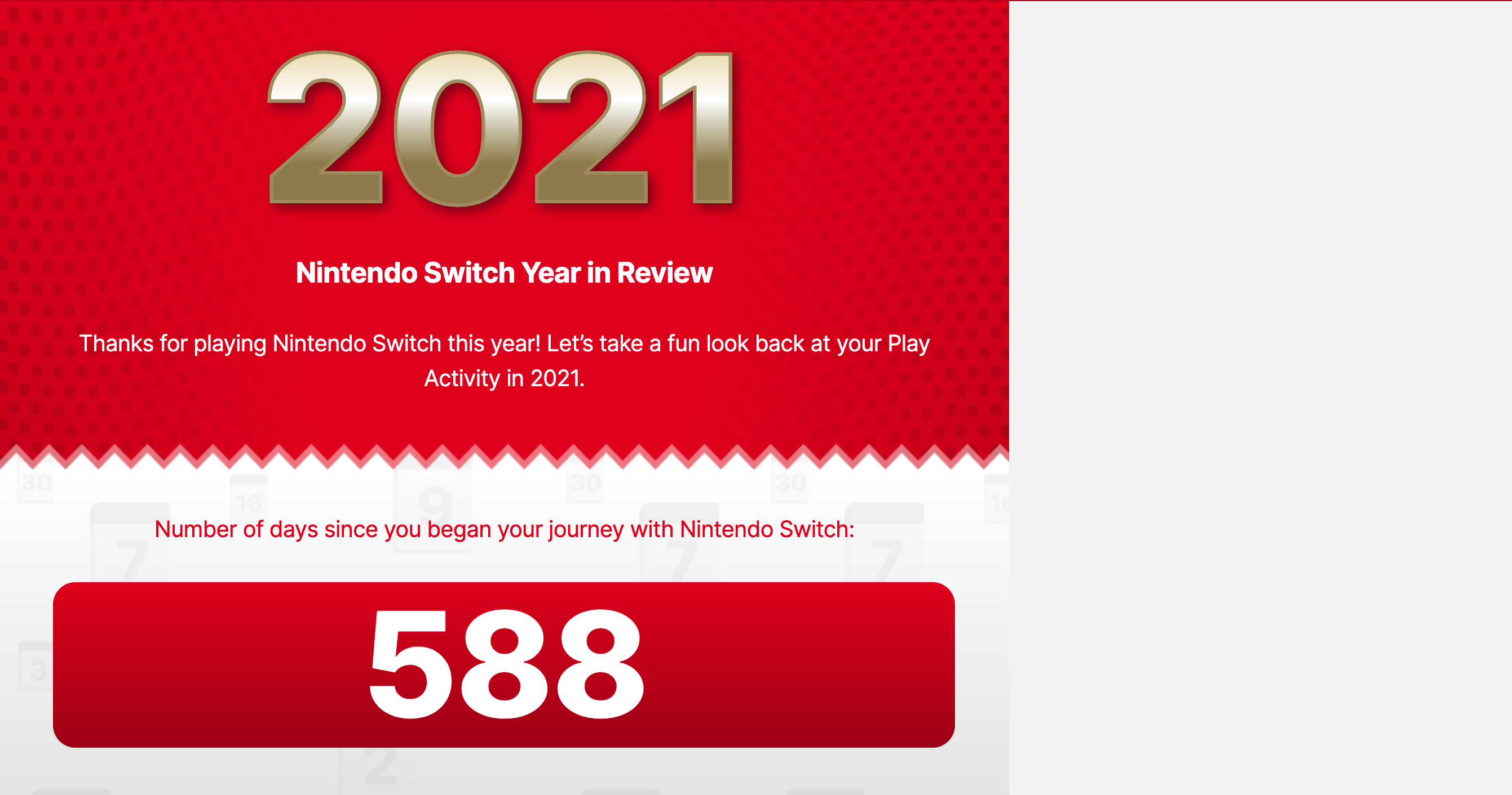
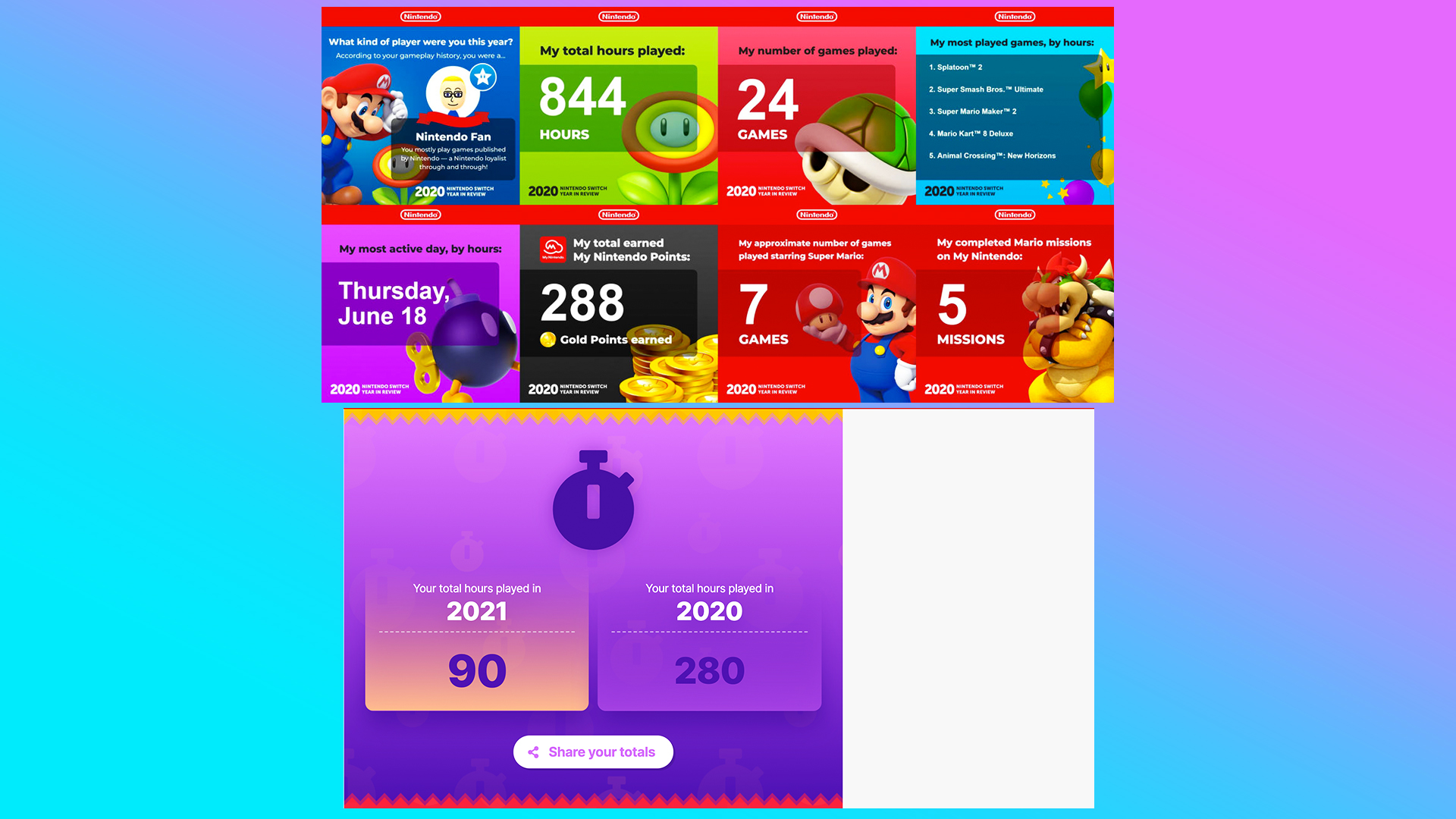
That's right, you can now catch up on all your shameless gaming habits from the past year. Nintendo's Year in Review will tell you stats like how long you've spent gaming, your favourite games and which months you were gaming most. It's a lovely insight into your Nintendo gaming experience, but the design for this year's review is a little underwhelming. If you haven't got your hands on a Switch yet, then why not check out our guide to where to buy a Switch online.

We think the graphics for Nintendo's Year in Review are a little bit boring, with an overload of blank space and a lack of familiar gaming characters or animations that would have brought the review to life. Perhaps Nintendo should've taken a leaf out of Spotify's book, because even though the Spotify Wrapped font was disastrous, overall the graphics are more engaging and look far cleaner than Nintendo's.
One user on Twitter also spotted the odd design and called it, "clunky". They also went on to say "It was kind of neat being more cinematic but I much prefer the style of previous years" – which we have to agree with. Last year Nintendo created a colour block-style Year in Review which was more exciting, featured a few familiar faces and certainly had a lot less blank space.

Alongside some personal stats for us gamers, Nintendo also released a short video that celebrates some of this year's best releases like Metroid Dread and Pokemon Diamond/Pearl. We would have liked to have seen stats from Nintendo as a whole about how many players it had globally, or what its most played game of the year was.
Despite the design, we still enjoyed having a look over our stats (even if it meant we could see that we spent nearly 4 days of the year on our Switch – yikes). You can check out your own Nintendo Year in Review on the Nintendo website. And if you haven't got your hands on a Switch yet, then check out our roundup of the best Nintendo Switch deals.
Read More:
Get the Creative Bloq Newsletter
Daily design news, reviews, how-tos and more, as picked by the editors.
- LG announces totally bizarre TV – and we’re not sure how to feel
- Stunning iOS 16 concept takes the iPhone to a whole new level
- This is the most beautiful vinyl player we’ve ever seen

Thank you for reading 5 articles this month* Join now for unlimited access
Enjoy your first month for just £1 / $1 / €1
*Read 5 free articles per month without a subscription

Join now for unlimited access
Try first month for just £1 / $1 / €1

Amelia previously worked as Creative Bloq’s Staff Writer. After completing a degree in Popular Music and a Master’s in Song Writing, Amelia began designing posters, logos, album covers and websites for musicians. She covered a range of topics on Creative Bloq, including posters, optical illusions, logos (she's a particular fan of logo Easter eggs), gaming and illustration. In her free time, she relishes in the likes of art (especially the Pre-Raphaelites), photography and literature. Amelia prides herself on her unorthodox creative methods, her Animal Crossing island and her extensive music library.
