The Super Bowl LVIII logo is its most original design in years
Sign up to Creative Bloq's daily newsletter, which brings you the latest news and inspiration from the worlds of art, design and technology.
You are now subscribed
Your newsletter sign-up was successful
Want to add more newsletters?
New logo reveals have become so over the top that it's almost inevitable that people will be disappointed. Just a couple of days after the Kansas City Chiefs won this year's Super Bowl in Arizona, the NFL has revealed the logo for next year's Super Bowl XVIII, with three men in suits struggling to unveil a ball of Brobdingnagian proportions that's been hidden under a sheet.
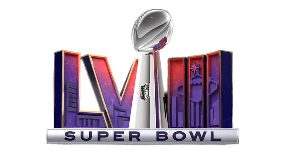
The reaction to the design for the game to be held in Las Vegas next February has been a collective sigh. Despite the fact that the Super Bowl XVIII logo is the NFL's most original effort in years – we'll unpack why below – fans still aren't impressed by the template format (NFL, if you're reading, see our guide to how to design a logo).
The countdown to #SBLVIII has officially begun. This larger-than-life #SuperBall will be making its way to Las Vegas as we start our journey to the biggest sporting event of the year. pic.twitter.com/7UP9q5BYBtFebruary 13, 2023
To understand the Super Bowl LVIII logo and the reaction to it we have to look back at Super Bowl logo controversies from the past few years. Until 2010, each year's game had a unique logo with references to the host city. That made them fun but also a bit tacky and chaotic, with no consistency in the branding.
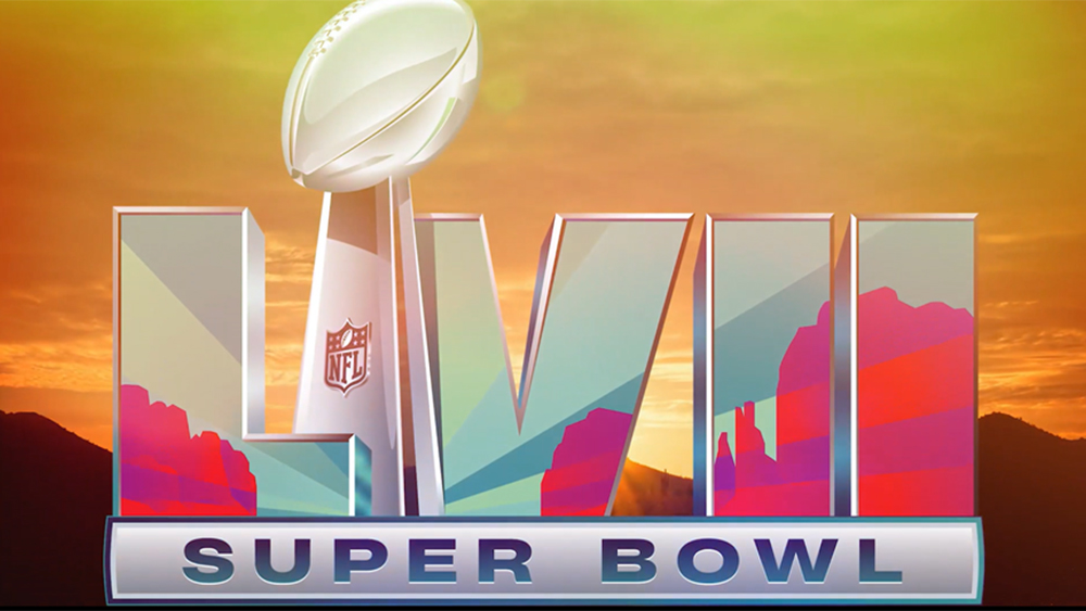
In a bid to reflect the Super Bowl's place as a international brand, from 2010, the NFL got serious and decided to impose some order. It basically started using the same template and same colours every year. The first of these logos with the Vince Lombardi Trophy Each featured each year's host stadium in the design, but that didn't prevent them from looking almost indistinguishable. If they succeeded in creating a brand, it was a boring one that made the biggest game in US sport feel like a corporate event. American football fans were impressed.


The last few years have seen the NFL apparently take this feedback on board – to a point. It brought back colour and host-city inspired designs to the logos for Super Bowl XVI and XVII, but the annual tweaks were still very subtle. For the game to be held at the Allegiant Stadium in Las Vegas on February 11, 2024, it's gone a little further. For a start, the design inside the Roman numerals actually looks like Vegas thanks to the outline of the city's famous sign.
The numerals themselves have also been rearranged. Their shape has been curved shape, which could reflect the architecture of the Bellagio casino or Wynn Las Vegas – maybe. The numerals have also been separated into two blocks on either side of the trophy, one assumes as a little Easter egg drawing attention to the LV, which could also stand for Las Vegas. Maybe.
Petition to bring back fun Super Bowl logos. You can spot the exact moment the NFL turned to the boring corporate logo 👎 pic.twitter.com/qGZWhFvN4NFebruary 9, 2022
But none of it seems enough for fans. While some have praised the design, others have are still insisting on a return to unique logos for each year. "What’s up with the plain looking dental medical buildings on the LV? Super low energy," one person tweeted. "The game is in LV and they couldn't do anything with that? They could've put the LVIII on the :as Vegas sign instead of putting a blank sign inside the logo."
Sign up to Creative Bloq's daily newsletter, which brings you the latest news and inspiration from the worlds of art, design and technology.
"They had a golden opportunity to do one of the best logos ever with the game being in Vegas and we get this," someone else complained. While other fans have put forward their own ideas for alternative Super Bowl LVIII logo designs
Man, I wish Super Bowl logos were creative again.Here's what I think Super Bowl LVIII's logo should look like next season if the NFL still used creative logos, based on the fabulous Las Vegas sign: https://t.co/2ugZeyVmQU pic.twitter.com/Jr6iBlcPfUJanuary 28, 2023
Sports fans have become design connoisseurs in recent years, and they're hard to please. The Super Bowl LVIII logo is like a compromise between maintaining a brand identity and putting some fun and creativity back into Super Bowl logos. But in the end it feels like while it's heading in the right direction, it still hasn't gone far enough to make fans happy. Think you can do better? If you need the software, see the best current prices for Adobe's Creative Cloud suite below.
Read more:

Joe is a regular freelance journalist and editor at Creative Bloq. He writes news, features and buying guides and keeps track of the best equipment and software for creatives, from video editing programs to monitors and accessories. A veteran news writer and photographer, he now works as a project manager at the London and Buenos Aires-based design, production and branding agency Hermana Creatives. There he manages a team of designers, photographers and video editors who specialise in producing visual content and design assets for the hospitality sector. He also dances Argentine tango.
