Grisly Super Bowl LVI logo design fail can never be unseen
Now that's a bloody logo.
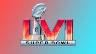
The Super Bowl is kind of a big deal, attracting millions (upon millions) of viewers each year. That means the games' logo is going to have plenty of eyes on it, so you'd expect the designers to want to get it absolutely right. But judging by the response to this year's design, you could say they've got it scarily wrong.
NBC's logo for this year's Super Bowl LVI was revealed all the way back in February last year, but is naturally appearing on more screens with the games taking place next month. And fans are beginning to notice that those bright red trees look rather a lot like, erm, dripping blood. Hardly best logos of all time material.

Indeed, with the tree trunks looking somewhat streaky, and the leaves somewhat, er, splattery, it's easy to see why, at a distance, fans are wondering whether they're looking at something out of CSI (or perhaps, if you're UK-based, Midsomer Murders). This one definitely falls under 'once you've seen it, you can't unsee it' – as far as we're concerned now, it's blood. And it seems countless Twitter users agree.
What’s up with the blood-drenched super Bowl logo this year? Freddy Krueger flips the coin? pic.twitter.com/HYRBXQPPDLJanuary 23, 2022
What's with the blood-drenched drive-by shooting Super bOwl logo? pic.twitter.com/6mSyCjXxFsJanuary 24, 2022
NBC’s Super Bowl logo of dripping blood (yes I know they’re trees) is not a good choice.January 23, 2022
Unfortunately, we have a feeling the bloody logo is here to stay. With the Super Bowl starting on 13 February, NBC only has a couple of weeks to completely redesign it. Unless, of course, it fancies simply choosing another colour for those trees (how about green? Green's a nice colour. A lot less 'Psycho shower scene').
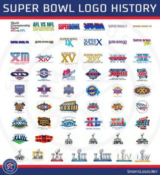
Still, at least this one's interesting, even if it is for the wrong reasons. Back when the 2021 logo leaked, fans lamented how it looked exactly like the logo before it (and the logo before that one (and the logo before that one))). As the infographic below shows, it looks like someone ran out of ideas right out 2017's Super Bowl LI. We suppose the accidental blood effect is giving us something to talk about.

Thankfully, we've seen plenty of brilliant designs from the world of sport over the last few years. Check out the best sports logos for a list of our favourites, and if you fancy creating your own, take a look at today's best Adobe Creative Cloud deals below.
Read more:
Get the Creative Bloq Newsletter
Daily design news, reviews, how-tos and more, as picked by the editors.

Thank you for reading 5 articles this month* Join now for unlimited access
Enjoy your first month for just £1 / $1 / €1
*Read 5 free articles per month without a subscription

Join now for unlimited access
Try first month for just £1 / $1 / €1

Daniel John is Design Editor at Creative Bloq. He reports on the worlds of design, branding and lifestyle tech, and has covered several industry events including Milan Design Week, OFFF Barcelona and Adobe Max in Los Angeles.
Related articles
-

-

-

-
