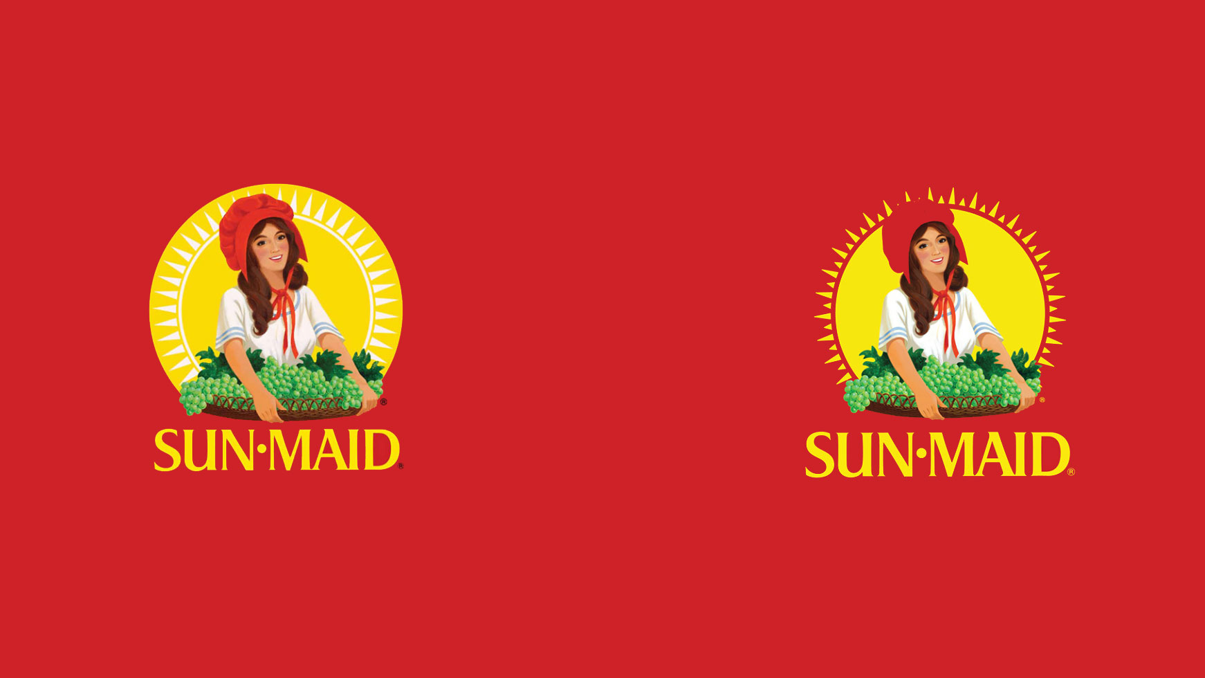
Sun-Maid, the raisin brand, has had a refresh. It's a brand tinged with nostalgia for many an adult who remembers it as a key lunchbox staple of their youth. So it's no wonder that this rebrand aimed to build on the well-known packaging and logo, tweaking it to modernise rather than completely overhauling the design.
The logo, in fact, has hardly changed at all (perhaps unsurprising given it's arguably as recognisable as some of the best logos of all time). But the packaging redesign is more noticeable, with the well-known but dated graphics streamlined and simplified to appeal to a millennial audience.
Click on the icon at the top-right to enlarge the images.
Latest Videos From Creative Bloq
What has design agency quench changed with the new logo? Well, Sun-Maid's mascot (who is called Lorraine, FYI) has been given a bit more 'space and depth' on the packages, with more prominence given to the sun rays surrounding the illustration. The way the sun now pushes out makes the image 'pop' (according to the press release). Plus, the rays have been switched from white to yellow, which simplifies the image and draws the eye in better than before.
The wordmark has been made a little bigger on the above flat image, but there are more changes on the packaging (below).
The previous red box design (left) next to the refreshed version (right) (Image credit: Sun Maid)
A hint of a drop shadow has been applied to the formerly flat wordmark when viewed on the packaging, to bring it in line with the rest of the lettering. This is an unusual shift in the era of totally flat design, and perhaps an unnecessary one when the rest of the graphics are so clean.
When looking at the raisin boxes side-by-side, there's also more depth of colour, with the grapes and sun appearing more vibrant than before, and a supercharged, but still signature, red.
Get the Creative Bloq Newsletter
Daily design news, reviews, how-tos and more, as picked by the editors.
The brand's credentials are also now front and centre with new tag lines 'timeless & trusted' and 'since 1912': a statement of heritage amidst modernisation.
The old mango packaging (left), next to the new (right) (Image credit: Sun-Maid)
The packaging design has generally been simplified, with elements that were previously muddled together now spaced out. The angled banners, which were slightly confusing for the eye before, are gone, with modern, flat typeface labelling the product next to an updated image. Talking of typeface, we have to note the inclusion of a new, rounded typeface that feels a little off when paired with the Sun-Maid wordmark type and logo (perhaps Sun-Maid should check out these examples of perfect font pairings).
The shadowed sun ray pattern across the packet is also no more, leaving a flat red background in its place. See below for the entire range to compare with the best packaging design out there.
The entire new range of Sun-Maid products (Image credit: Sun Maid)
Updating a brand steeped in heritage can provoke different redesign responses, as shown by the Reebok rebrand last year, and the public's response to a logo refresh can be brutal as the LA Rams found out in March... and again this week. So though Sun-Maid's approach has been cautious, we think it is a winner that keeps well-known elements, whilst removing the clutter.
Georgia is lucky enough to be Creative Bloq's Editor. She has been working for Creative Bloq since 2018, starting out as a freelancer writing about all things branding, design, art, tech and creativity – as well as sniffing out genuinely good deals on creative technology. Since becoming Editor, she has been managing the site and its long term strategy, helping to shape the diverse content streams CB is known for and leading the team in their own creativity.