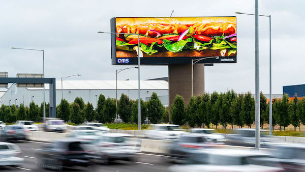
Subway drops its logo in bold new billboard
Sandwich brand imitates the likes of McDonald's, but can it get away with it?

What do Nike, Apple and Starbucks have in common? They all removed the text from their logos in recent times, with McDonald's going one step further with its recent advertising campaigns by removing words, logo, pictures and its brandname across various designs. And Subway has now decided to follow in its foot(long) steps by removing all trace of branding for a new billboard campaign in Australia. See it above.
Featuring only a close-up picture of the 'iconic' sandwich, the campaign exudes confidence that consumers will recognise the Subway brand without any signposting beyond the actual product itself. Bold, indeed, but is it a risky move? (Check out our roundup of billboard adverts for more advertising on a giant scale.)

Now, we know this strategy has been successful for McDonald's in particular (see above) – so it's no wonder Subway wanted to pull off the same. But we're not sure Subway has done enough to make the billboard recognisable. Even McDonald's, an arguably more iconic brand, played with typography, colour palette and parts of its logo to project the essence of the brand through well-known elements. Missed this? Remind yourself with this lockdown delivery campaign, and these type-only ads.
Subway's campaign, handled by Publicis Worldwide, has none of those signposts. And though Subway Australia and New Zealand's marketing director said that 97 per cent of all consumers can identify Subway’s famous Footlong (if you say so, Subway), this billboard doesn't even show the whole sandwich. Without the entire Footlong, it's in danger of being just the inside of a sandwich, albeit a delicious one.

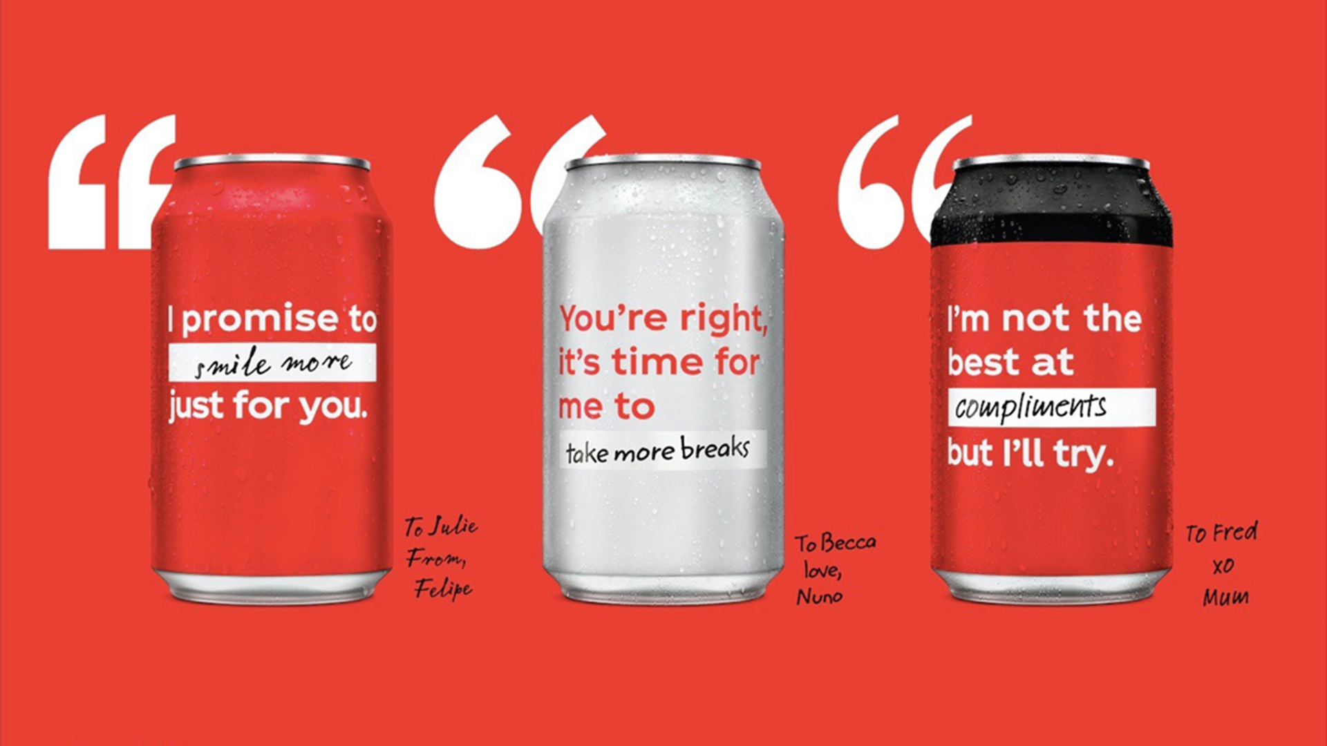
Coca-Cola was another brand who recently ditched its branding (see it above). But with the iconic red colour, and the actual can to fall back on, it was safe to assume that the brand remained recognisable to the vast proportion of consumers.
The overall question has to be: do you think Subway has the clout to rely on a zoomed-in image of its sandwich? We can't really speak for the entire Australian market, and maybe we're just not big on sandwiches, but we're not convinced. We look forward to being proven wrong.
For brands who can carry off a textless logo, check out our roundup of the best textless logos.
Get the Creative Bloq Newsletter
Daily design news, reviews, how-tos and more, as picked by the editors.
Read more:

Thank you for reading 5 articles this month* Join now for unlimited access
Enjoy your first month for just £1 / $1 / €1
*Read 5 free articles per month without a subscription

Join now for unlimited access
Try first month for just £1 / $1 / €1

Georgia has worked on Creative Bloq since 2018, and has been the site's Editor since 2022. With a specialism in branding and design, Georgia is also Programme Director of CB's award scheme – the Brand Impact Awards. As well as immersing herself with the industry through attending events like Adobe Max and the D&AD Awards and steering the site's content streams, Georgia has an eye on new commercial opportunities and ensuring they reflect the needs and interests of creatives.
