I hope I'm wrong about the new Substack design
Please don't turn into Twitter.

Substack has been doing a pretty good job of differentiating itself from the Facebooks and Xs (exes?) of this world. Instead of being plagued by algorithms and ads pushing content that users never asked to see, the newsletter platform is designed to foster meaningful connections between writers and readers through its subscription model. Which is why the newly redesigned app has me slightly worried.
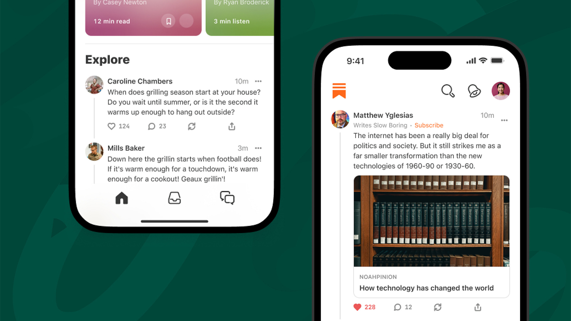
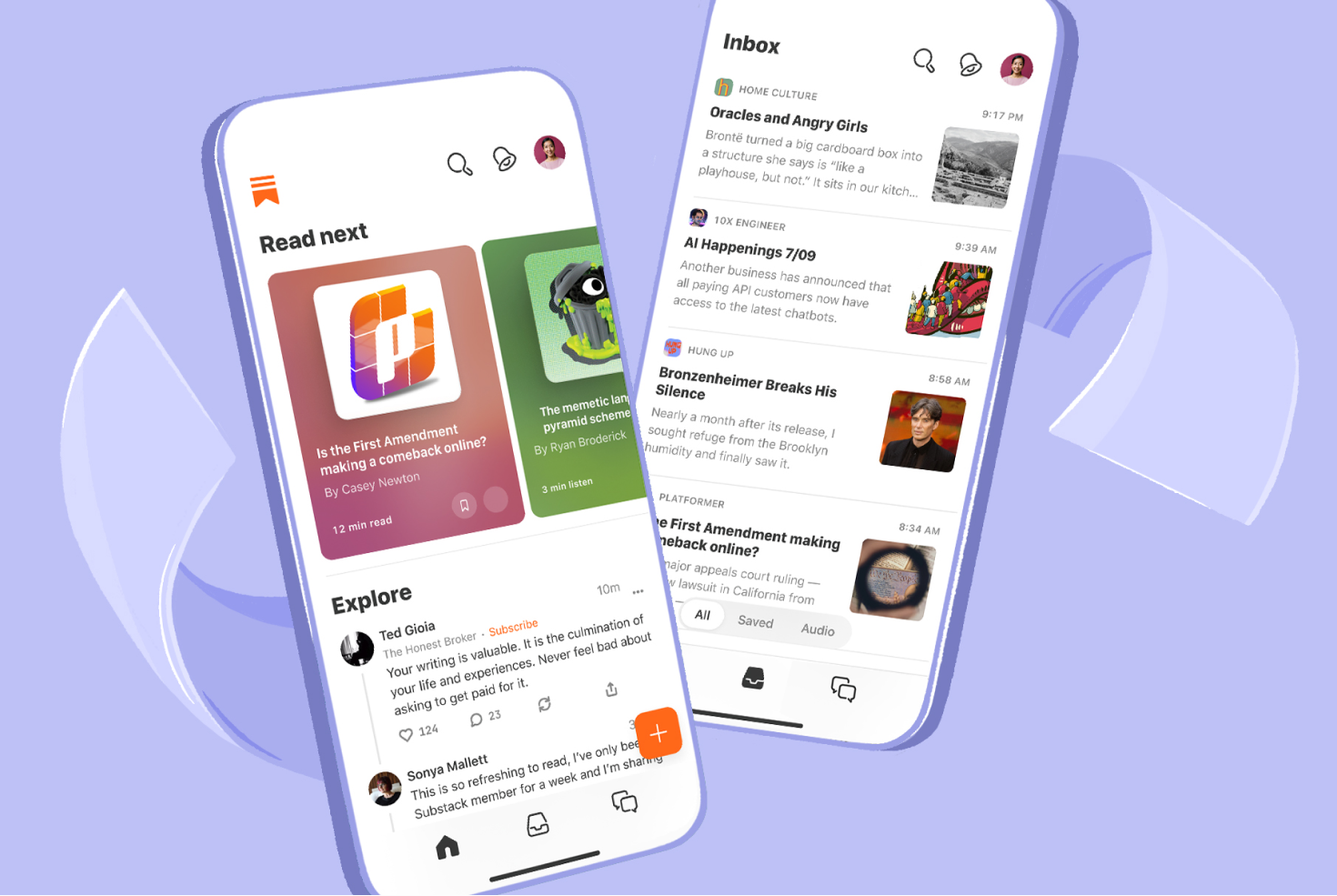
Preceded by a (somewhat woolly) blog post explaining the rationale, the redesign, which launched today, seems a lot more akin to the social media apps we know and (don't necessarily) love. For the full lowdown on the platform, check out our Substack review.

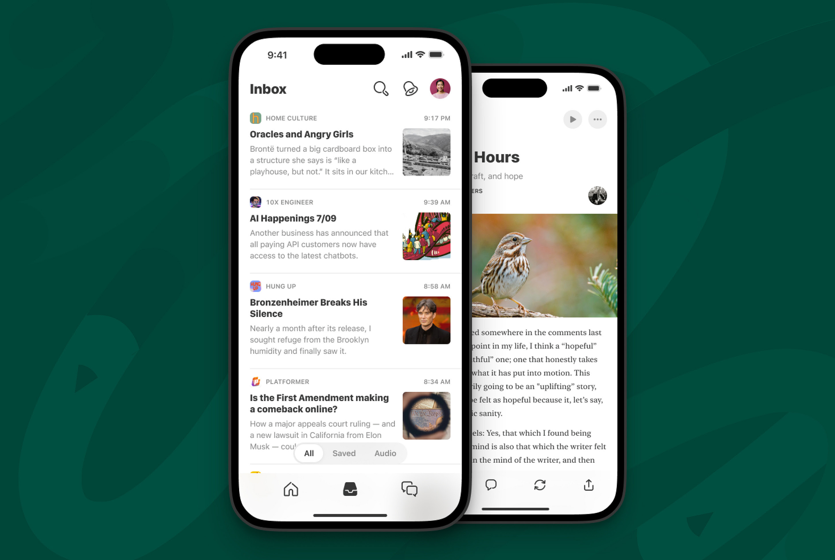
At the centre of the redesigned app is a new "Home experience", featuring a series of cards suggesting Substack posts to read in a much more visual – and curated – manner than the previous list format (which is still available via the Inbox tab). In a Substack post, the company explains how it "designed this queue to boost retention for writers by prioritising new posts from paid subscriptions, things the reader has saved, and the publications they always read. No matter how many subscriptions a reader has, we want them never to miss what they value most. This is in keeping with the core principle that subscriptions will always be the foundation of the Substack experience."

Something that "prioritises" content for us sounds a lot like an algorithm. Substack prepared us for this yesterday, via another blog post that declared, "We are not against algorithms. We’ll enthusiastically use algorithms, or AI, or any other technology we can get our hands on, as long as we can use them to serve the human ends that we care about." And the app's Notes feature has been promoting 'recommended' content for a few months now.
The design of the new app certainly feels like a step forward. It's cleaner and more visually striking – and if it's designed to make me spend more time on Substack, I have a feeling it's going to work. I just hope that time is spent seeing things I have chosen to see – and it seems I'm not alone in worrying that a pivot towards 'curated' experiences could shift things towards the attention economy. "Algorithms of any kind, even with the best of intentions, ruin discovery and serendipity. I can trust my own discoverability/curation/interests," one Substack user comments on the new announcement.
Perhaps part of my concern stems from the fact that while Substack feels different to other social media platforms, it has begun to implement design touches that feel a little Twitter or Instagram. Most notable is the addition of a check mark next to newsletters with a high quantity of subscribers, adding a sense of social currency that feels very, well, social media.
So while the design of the new Substack app is certainly a winner, it's what it could represent that worries me – that is, a shift further towards a social media-esque world of influencers (in this case literary ones) and a cacophony of content vying for my attention. But there's every chance Substack could prove my concerns to be unfounded. It might be that the new app and "algorithm for quality" (as Substack puts it) helps the platform flourish as an aspirational place. Anyway, now that I have your attention, check out my Substack page.
Get the Creative Bloq Newsletter
Daily design news, reviews, how-tos and more, as picked by the editors.

Thank you for reading 5 articles this month* Join now for unlimited access
Enjoy your first month for just £1 / $1 / €1
*Read 5 free articles per month without a subscription

Join now for unlimited access
Try first month for just £1 / $1 / €1

Daniel John is Design Editor at Creative Bloq. He reports on the worlds of design, branding and lifestyle tech, and has covered several industry events including Milan Design Week, OFFF Barcelona and Adobe Max in Los Angeles.
