Studio creates minimalist Stranger Things animation
The stunning passion project was created in between client projects.
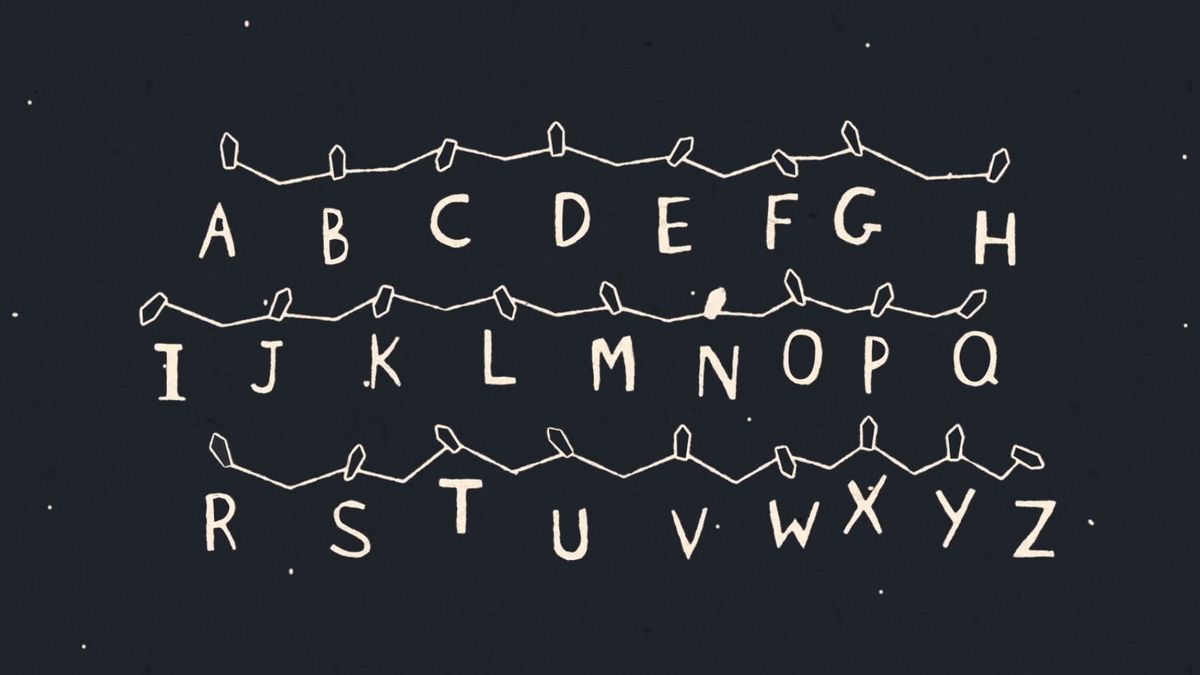
As creative side projects go, this new Saul Bass-inspired minimalist animation for Stranger Things is one of our favourites.
Unless you've been living in an internet black spot for the past few months, it can't have escaped your attention that the phenomenally popular Netflix show Stranger Things is back. Chances are you've even binged on series two already. We haven't had time yet – there's a lot of quality content out there to ingest, okay? – so please don't bombard us with spoilers.
As well as impressing genre fans, the look and feel of the science fiction horror series has been a huge source of inspiration and nostalgia for designers. We've already seen the show's characters turned into a brilliant Peanuts-style animation mashup and the show given an 8-bit videogame makeover, but the latest passion project to emerge from Stranger Things comes courtesy of design studio Creative Mammals.
Created by a team of three people, this short minimalist video rattles through key scenes from the first series such as the boys cycling through the woods, letters being spelled out with Christmas lights, and everyone's favourite outsider, Barb, dipping her toes into the swimming pool.
The animation style has a beautiful handmade look to it, and we really love how it makes clever use of negative space to create some truly interesting transitions and compositions. Check it out for yourself below.
What makes the animation even more impressive is that the team at Creative Mammals made it purely because it loves the show so much. The passion project was whipped up over the course of three weeks in between work from clients.
Over on Reddit the team at Creative Mammals has been talking about the creative process to give users an insight into how it turned it around so fast.
Get the Creative Bloq Newsletter
Daily design news, reviews, how-tos and more, as picked by the editors.
"We did it in the same pipeline we'd so anything for any major network. Ideation (which was me and a co worker talking at lunch.) I went ahead and did some research into the top moments of Stranger Things, listed them down, and made boards with them.
"After that I handed the boards off to my creative director who would tackle it when he had free time. He is pretty fast, so his spurts would do a far chunk, plus we did this style because it's "hard but quick."
"After he did all of the keys, I had a intern who just finished a project and we really wanted him to have some cool stuff on his demo reel so we asked if he could do the smoothing out, which he did."
Most of the animation was done in After Effects and Cinema 4D, with everything given a black and white treatment and an eerie grainy effect.
Related articles:

Thank you for reading 5 articles this month* Join now for unlimited access
Enjoy your first month for just £1 / $1 / €1
*Read 5 free articles per month without a subscription

Join now for unlimited access
Try first month for just £1 / $1 / €1
Dom Carter is a freelance writer who specialises in art and design. Formerly a staff writer for Creative Bloq, his work has also appeared on Creative Boom and in the pages of ImagineFX, Computer Arts, 3D World, and .net. He has been a D&AD New Blood judge, and has a particular interest in picture books.
