The Street Fighter 6 logo is seriously underwhelming
Fans aren't impressed.
With its bold characters and extravagant moves, Street Fighter was one of the first competitive two-player games, and is an iconic title for many gamers. Now fans are getting excited about the release of the sixth game in the series, but if it's anything like its new logo, we may be disappointed.
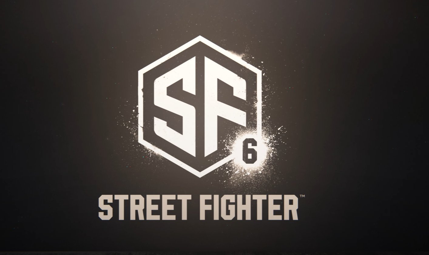
Capcom Company has released the brand new logo (see below) for Street Fighter 6, and it's safe to say, it's pretty underwhelming. The minimalistic design, featuring a very simple 'S' and 'F' in a hexagon, is very different to the previous logos, and fans aren't loving the new look. It sounds as though Capcom should have followed our 15 golden rules of logo design.

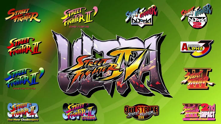
All the other previous Street Fighter logos (see below) were arguably a bit of an eyesore with their gradients and striking fonts, but they were also part of the novelty of the game. The new logos looks very dull in comparison, and if 'Street Fighter' wasn't actually written on it, it'd be hard to guess it's part of the franchise at all.
However, one user on Twitter has pointed out that the typeface and colour scheme featured on the new design is similar to the UFC (Ultimate Fighting Championship) logo. And while it doesn't necessarily reflect the previous games, we can appreciate that the designers have taken inspiration from the actual sport. Perhaps the real-world inspo reflects the game's new hyper-realistic graphics that have been teased in the trailer for the game.

It seems as though fans are just as perplexed as us by the minimalistic design, and many have taken to Twitter to comment on the logo. One user said, "This is a terrible and lazy looking logo," and another called it, "weird indeed". Fans have compared the design to the likes of the Scooby-Doo logo, an NFT and the ESports logo – and we can see what they mean.
Damn the Street Fighter 6 Logo Go Hard 💀 pic.twitter.com/pif8h5uFGGFebruary 21, 2022
Low-key thought capcom just release some StreetFighter N F T drop or something fuck....come on, the original logo was what it is.... pic.twitter.com/XzULCmfP9kFebruary 21, 2022
Not really love the logo (it seems an app with 6 notifications 😅) but the hype has just started #StreetFighter6 #capcom #StreetFighter pic.twitter.com/bJS8I9lkfmFebruary 21, 2022
We'll have to wait and see whether the game is better than the logo, but for now why not catch up on the previous Street Fighters? Check out our roundup of the best games consoles available and get playing. Or if you'd rather sink your teeth into some more designs, then you'll love our roundup of the best logos of all time.
Read More:
Get the Creative Bloq Newsletter
Daily design news, reviews, how-tos and more, as picked by the editors.
- Ingenious road safety poster is a hit online
- Hilarious Halo Easter Egg discovered after 21 years
- The new Australia Made logo has a hidden meaning

Thank you for reading 5 articles this month* Join now for unlimited access
Enjoy your first month for just £1 / $1 / €1
*Read 5 free articles per month without a subscription

Join now for unlimited access
Try first month for just £1 / $1 / €1

Amelia previously worked as Creative Bloq’s Staff Writer. After completing a degree in Popular Music and a Master’s in Song Writing, Amelia began designing posters, logos, album covers and websites for musicians. She covered a range of topics on Creative Bloq, including posters, optical illusions, logos (she's a particular fan of logo Easter eggs), gaming and illustration. In her free time, she relishes in the likes of art (especially the Pre-Raphaelites), photography and literature. Amelia prides herself on her unorthodox creative methods, her Animal Crossing island and her extensive music library.
