Capcom's Street Fighter 6 logo woes just got even worse
Have we seen the design somewhere before?
Yesterday we brought you the news that the Street Fighter 6 logo is being poorly received by gamers and designers alike – and things are going from bad to worse for the controversial design. Now, the creator of a stock image is attempting to sell their design to Capcom, thanks to its uncanny similarity to the new logo.
Capcom's design features the initials 'SF' inside a hexagon, with the edges of the letters following the shape of the border. The $80 Adobe Stock image features, well, the same – and Twitter users are already hypothesising that Capcom simply typed 'SF' into a stock logo site. (Couldn't they have simply read our how to design a logo guide?)
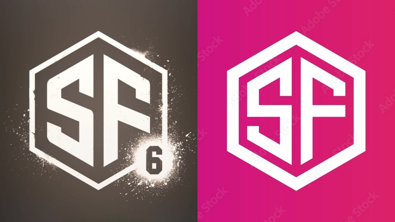
The new Street Fighter 6 logo is $80 on Adobe's Stock siteI don't even know what to say. I knew it was generic but I didn't realize it was this bad. They searched for "SF" on a stock logo site and rounded a couple corners and added the 6I cannothttps://t.co/SViXFjElou pic.twitter.com/yOzYePaYfVFebruary 21, 2022
Indeed, aside from the rounding of a few edges, the designs are practically the same. Oh, and Capcom has also slapped a '6' in a circle in the bottom corner of the logo, either to denote that it's the 6th Street Fighter entry, or the logo has 6 unread emails – we're not sure.
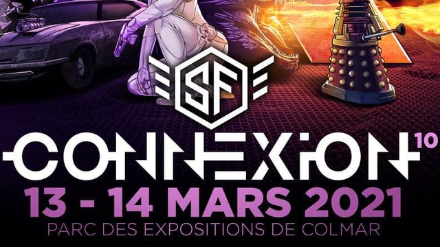
The Adobe Stock image was created by a user called xcoolee, who told IGN they're "looking to sell exclusive rights for the image to Capcom, removing it from sale to other parties." As some Twitter users have spotted, the same design was used for sci-fi convention in France just last year (below).
Hilariously, the hexagon design is available on Adobe Stock with several different initials (below). As Ars Technica's Aurich Lawson suggests, these could be great for anybody looking to launch their own franchise, such as "Street Guardians, Street Puncherz, Street Crash, Street Heist, Street Smashers, or Street Assault."
Now, we don't have anything against stock images – they exist for a reason, and many a designer will have found many a stock image site extremely useful over the years. But if it did borrow the design, couldn't Capcom have made it a tiny bit more, erm, different?

Even before the stock image came to light, the new logo was hardly a triumph. Compared with the zingy designs of yore, this one looks positively corporate – and hardly brings to mind images of characters in flamboyant costumes fighting in the street. Let's just say, it won't be hitting our best logos roundup any time soon.
Get the Creative Bloq Newsletter
Daily design news, reviews, how-tos and more, as picked by the editors.
Read more:

Thank you for reading 5 articles this month* Join now for unlimited access
Enjoy your first month for just £1 / $1 / €1
*Read 5 free articles per month without a subscription

Join now for unlimited access
Try first month for just £1 / $1 / €1

Daniel John is Design Editor at Creative Bloq. He reports on the worlds of design, branding and lifestyle tech, and has covered several industry events including Milan Design Week, OFFF Barcelona and Adobe Max in Los Angeles. He has interviewed leaders and designers at brands including Apple, Microsoft and Adobe. Daniel's debut book of short stories and poems was published in 2018, and his comedy newsletter is a Substack Bestseller.
