Starbucks' style guide reveals subtle brand refresh
Explore the chain’s "family of greens" with this branding bible.

Even if you've never set foot in a Starbucks and had your name misspelled by its baristas, chances are you can picture the coffee chain in your head. That's because it's got one of the strongest brand identities on the high street. And just like other big companies in our design style guide roundup, Starbucks has shared how its brand works, and how it's evolving.
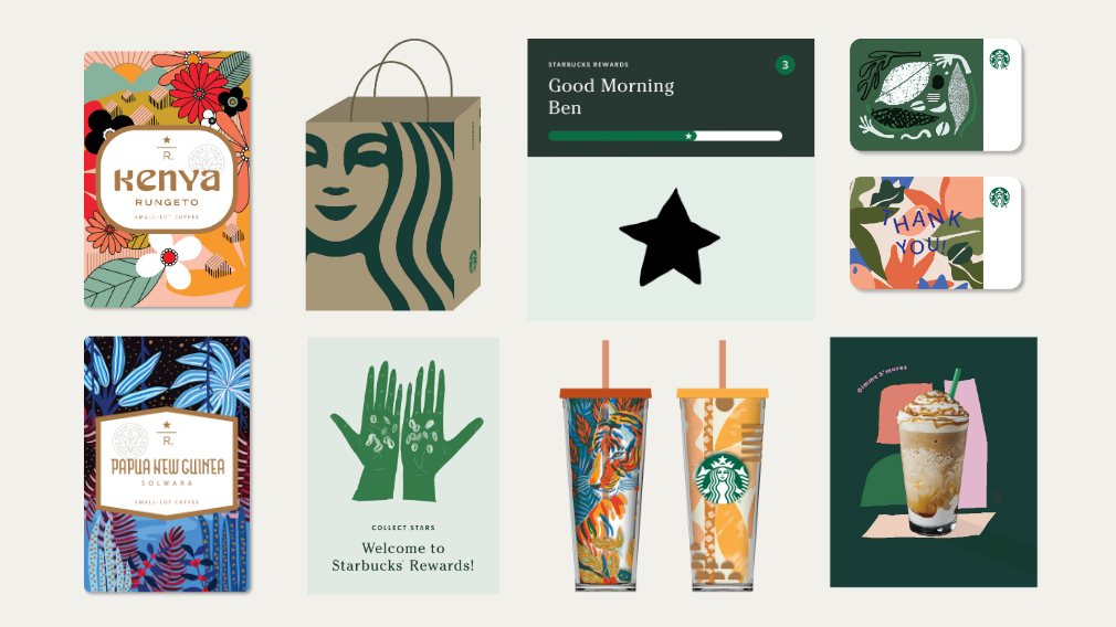
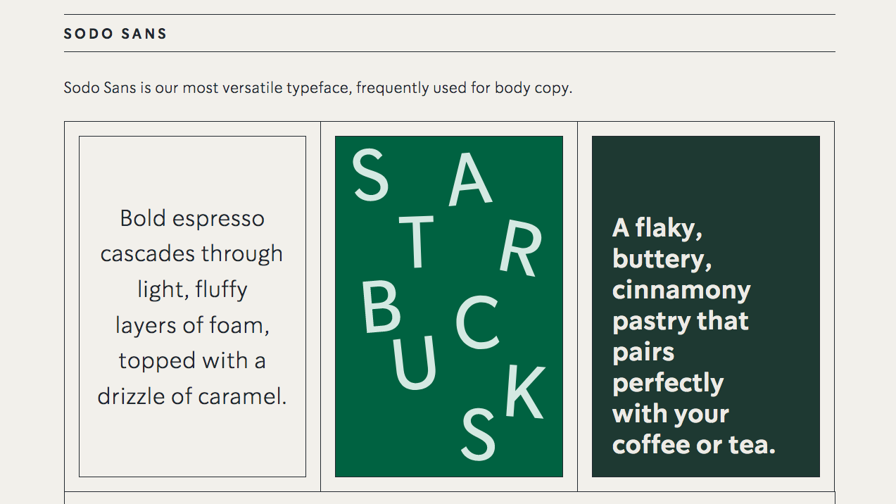
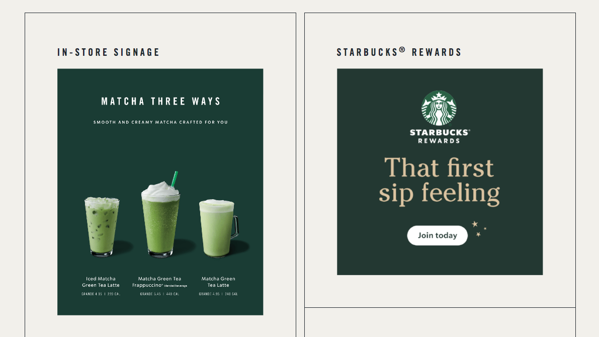
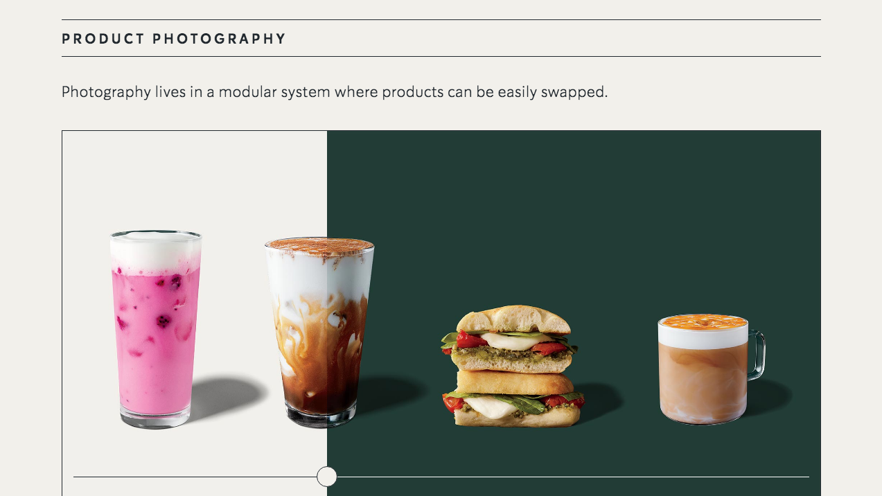
Covering all aspects of its visual identity, such as its distinctive colour scheme, typography, and illustrations, the Starbucks Creative Expression microsite describes itself as an "overview of how the Starbucks brand comes to life".
This includes a look at how Starbucks' famous Siren logo has changed over the years, the thought process behind its tone of voice, and how it links content back to its heritage. If you're a designer who wants to learn how to make a style guide, this is a great example to learn from.
As well as covering how the brand has evolved, it also looks at how Starbucks has introduced a "fresh design system". Check out what to expect by clicking through the gallery of images below.


"As we evolve to meet beautifully diverse customers all over the world, our brand has evolved too," the site explains. "Here we introduce a fresh new design system that maintains the core elements of our brand while keeping our customers’ experience central to creative expression.
"To achieve this, we’re thoughtfully incorporating beautiful, expressive moments with calm confidence in ways that are optimistic, joyful and recognisably Starbucks," it adds.
How does this fresh new design system manifest itself, we hear you ask? The microsite explains that Starbucks is moving away from hand lettering, and that it wants to remove obstacles that get in the way of what people want from the chain. It also reveals that Starbucks is "leaning into a family of greens to leverage brand recognition".
Get the Creative Bloq Newsletter
Daily design news, reviews, how-tos and more, as picked by the editors.
This all sounds well and good, but when you stop and think about it you realise that this borders on substance-less corporate waffle. Also, some of the microsite's functionality is a little janky. Hovering over the side bar brings up images that get in the way of what you're already reading, and sometimes subsections are a little slow to load.
These are minor quibbles though. This is a generous look into how the Starbucks brand works, and we hope it gets updated as more details about the coffee chain's new creative expressions roll out.
Related articles:

Thank you for reading 5 articles this month* Join now for unlimited access
Enjoy your first month for just £1 / $1 / €1
*Read 5 free articles per month without a subscription

Join now for unlimited access
Try first month for just £1 / $1 / €1

Dom Carter is a freelance writer who specialises in art and design. Formerly a staff writer for Creative Bloq, his work has also appeared on Creative Boom and in the pages of ImagineFX, Computer Arts, 3D World, and .net. He has been a D&AD New Blood judge, and has a particular interest in picture books.
