The Starbucks logo secret you probably never noticed
The siren isn't as perfect as she seems.
However you feel about Starbucks' coffee (it's a divisive issue, we know), there's no denying the brand's logo is one of the most iconic in design. Complete with fascinating backstory (we'll go into that later) and previous iterations more, erm, graphic in nature, the caffeinated siren is instantly recognisable world over. But have you ever noticed the on-purpose-mistake designers put in there to make the siren even more special?
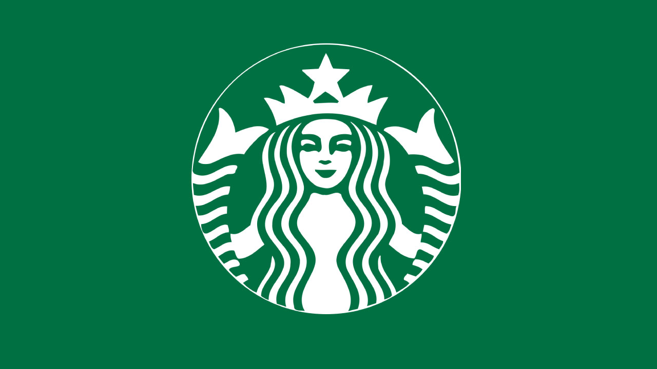
The small detail can be found at the upper-right side of the character's nose. In case you haven't seen it yet, we'll give you a second alone with the design to see if you can work it out. (When you notice it, you'll realise why this design is considered one of the best logos ever.)

See it yet? The logo designers decided to place an extended shadow falling from the eye, to the right-hand side of the nose – offsetting the symmetrical nature of the rest of the character design. But why? And has it always been there?
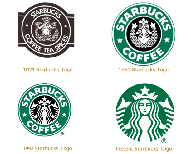
Well, no. Actually, the unsymmetrical shadow was only added in 2011, when Starbucks decided to make the siren more human and approachable. Whereas the previous iteration (from 1992 onwards, find it below) was completely symmetrical, the added imperfection makes her more intriguing and less 'perfect'.

But this isn't as wild as the Starbucks siren has been in the past (hard to believe we know – she's really let herself go). The original logo, designed in 1971 (see it above), tells a very different tale of the character. Based on a twin-tailed Nordic siren from the sixteenth century, the original design saw her bare-breasted and full of imperfections and asymmetry. She is wild and free in this version, sitting slightly off centre and turned to the right, with none of the cleanly-cut graphic austerity to be found.
If the shadow was added onto the original design, it would be hard to spot but when placed carefully on the present iteration, it is a small detail that makes all the difference. And at least the discrepancy was was put there on purpose, unlike the Paramount logo mistake that has got the internet talking. Ouch.
Just starting out and want to make a logo quickly? Or maybe you would like to try out a logo designer for fun, or to see how the automation process works. Either way, see our best logo designer post, and the deals below.
Get the Creative Bloq Newsletter
Daily design news, reviews, how-tos and more, as picked by the editors.
Read more:
- Logo design: All you need to know
- Where to find logo design inspiration
- Ridiculous tutorial reveals the 4 steps to logo design

Thank you for reading 5 articles this month* Join now for unlimited access
Enjoy your first month for just £1 / $1 / €1
*Read 5 free articles per month without a subscription

Join now for unlimited access
Try first month for just £1 / $1 / €1

Georgia is lucky enough to be Creative Bloq's Editor. She has been working for Creative Bloq since 2018, starting out as a freelancer writing about all things branding, design, art, tech and creativity – as well as sniffing out genuinely good deals on creative technology. Since becoming Editor, she has been managing the site and its long term strategy, helping to shape the diverse content streams CB is known for and leading the team in their own creativity.
