The Starbucks logo flaw you've probably never noticed
There's a little more than meets the eye.

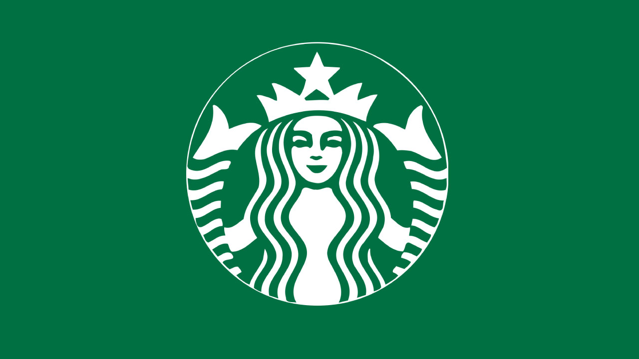
The Starbucks siren is undeniably one of the most iconic logos of the 21st century. Last year we discovered that our favourite coffee house has been hiding a sneaky secret right under our noses since 2011. And we're still amazed by it today.
If you haven't spotted it yet, look to the right of the siren's nose and you'll see the shadow of the eye is longer than it is on the left. The detail is tiny, we know, but once you've spotted it, it's a detail you'll never be able to unsee. We had no idea this was part of the otherwise symmetrical Starbucks logo, but it's just one of the iconic design's features that we think makes it one of the best logos ever.

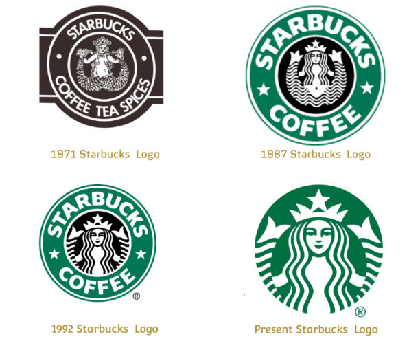
We know what you're thinking, why has Starbucks deliberately made its logo asymmetrical? Back in 2011, the coffee chain giant decided that it needed to make the siren more human and approachable. Every logo between 1992 and 2011 was totally symmetrical but the newest imperfect design makes the design all the more intriguing.

It's far from more outlandish Starbucks logo released in the 70s, but the newest logo with its asymmetry definitely is an ode to that wily and imperfect siren in the first design. We like both the logos, new and old, but appreciate that Starbucks has tried to capture more of that likeable character from the 70s logo in its newest design – even if it did take us a decade to notice it.
It's not easy to make a great logo, and as this Starbucks shows, it's the tiniest detail that can make such a big difference. If you're designing your own logo and need some pointers to make sure it's the best it can be, then check out our 15 golden rules of logo design. Or if you need a helping hand getting started with a logo, then make sure you have a look at our roundup of the best free logo makers.
Read more:
- Are these the 10 commandments of logo design?
- New iPhone 14 price rumour hints at exciting new features
- 12 design trends to watch in 2022
Get the Creative Bloq Newsletter
Daily design news, reviews, how-tos and more, as picked by the editors.

Thank you for reading 5 articles this month* Join now for unlimited access
Enjoy your first month for just £1 / $1 / €1
*Read 5 free articles per month without a subscription

Join now for unlimited access
Try first month for just £1 / $1 / €1

Amelia previously worked as Creative Bloq’s Staff Writer. After completing a degree in Popular Music and a Master’s in Song Writing, Amelia began designing posters, logos, album covers and websites for musicians. She covered a range of topics on Creative Bloq, including posters, optical illusions, logos (she's a particular fan of logo Easter eggs), gaming and illustration. In her free time, she relishes in the likes of art (especially the Pre-Raphaelites), photography and literature. Amelia prides herself on her unorthodox creative methods, her Animal Crossing island and her extensive music library.
