The Star Wars design tricks we're all still using
This is the infographic you're looking for this May 4th.

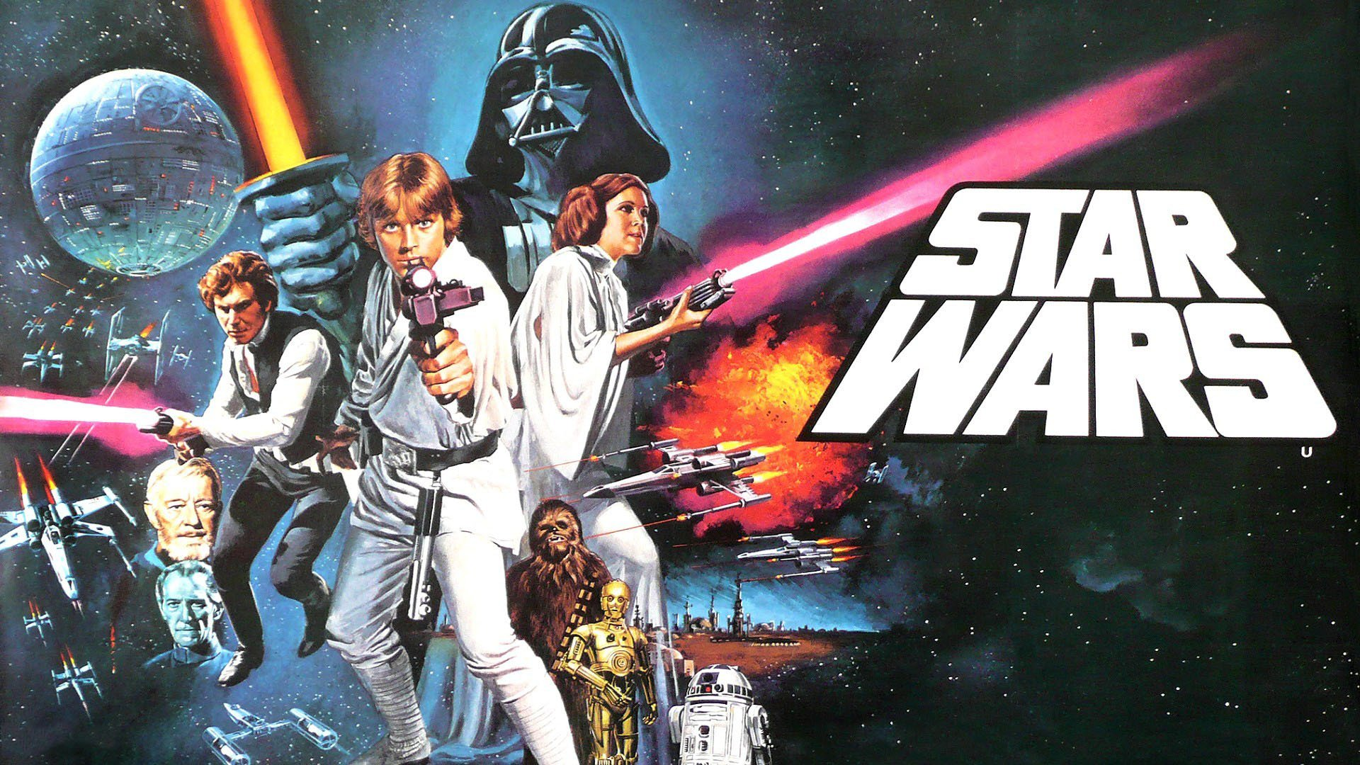
We've seen plenty of brilliant infographic designs in our time here at Creative Bloq. Infographics are a colourful and fun way to convey information in an engaging and visual way. And seeing as today is Star Wars day (you know, May the Fourth...?), we thought we'd treat you to a galactic-themed design infographic to help you through the day.
The Star Wars infographic (see below) covers the design elements of the first three Star Wars movies. It's jam-packed full of info about the movies and gives tips on how to recreate a similar look, meaning it's perfect for any aspiring cinematographer or Star Wars fan who wants a deeper insight into the movies and into design too. If you're feeling inspired by this infographic and want to have a go at making your own, then why not check out our roundup of the best infographic makers?

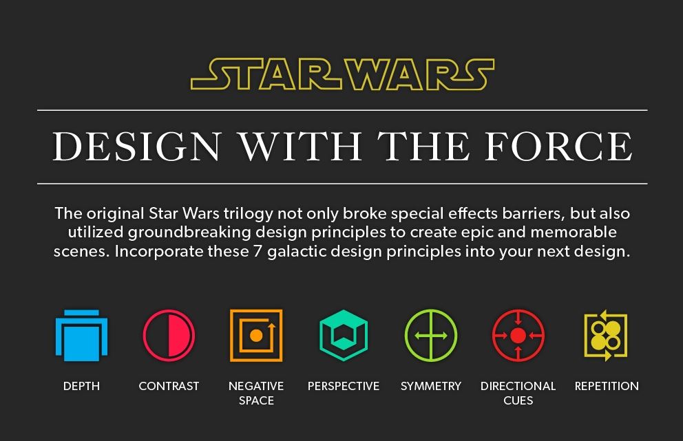
The infographic was created by Steven Shearer for Venngage, who has narrowed the design principles of the original Star Wars movies down to seven different elements. According to Venngage, depth, contrast, negative, perspective, symmetry, directional cues and repetition all make up that classic Star Wars look.
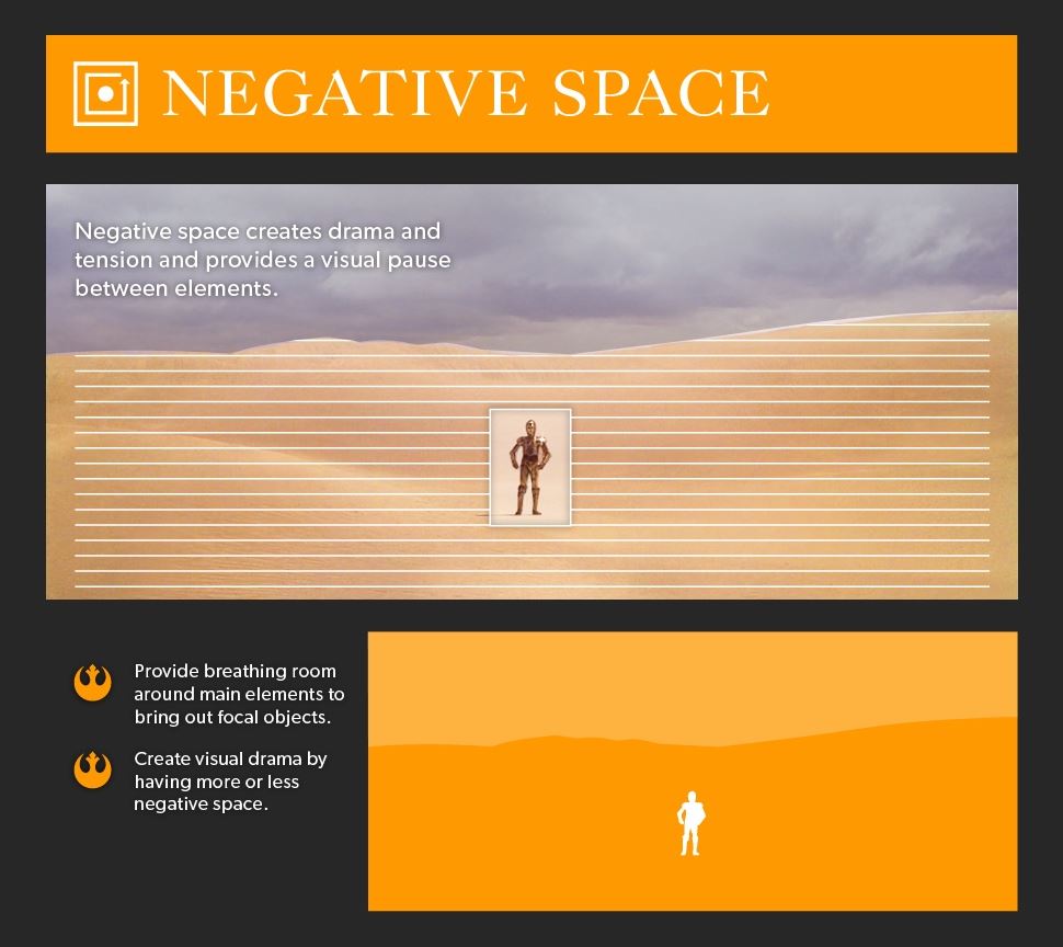
The infographic gives a surprising insight into some of the techniques used to make the movies and describes the effect each element has on a viewer. Each principle is broken down with a graphic of the shot composition, as well as pointers on how to recreate the look – and it's fascinating to see that many of the insights are techniques applied by designers everywhere, not only in the Star Wars galaxy.

If you're feeling inspired by all this Star Wars talk and fancy digging your teeth into all things galaxy-themed, then make sure you check out our roundup of the best Lego Star Wars deals. Or if you'd rather just indulge in the movies, then why not sign up to Disney Plus, where you can watch all the movies and, very soon, the new Obi-Wan Kenobi series?
Read More:
- These new cereal-themed Crocs are utterly bizarre
- Apple Watch Series 8 could get the feature we wanted
- We’re still obsessed with these vintage logo redesigns
Get the Creative Bloq Newsletter
Daily design news, reviews, how-tos and more, as picked by the editors.

Thank you for reading 5 articles this month* Join now for unlimited access
Enjoy your first month for just £1 / $1 / €1
*Read 5 free articles per month without a subscription

Join now for unlimited access
Try first month for just £1 / $1 / €1

Amelia previously worked as Creative Bloq’s Staff Writer. After completing a degree in Popular Music and a Master’s in Song Writing, Amelia began designing posters, logos, album covers and websites for musicians. She covered a range of topics on Creative Bloq, including posters, optical illusions, logos (she's a particular fan of logo Easter eggs), gaming and illustration. In her free time, she relishes in the likes of art (especially the Pre-Raphaelites), photography and literature. Amelia prides herself on her unorthodox creative methods, her Animal Crossing island and her extensive music library.
