Sport Direct's new logo aims for equality
But does it go far enough?
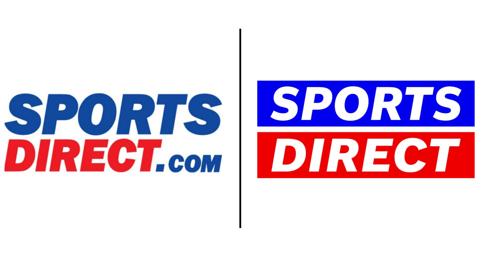
Shops may have taken a bit of a drubbing in the last year, but that doesn't mean it's time for retail stores to pack it in or stop thinking big. Case in point: Sports Direct, the British high-street mecca of trackies, trainers and more, which has this week unveiled a new look to its branding.
The new look logo puts the brand name within two horizontal bars denoting the equal sign. The motif is an attempt at putting equality and inclusivity front and centre, but the brand itself may not be a bastion on either front, having been dogged on various occasions about working conditions and pay (more on that below). Whether a logo can make a controversial brand look better is debatable, but you can always make sure your logos look good with our guide to logo design.
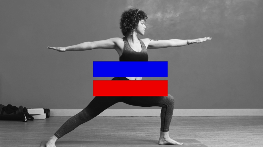
The new look was created by global brand company venturethree, whose creative partner Graham Jones said: "We love the idea that we are all equal through sport. We wanted to create a brand that boldly makes that statement. An extroverted, super sporty brand that keeps it simple and helps people to feel empowered."
A virtuous ideal, sure, but some companies can hide behind virtue to hide some unpalatable truths. Sports Direct was revealed to have been apparently paying its staff below the minimum wage, and accused of asking them to come in to work despite the pandemic. Problems have been long-running at the firm, which make us ask if this rebrand is enough in the name of equality.
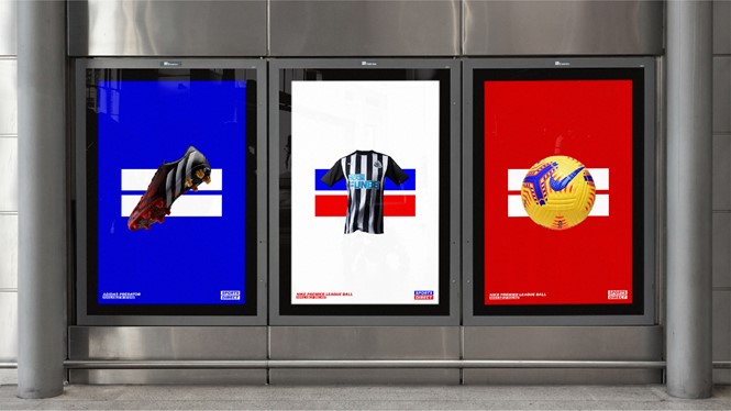
It also remains to be seen whether this will be enough to get people back into shops. Once lockdown lifts, brands will have to do a lot to grab attention to reaffirm their status on the highstreet. Posters and online campaigns are a good way of going about this, proving how important design and branding is to any business worth its salt.
Ironically, despite the company's history, the new Sports Direct identity so far remains without controversy. It's rare these days for a new logo to not stir immediate discussion; case in point, the recent RFEF rebrand, which got the red card from designers and football lovers.
Read more:
Get the Creative Bloq Newsletter
Daily design news, reviews, how-tos and more, as picked by the editors.

Thank you for reading 5 articles this month* Join now for unlimited access
Enjoy your first month for just £1 / $1 / €1
*Read 5 free articles per month without a subscription

Join now for unlimited access
Try first month for just £1 / $1 / €1
Giacomo is a writer and talking head who has covered creativity and creative tools for Wallpaper*, Digital Arts, Creative Boom, VICE, Little White Lies, the BBC and more. Giacomo has also hosted for Adobe and D&AD, and judged the annual New Blood Awards. He was deputy editor of Creative Bloq for a short time in 2021.
