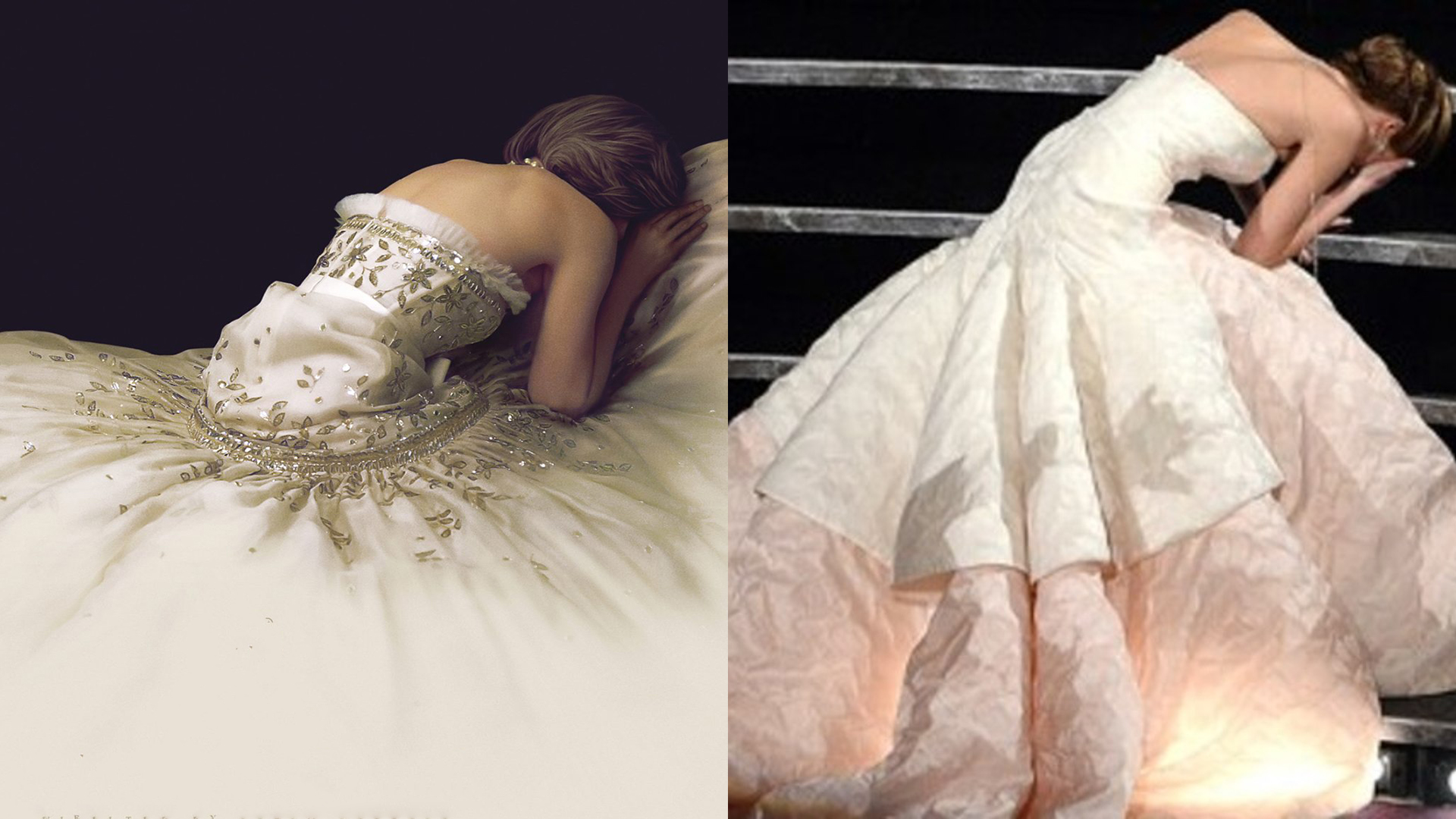
New poster for Diana biopic Spencer is utterly beautiful
But the internet has spotted a hilarious resemblance.

This week the internet was graced by the arrival of the poster for the much-anticipated biopic, Spencer. Directed by Pablo Larraín, the movie stars Kristen Stewart as Lady Diana and if this beautiful poster is anything to go by, it's going to be far from sunshine and rainbows.
Alongside the teaser trailer, the poster suggests that we will be given insight into Lady Diana's troubled relationship with fame, Prince Charles and the Royal Family. This beautiful, perfectly simplistic poster makes use of negative space and draws your attention to the vulnerability and emotion of the character without even showing her face. It could even be a contender for our list of best print ads.

With the recent resurgence in interest of the Charles/Camilla/Diana scandal (thanks, of course, to Netflix's The Crown), Lady Diana has been dominating the Royal Family-related media once again – and as a result, has gathered newer, younger fans who sympathise for the late princess. Many have reacted strongly to the release of this poster, praising the striking composition:
THIS IS THE POSTER OF THE YEAR EVERYONE GO HOME.Kristen Stewart is Princess Diana in #SPENCER pic.twitter.com/RHryBHxCc8August 25, 2021
simple_beautiful_movie_poster_for_pablo_larra%C3%ADns from r/DesignPorn
kristen_stewart_as_princess_diana_on_the_new from r/TheCrownNetflix
While the movie is to tackle a serious topic, the internet was (as the internet always is) quick to make light of the poster. Some have compared the poster to Jennifer Lawrence's epic fall at the Oscars – and to be honest, we totally see it.

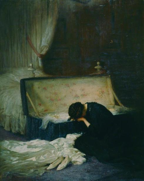
With the soft lighting partnered with such a stark black background, we can't help but think that the poster may be alluding to some classic paintings. Potentially drawing off the archaic concept of 'the fallen woman' or an innocence corrupted by a cruel society, this poster arguably wouldn't look out of place in an art gallery.
With the theme of marriage and loss, Frederick William Elwel's 'The Wedding Dress' bears a resemblance to the Spencer poster. The painting depicts a young woman facing away from the viewer next to her wedding dress, crying into her arm. When comparing both the body positions and linking to the theme of marriage and loss, we wonder if the designers were using this painting as inspiration for the poster.

Despite its minimalistic approach, this poster has been causing maximal impact online (much like the recent Dune poster) and we look forward to seeing the film. If you're inspired by this poster, then make sure to check out our post about the best negative space examples for tips on how to use it in your own work.
Get the Creative Bloq Newsletter
Daily design news, reviews, how-tos and more, as picked by the editors.
Read More:
- Fans are going wild for Netflix's Sex Education Series 3 posters
- Poster designs: 53 inspirational examples
- The Tokyo 2020 Paralympic Games posters are a thing of beauty

Thank you for reading 5 articles this month* Join now for unlimited access
Enjoy your first month for just £1 / $1 / €1
*Read 5 free articles per month without a subscription

Join now for unlimited access
Try first month for just £1 / $1 / €1

Amelia previously worked as Creative Bloq’s Staff Writer. After completing a degree in Popular Music and a Master’s in Song Writing, Amelia began designing posters, logos, album covers and websites for musicians. She covered a range of topics on Creative Bloq, including posters, optical illusions, logos (she's a particular fan of logo Easter eggs), gaming and illustration. In her free time, she relishes in the likes of art (especially the Pre-Raphaelites), photography and literature. Amelia prides herself on her unorthodox creative methods, her Animal Crossing island and her extensive music library.
