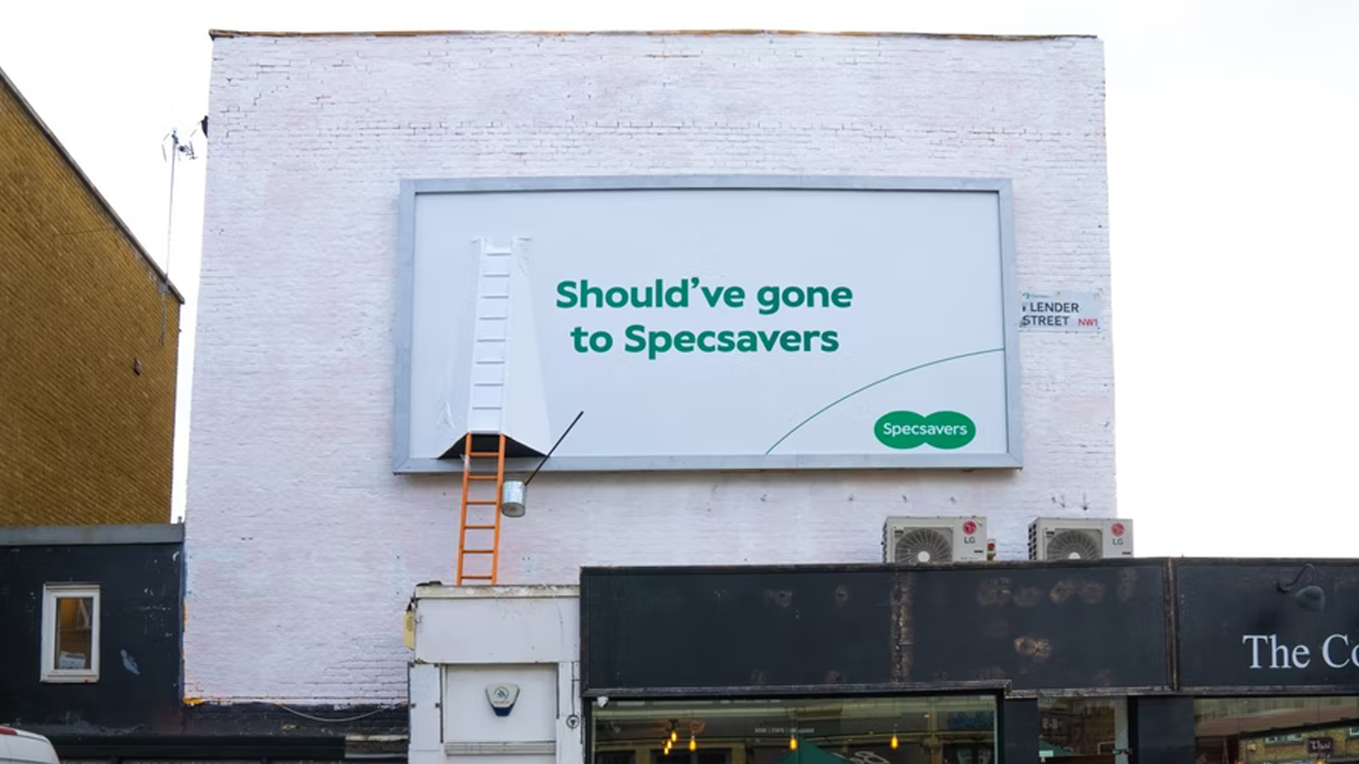
These billboards are one big genius mistake
Now, this is how to design a print ad.

If you've been living in the UK for a while, then you've probably heard about the opticians Specsavers and its famous tagline "should've gone to Specsavers". The slogan has become a household catchphrase with its adverts taking on iconic-level status – and its latest campaign is no exception.
A number of humorous billboards have been spotted around the UK today, all promoting the famous spectacle brand. The clever designs may look like huge blunders, but it's all part of Specsavers' genius campaign. Loving these designs and fancy sinking your teeth into some more? Check out our roundup of the best examples of billboard advertising.

According to Campaign, these rogue billboards have been spotted in both Leeds and London, and were created by Specsavers' in-house marketing team, The Agency. The designs all look like freak accidents with one billboard being the wrong way up and another supposedly being plastered over an actual ladder. The billboards are part of the refreshed 'Should've gone to Specsavers' campaign, which, of course, features a classic Specsavers advert (see below).
With the humorous, bold and engaging designs, they kind of remind me of a mischievous Banksy piece. We love how these adverts would make you have to double-take – they do look like a huge mistake after all. We love how busy it's been in the world of print ads this past month with the topsy-turvey Stranger Things design turning heads and the ingenious Burger King plant-based ads.
We can't wait to see (get it?) what Specsavers will do next. If you're feeling inspired and want to have a go at creating your own ads then check out how to download Photoshop and get designing. Or if you'd indulge in some more brilliant designs, then you'll love this roundup of the best print adverts of all time.
Read More:
- I love this utterly adorable Princess Peach Lego set
- I can't tell if I love or hate this bizarre computer mouse concept
- These 3D Super Mario 'humans' are going to haunt my nightmares
Get the Creative Bloq Newsletter
Daily design news, reviews, how-tos and more, as picked by the editors.

Thank you for reading 5 articles this month* Join now for unlimited access
Enjoy your first month for just £1 / $1 / €1
*Read 5 free articles per month without a subscription

Join now for unlimited access
Try first month for just £1 / $1 / €1

Amelia previously worked as Creative Bloq’s Staff Writer. After completing a degree in Popular Music and a Master’s in Song Writing, Amelia began designing posters, logos, album covers and websites for musicians. She covered a range of topics on Creative Bloq, including posters, optical illusions, logos (she's a particular fan of logo Easter eggs), gaming and illustration. In her free time, she relishes in the likes of art (especially the Pre-Raphaelites), photography and literature. Amelia prides herself on her unorthodox creative methods, her Animal Crossing island and her extensive music library.
