New Sonic the Hedgehog logo runs rings around the rest
Has it really been 30 years?!
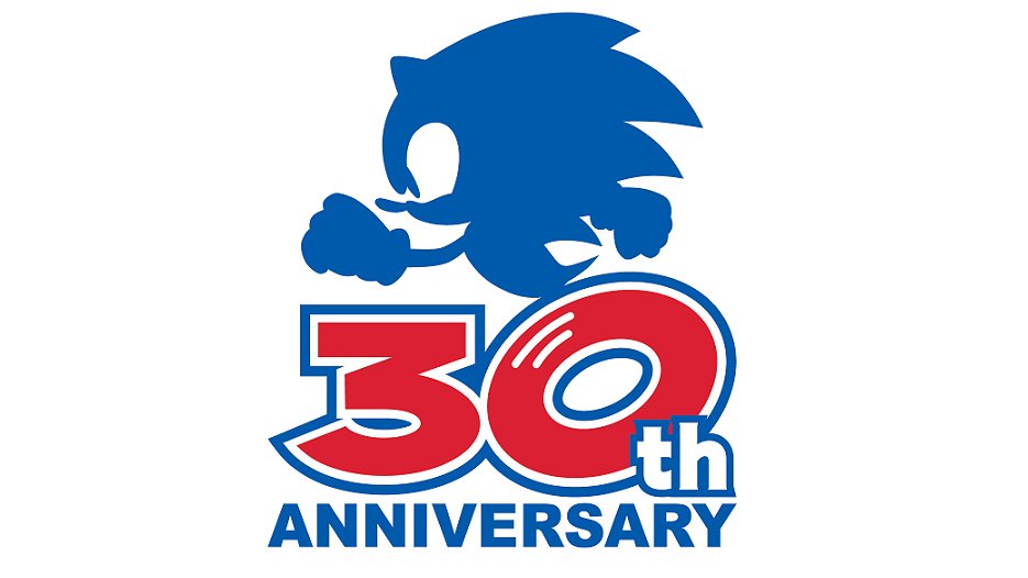
Not only does he move fast, but the world's most famous blue hedgehog seems to be growing up fast as well. Next year marks the 30th anniversary of Sonic the Hedgehog's first outing on Sega's Mega Drive, and the company has just revealed a brilliant new logo to mark the occasion.
The new design features a blue silhouette of Sonic in profile atop the words '30th anniversary'. Fans were quick to spot that the '0' also forms the iconic loop of Sonic's running shoes, in a clever nod to the original games' 2D animation. If you're looking for inspiration of your own, check out our logo design guide.

The clean logo has proven a huge hit online, with fans loving the subtle inclusion of Sonic's shoes, as well as the return to a more traditional character design for the blue blur. Unlike the more realistic, furry design from the recent Sonic movie (not that a talking blue hedgehog will ever be entirely realistic), the logo marks a return to the more cartoon-like character that graced the box art of games in the 90s (take a look at our character design guide if you're looking for tips).
YOOO IM LOVING THE OFFICIAL LOGO FOR SONIC’S 30TH ANNIVERSARY AAAAHHHHH💙 pic.twitter.com/u40vHpNLHlSeptember 14, 2020
Oh geez. My blood is boiling just how it was back in 2017. No franchise gets me SO PUMPED just from a logo. Sonic has always been my favourite man.Honestly 2021 cannot come any sooner. PLEASE! https://t.co/TiLP4giZD2September 14, 2020
I LOVE this logo! Neat touch making the 0 Sonic’s feet like he’s running. https://t.co/nsPlTl3KcUSeptember 14, 2020
This isn't Sonic's first anniversary logo – the character's 10th, 15th, 20th and 25th birthdays were each marked with their own designs. But the feeling among fans seems to be that, with its clean design and clever visual pun, the 30th anniversary logo runs rings around the rest.
#Sonic30th has the best logo.So simple.But yet it’s more than just a number.Let’s go 2021!!! pic.twitter.com/yKaMSCdmxHSeptember 14, 2020
Along with the logo, Sega has also announced a slew of merchandise including apparel, a hardback "encyclo-speed-ia" and, er, energy drinks. "Over the past 30 years spanning multiple generations, Sonic fans have created memories with their speedy Blue Blur," Sega says in a press release. "We have partnered with some of the top licensees in the industry to produce collectible Sonic the Hedgehog merchandise that our enthusiastic and loyal fans can cherish for years to come."
Design-wise, the blue-blur has certainly hit a few speed bumps over the years – most famously with the hastily redesigned movie character design. But if this new logo is anything to go by, Sonic's next 30 years are off to a running start.
Read more:
Get the Creative Bloq Newsletter
Daily design news, reviews, how-tos and more, as picked by the editors.

Thank you for reading 5 articles this month* Join now for unlimited access
Enjoy your first month for just £1 / $1 / €1
*Read 5 free articles per month without a subscription

Join now for unlimited access
Try first month for just £1 / $1 / €1

Daniel John is Design Editor at Creative Bloq. He reports on the worlds of design, branding and lifestyle tech, and has covered several industry events including Milan Design Week, OFFF Barcelona and Adobe Max in Los Angeles.
