Brilliant album cover concepts make social distancing look cool
Famous bands stay six feet apart.
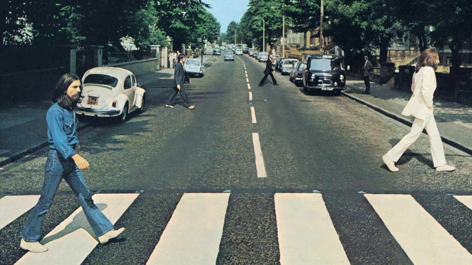
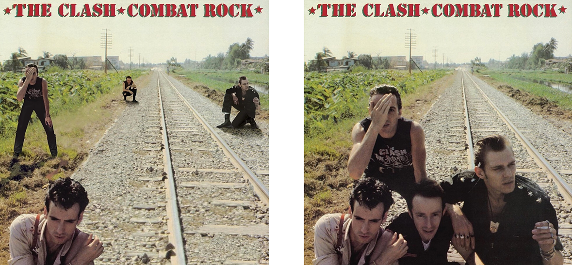
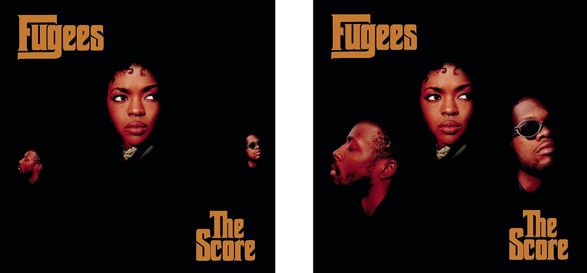
We've seen lots of amazingly creative responses to the rise of self isolation and social distancing over the past few weeks, and this album cover project by Los Angeles agency Activista is another brilliant addition. Designed to raise awareness of the importance of staying at least six feet away from each other, the 6 Feet Covers project takes several iconic album artworks and, with a little digital trickery, separates the band members.
From hip-hop to rock, the collection by Activista's art director Paco Conde and copywriter Beto Fernandez covers a broad spectrum of famous covers. Most of them, like all the best album covers, are instantly recognisable.
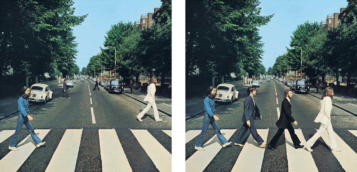
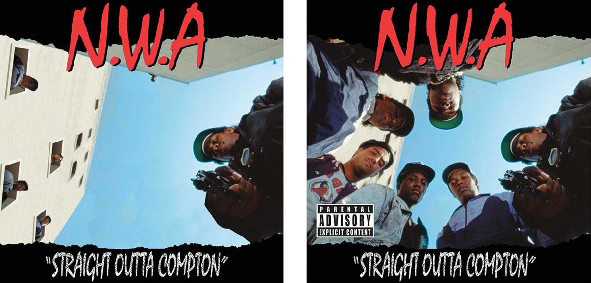
The Beatles' Abbey Road cover now sees the fab four crossing the road at entirely different points. And a genius piece of graphic design sees the members of N.W.A now poking out of the windows of the building behind the huddled group in the original cover for Straight Outta Compton (below).
“The original idea was movie posters,” Conde told AdWeek. “But we thought album covers could be a simple visual solution. The main criteria was that the cover should be iconic enough for people to recognise."
Perhaps the most impressive thing about the new concepts is that they still manage to maintain the attitude of the originals. Social distancing has never looked so rock and roll.
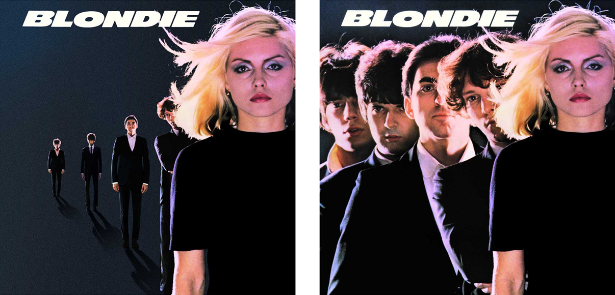
“[The coronavirus crisis] is very sad,” Conde said. “With these album covers, at least we’re making people smile. But at the same time, we’re making the message clear. Better to be six feet apart than six feet under." Below are more of our favourites – visit Six Feet Covers for the full collection.
It's great to see the creative community coming together in the face of adversity. If you're an artist or designer stuck at home right now, check out our list of the best free online resources available for you right now.
Get the Creative Bloq Newsletter
Daily design news, reviews, how-tos and more, as picked by the editors.

Read more:

Thank you for reading 5 articles this month* Join now for unlimited access
Enjoy your first month for just £1 / $1 / €1
*Read 5 free articles per month without a subscription

Join now for unlimited access
Try first month for just £1 / $1 / €1

Daniel John is Design Editor at Creative Bloq. He reports on the worlds of design, branding and lifestyle tech, and has covered several industry events including Milan Design Week, OFFF Barcelona and Adobe Max in Los Angeles. He has interviewed leaders and designers at brands including Apple, Microsoft and Adobe. Daniel's debut book of short stories and poems was published in 2018, and his comedy newsletter is a Substack Bestseller.
