Slack reveals its biggest ever redesign
Simple new look will be welcome for those working from home.
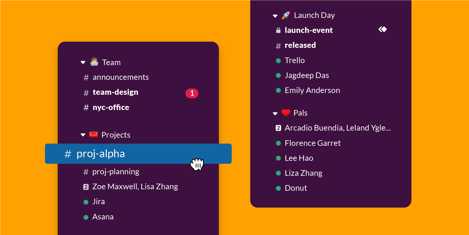
Slack has begun rolling out a redesigned interface, adding features designed to create what its website calls "a simpler, more organized Slack." These include a new navigation bar, collapsible folders for organising conversations, and more.
Millions of teams and colleagues communicate using Slack, and the update aims to make the software easier to use. The sidebar's new collapsible folders mean that if you’re working on a project with its own channels and chats, these can now be nested under one section – handy for creatives with multiple projects on the go at once. Unfortunately, though, the customisable sections are will only be available for users on paid plans.
Redesigning your UI? Check out our list of the best web design tools.

The new navigation bar has a search function for looking up conversations, files and other items. And in the top left is a new 'compose' button, which enables you to start writing a new message from anywhere in the app before deciding where to send it. Plus, if you get distracted, the message will remain saved as a draft (not that we ever get distracted on Slack, of course.).

Also new is a lightning bolt icon next to the message input field. This is where you can find apps. Slack says many of these will arrive in the coming weeks, including Simple Poll and Cisco WebEx Meetings. And finally, spacing has been increased for more breathing space across the whole app.
We're fans of the new, tidy design. Slack can be an intimidating place for newcomers, and the new look makes the old Slack look positively cluttered. With so many people working from home right now in the wake of coronavirus, this is a bold time for Slack launch a redesign, and we kind of admire them for it. Hopefully it'll help creatives keep more on top of all their projects, instead of, you know, slacking (sorry).
Related articles:
Get the Creative Bloq Newsletter
Daily design news, reviews, how-tos and more, as picked by the editors.

Thank you for reading 5 articles this month* Join now for unlimited access
Enjoy your first month for just £1 / $1 / €1
*Read 5 free articles per month without a subscription

Join now for unlimited access
Try first month for just £1 / $1 / €1

Daniel John is Design Editor at Creative Bloq. He reports on the worlds of design, branding and lifestyle tech, and has covered several industry events including Milan Design Week, OFFF Barcelona and Adobe Max in Los Angeles.
