Slack dark mode is live! Here's how to activate it
Turn down the lights on your work chat with the new Slack dark mode.

Slack dark mode is here. The new theme was added on a recent update, and brings a less jarring black background to your chats. To find out how to activate Slack dark mode, read on.
Dark modes are having a moment right now. Twitter kicked off the trend earlier in the year, and the new Instagram dark mode is proving very popular. It seems like a simple thing, but there are a number of benefits to activating dark mode. It'll help save battery on your phone or tablet, and is less distracting for others if you're working in an area with dimmed lights, such as a design conference. It also seems to be easier on the eyes when compared to a bright white background – if you suffer from migranes, for example, dark mode can help.
No matter what type of design you do, chances are if you work with others you have Slack installed on your machine (for more handy apps and software, explore our guides to the best tools for graphic designers and the top web design tools around). Could this be the design move that redeems the tool for designers after the fiasco that surrounded the new Slack logo?
How to activate Slack dark mode on desktop
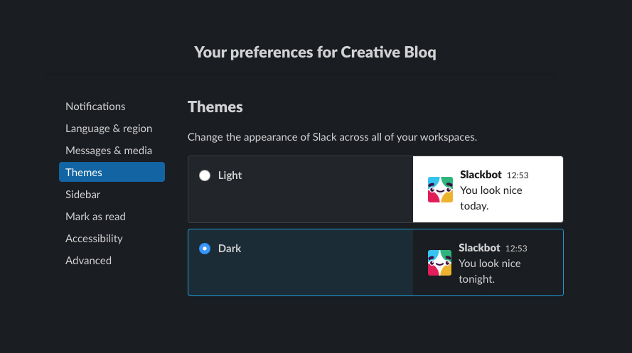
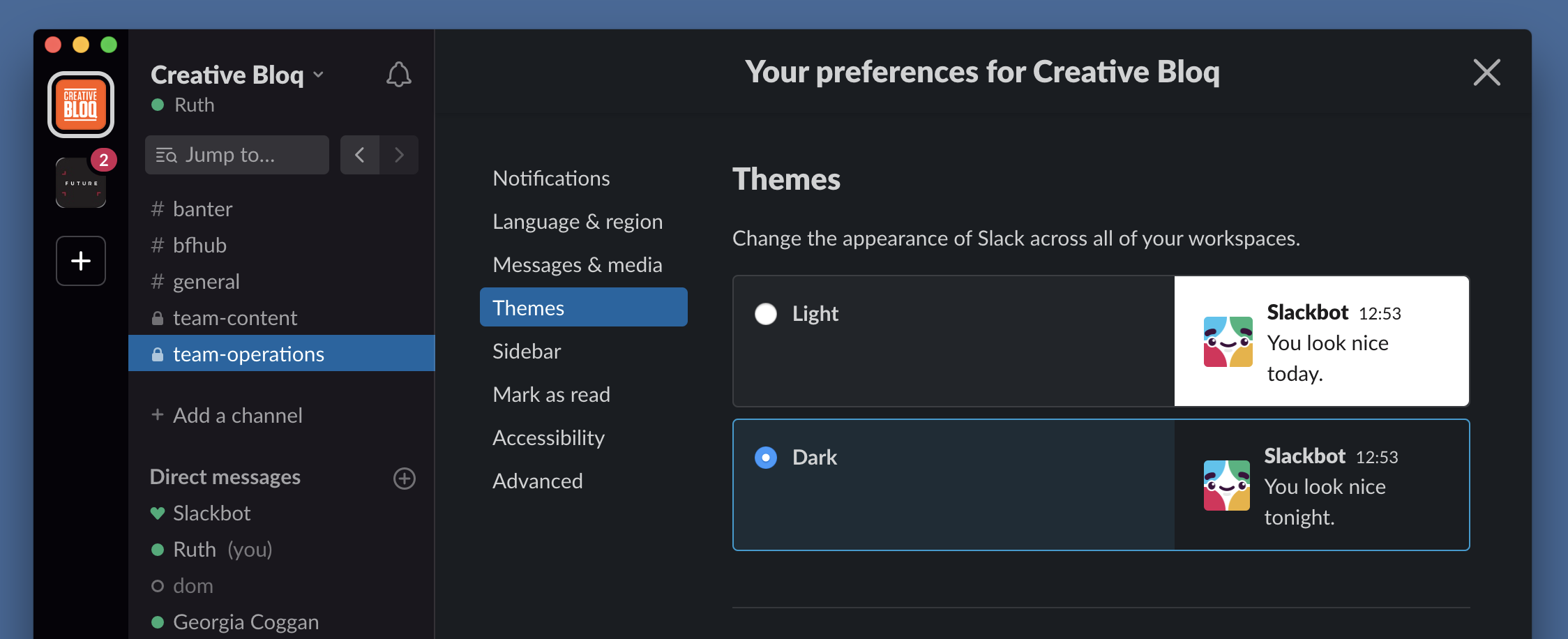
To activate Slack dark mode, you just need to follow a couple of very simple steps. On desktop, open the app and go to Slack > Preferences > Themes and then simply select Light or Dark.

How to activate Slack dark mode on mobile
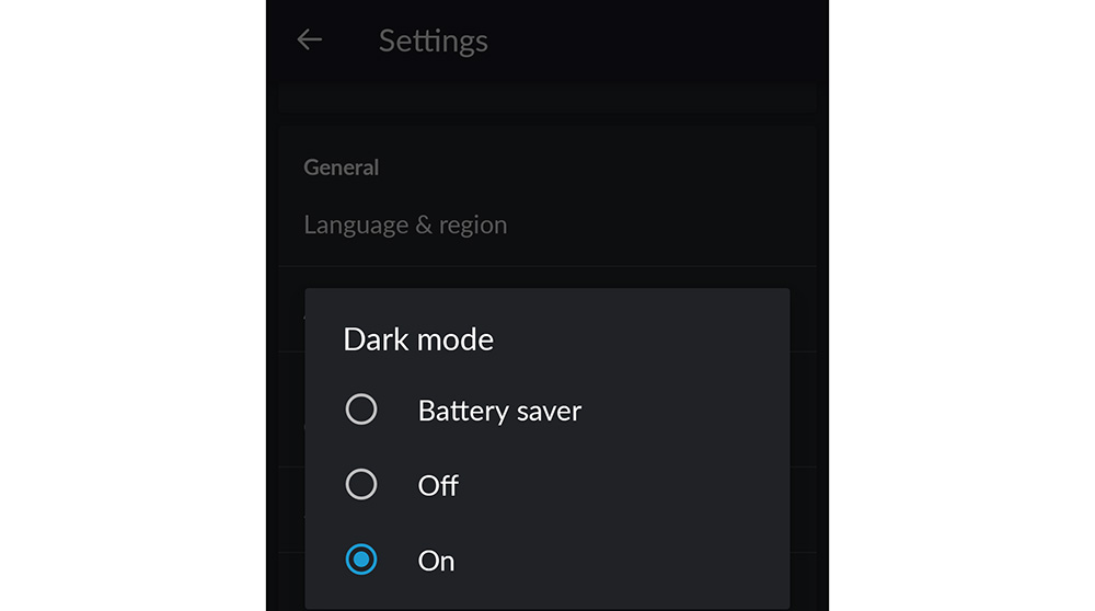
On mobile, open the app and tap the three dots in the top right of your screen. From the drop-down that appears, select Settings. Scroll down, and under General you'll see an option to select Dark Mode. The process should be the same for iPhone, iPad and Android.
If your device is running iOS 13, you'll need to turn on dark mode in Slack from your OS settings.

Still having trouble? Check out Slack's instruction page.
Get the Creative Bloq Newsletter
Daily design news, reviews, how-tos and more, as picked by the editors.
You can go further and change the sidebar shade and accent colour within your dark mode. Choose from a range of excitingly titled options, from Dagobah (blue) to Noctune (also blue) to Monument (orange).
Slack also offers a couple of accessible themes catering to different types of colour blindness: there's one for users suffering from protanopia (reduced sensitivity to red light) or deuteranopia (reduced sensitivity to green light) and one for those with tritanopia (where the user cannot distinguish between blue and yellow).

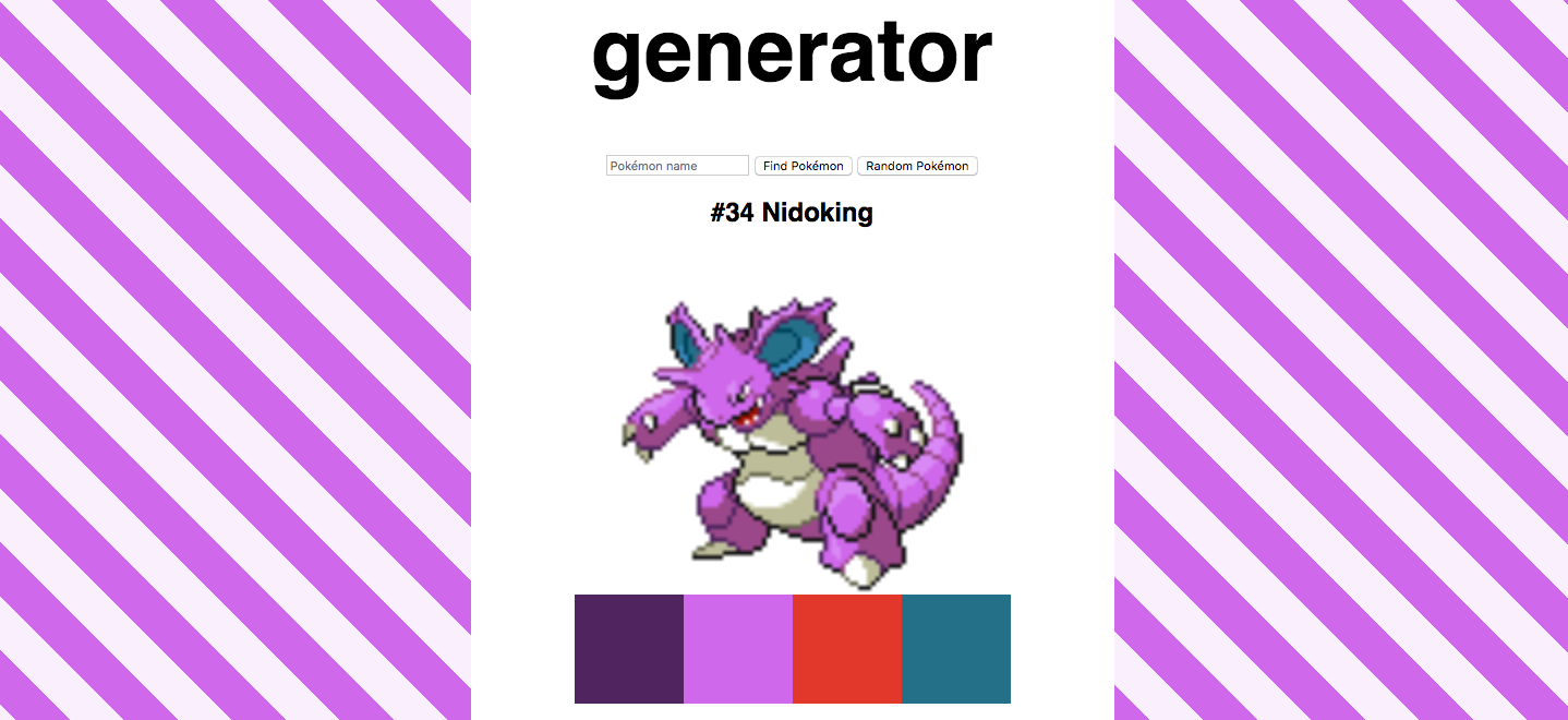
After something more expressive? Pokéslack is a generator that will create a light and dark theme based on your favourite Pokémon.
Read more:

Thank you for reading 5 articles this month* Join now for unlimited access
Enjoy your first month for just £1 / $1 / €1
*Read 5 free articles per month without a subscription

Join now for unlimited access
Try first month for just £1 / $1 / €1

Ruth spent a couple of years as Deputy Editor of Creative Bloq, and has also either worked on or written for almost all of the site's former and current design print titles, from Computer Arts to ImagineFX. She now spends her days reviewing small appliances as the Homes Editor at TechRadar, but still occasionally writes about design on a freelance basis in her spare time.
