Skype users desperately want its old icon back
Telecoms tool is the latest Microsoft app to get a redesign.

It's been a rough week for people who are overly attached to Android and iOS app icons. Not only were youngsters sent into a tailspin when Snapchat updated its icon, but now it's the turn of Skype users to go through the pain of watching their beloved app get a visual update.
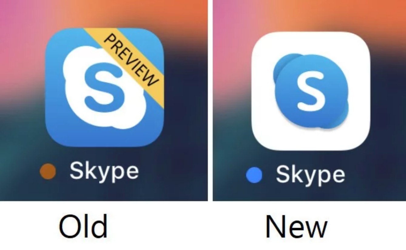
That's because Skype has got a new icon on iPhones and iPads. It's part of a larger aesthetic overhaul of Microsoft Office icons, which has been in the works since last year. And while the new icon is arguably more noticeable than the Snapchat update, is this redesign a case of users getting angry over nothing?

In the redesign we can see that it's inverted the colours of the previous app icon, so now the S is white and the circular background is a blue gradient. The new Skype icon is in line with Microsoft's Fluent Design System and will roll out to all platforms in the next few weeks.
As is often the case with redesigns of familiar products, the new icon has provoked a negative reaction from users. Plenty were quick to point out that the new colour scheme makes the telecommunications application look suspiciously similar to Facebook Messenger. Meanwhile, others noticed that the sizing of the new icon made it appear bloated and overweight, leading to them to consider removing it from their devices altogether – a response Skype probably wasn't going for.
Could the new Skype iOS icon lool any more like FB Messenger? pic.twitter.com/YzLfsn2aoEAugust 16, 2019
Skype’s new icon looks obese. pic.twitter.com/fOTALiSp6ZAugust 16, 2019
This new Skype app icon is really ugly 🤢 pic.twitter.com/xG6NNrE7qdAugust 14, 2019
@Skype seriously? this is the new icon of Skype? Even the icon since 10 years ago is better than this... time to remove it from my dock after 10+ years :/ pic.twitter.com/cdQ6MXVlAFAugust 16, 2019
Let's just hope people aren't jumping ship too soon. The updated icon is part of a wider upgrade to the app that sees Microsoft fix some of the bugs that have plagued previous iterations. So while it might take a while to get used to the new icon, at least Skype will work better than before.
In the cut-throat and fickle world of communications apps though, maybe this will be the nail in the coffin for Skype. After all, it's been flagging behind Whatsapp and Facebook Messenger for some time now. Or perhaps new features, such as Microsoft's plan to allow Skype users to make VoIP calls to each other in the start of 2020, will give the app a new lease of life.
Related articles:
Get the Creative Bloq Newsletter
Daily design news, reviews, how-tos and more, as picked by the editors.

Thank you for reading 5 articles this month* Join now for unlimited access
Enjoy your first month for just £1 / $1 / €1
*Read 5 free articles per month without a subscription

Join now for unlimited access
Try first month for just £1 / $1 / €1

Dom Carter is a freelance writer who specialises in art and design. Formerly a staff writer for Creative Bloq, his work has also appeared on Creative Boom and in the pages of ImagineFX, Computer Arts, 3D World, and .net. He has been a D&AD New Blood judge, and has a particular interest in picture books.
