The Skoda logo is 100 years old next week. While we didn't include it in our list of the best car logos of all time, its longevity and relatively few changes over the years suggests that maybe we should.
To mark the anniversary, the Czech car has published details about the design's history - at least as much as it's been able to gather from its archives. And it seems the logo design had a surprising inspiration. No, it wasn't initially inspired by a bird or an arrow.
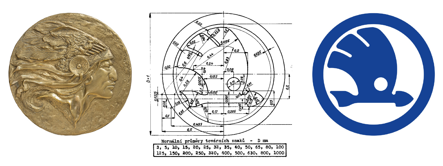
The Škoda logo was registered at the patent office in Pilsen in the Czech Republic, then Czechoslovakia, on 15 December 1923. It's believed that the original winged arrow design was based on a concept created by Tomáš Maglič, the company's commercial director at the time. His inspiration was apparently the image of a native American wearing a feather headdress (see the image above left).
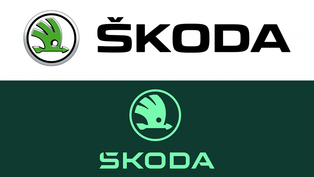
While the design has seen several tweaks over the years, many of the changes have focused on the accompanying logotype. The concept of the winged arrow remains largely the same, including after last year's redesign, which flattened the logo to improve visibility on digital platforms and create a more modern look, making it into our pick of the best car logo redesigns.
The story behind the Skoda logo
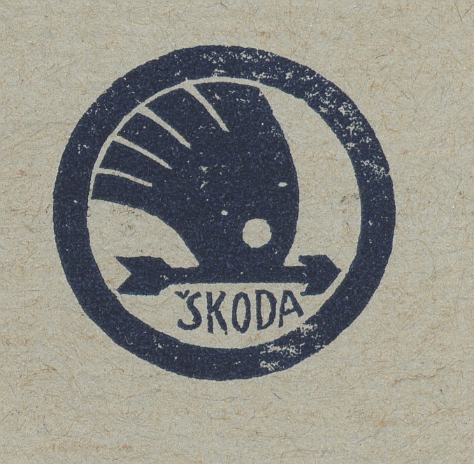
Skoda says it can't be entirely sure of the history behind the design, but it thinks the Skoda logo was the result of a competition and that Maglič's winning design took inspiration from a relief on the wall of his office, which depicted a Native American man wearing a feather headdress. It's not clear who further developed his concept, but Skoda thinks the Czech sculptors Otakar Španiel and Otto Gutfreund may have contributed ideas, with the final piece being created by a graphic designer.
Initially, two versions of the winged arrow were created, one with five feathers and one with three. Both were registered as trademarks on 15 December 1923, but the version with three feathers became the preferred choice as it was graphically cleaner and visually simpler. It was initially used on Skoda's trains and began to appear on cars after the company merged with Laurin & Klement in 1925.
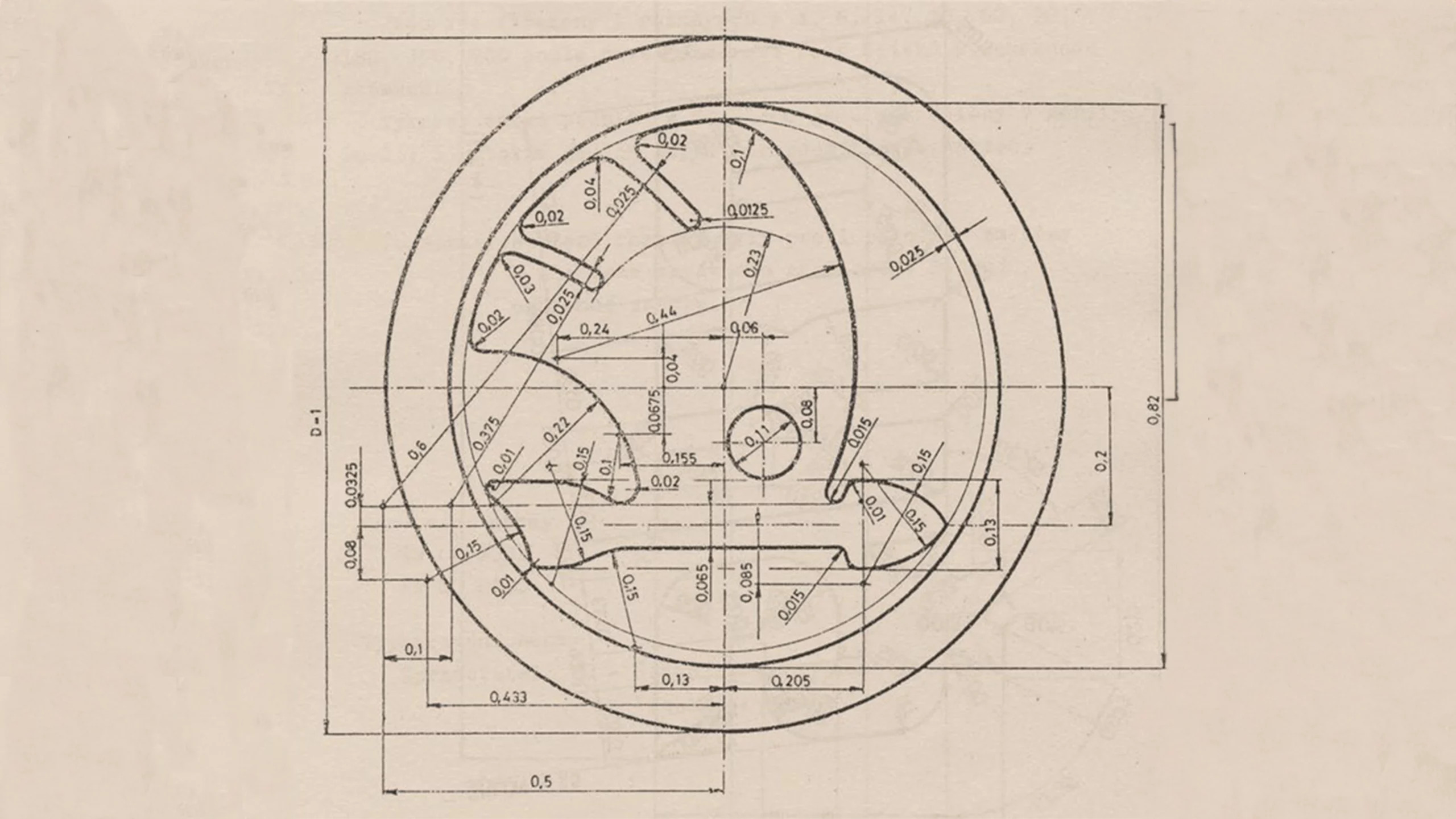
Skoda says that each element of the logo design "embodies brand’s commitment to high technical and aesthetic standards, and precise manufacturing, as well as symbolising the dynamism of forward motion." The large circle represents global reach and "impeccable production", the wing denotes technological advancement and the range of production The "forward-pointing arrow signifies progressive manufacturing processes and efficiency", while the smaller circle, which looks like a bird's eye, "symbolises the precision of Škoda’s engineering, expertise, and foresight."
Get the Creative Bloq Newsletter
Daily design news, reviews, how-tos and more, as picked by the editors.
There seems to be a lot of crossover there, and I'm not sure if the logo was created with this symbolism in mind or rather that the company has come up with these interpretations after the fact. Either way, the success of the Skoda logo design is clear: it's only undergone five real modifications in 100 years of history, and many of them have been subtle (although not quite a subtle as the new Ford logo redesign). The most notable were the changes in colour from silver and blue to red in the 1950s and 1960s and then green in the 1990s. An accompanying wordmark was used for much of the time since the 1950s.

Thank you for reading 5 articles this month* Join now for unlimited access
Enjoy your first month for just £1 / $1 / €1
*Read 5 free articles per month without a subscription

Join now for unlimited access
Try first month for just £1 / $1 / €1

Joe is a regular freelance journalist and editor at Creative Bloq. He writes news, features and buying guides and keeps track of the best equipment and software for creatives, from video editing programs to monitors and accessories. A veteran news writer and photographer, he now works as a project manager at the London and Buenos Aires-based design, production and branding agency Hermana Creatives. There he manages a team of designers, photographers and video editors who specialise in producing visual content and design assets for the hospitality sector. He also dances Argentine tango.
