Hilarious Sega poster blunder hits a bum note
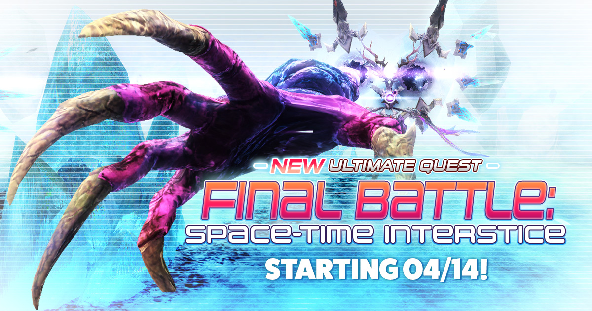
Very little kicks off a weekend quite like a priceless typographical blunder, and we have a doozy for you here. Video games master Sega recently released a video game poster for the second instalment of the Phantasy Star Online series – the thrilling-sounding Ultimate Quest Final Battle: Space-time Interstice.
But, Sega's poster design strikes quite a different tone due to an unfortunate font choice, which highlights the importance of careful kerning. Yup, the word 'final' can be read very differently indeed. Maybe Sega should have used one of our favourite tried-and-tested free fonts instead.

Do you see the problem? It was super-clear to highly-amused Sega fans on Twitter, who pointed out that the word 'final' has an 'F' and 'i' so close together it reads as the word 'anal'. It's so obvious we're kinda surprised it got through the many rounds of vetting required to sign off on these kinds of assets. All it would have taken to fix was a shortening of the parallel lines on the capital F, and a slight respacing of the 'F' and the 'i'. (If you don't see it, it could be because you're viewing it on a big screen – it's even clearer on a small device.)
Some users are simply delighted by the mistake, but others take a more cynical view, sure that the 'misprint' is intentional.
"Clearly with a zoom you can even see this was intended the F and I are clearly closer tog[e]ther then the rest!", said eagle-eyed Kane Hardman. He continued, "also why did they use a Caps I when the n and a are lower case? So just ask yourself one thing, why is it Anal battle?".
"Free publicity.", answered Toni On. "Well done you whoever did it."

It isn't the first time we've enjoyed an error of this exact sort. Last year, a hilarious poster for the Malaysian New Year hit its own bum note when the word 'Anak' was confused with 'anal' (see it above). We're ass-uming (sorry) that pants design was a mistake too, but anything is possible when it comes to publicity.
Daily design news, reviews, how-tos and more, as picked by the editors.
Read more:
- Typography design: Rules and terms every designer must know
- The best video game logos of all time
- Font design: Brilliant tips to create your own typeface

Georgia has worked on Creative Bloq since 2018, and has been the site's Editor since 2023. With a specialism in branding and design, Georgia is also Programme Director of CB's award scheme – the Brand Impact Awards. As well as immersing herself with the industry through attending events like Adobe Max and the D&AD Awards and steering the site's content streams, Georgia has an eye on new commercial opportunities and ensuring they reflect the needs and interests of creatives.
