The best logos tend to be simple, memorable and versatile. Some are so versatile they can be put to uses the original designer never imagined. That's the case of San Francisco's 'worm', as the logo of the city and county's municipal transport network is affectionately known.
The San Franciso Municipal Railway's classic wiggly logo is the star of a new ad campaign in which its distinctive form is used to represent more than the network's train lines and its abbreviated name – muni. Some think the campaign is ingenious design, but not everyone agrees. In fact, some are arguing that even the original logo is a stinker. But even it does break some of the rules of how to design a logo. But does that really matter?
The Muni logo in sunset colours on a bus in the 1970s (Image credit: SFMTA)
The Muni logo is often hailed as a design classic. Created by Walter Landor in 1975, it represents transport lines but also spells out the network's abbreviated name. And while it's clearly a product of its era, with smooth, almost psychedelic lines reminiscent of the early 70s, it's stood the test of time. It proved iconic enough to resist change when the SF Municipal Transportation Agency (SFMTA) was created in 1999 and it remains in use today.
Latest Videos From Creative Bloq
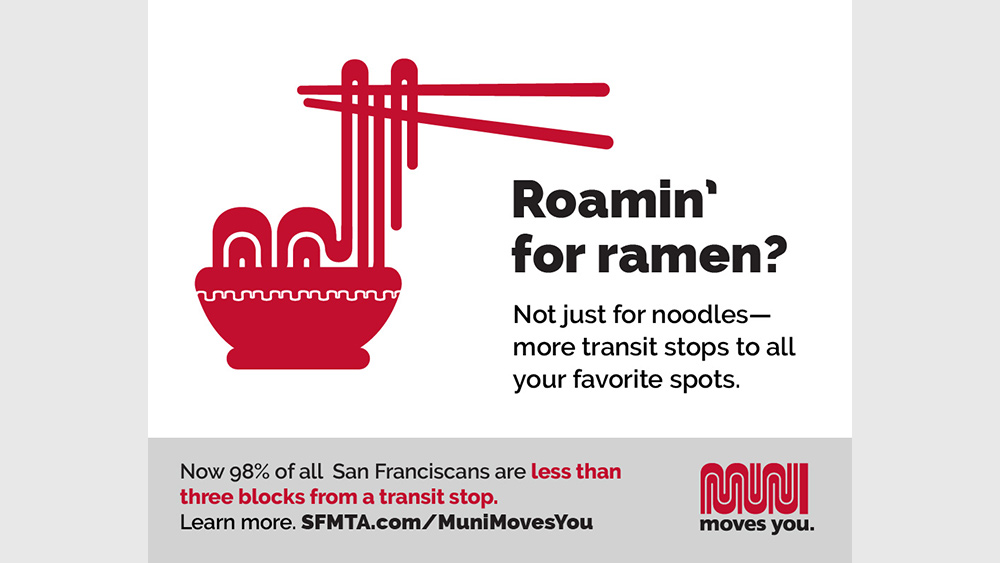
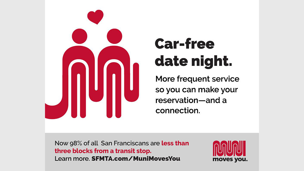
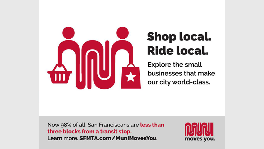
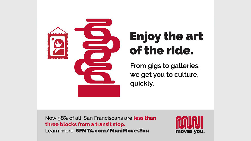
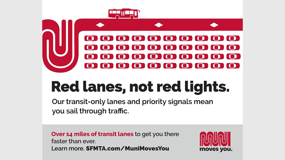
Now a new campaign cleverly reworks the Muni logo into different shapes. The "Muni Moves You!" campaign is designed to draw commuters back to the network in the wake of the Covid-19 pandemic with print and digital ads that see the abstract Muni worm morph into icons representing noodles, art, dating and shopping (see below).
Image 1 of 5
Train lines turn to noodles in this Muni ad. click right for more(Image credit: SFMTA)
Muni at the movies(Image credit: SFMTA)
Another ad from the Muni moves you campaign(Image credit: SFMTA)
The Muni logo claims its place in a gallery(Image credit: SFMTA)
Adverts from the Muni moves you campaign(Image credit: SFMTA)
The designs have been delighting many in Reddit's r/DesignPorn community – particularly people who know San Francisco. However, others have rubbished both the new designs and the original logo, describing the former as "confusing" and the logo as "unreadable". One person has pointed out that the ramen icon looks like a toilet.
"Seriously, what is this supposed to be?" one person asked. "That logo is horribly unreadable," someone else protested. Even some San Franciscans admit that they never realised the original logo was supposed to spell 'Muni'.
The debate raises some interesting questions about logo design. I'd usually agree that readability should be a primary goal – unless you're designing for a metal band. But should we always be so prescriptive?
Get the Creative Bloq Newsletter
Daily design news, reviews, how-tos and more, as picked by the editors.
Perhaps you have to know San Francisco to make the connection and understand the new ads, but then the campaign is aimed entirely at San Francisco residents who've seen the Muni logo for decades and will immediately recognise it in the new icons through the forms and the colours. "To San Franciscans (like me), the Muni logo is everywhere," one San Franciscan has pointed out in the debate on Reddit. "The tie-in was obvious and fun."
As for the original logo, we've been quick to criticise logo designs for a lack of readability on occasion, but I wonder if it really matters here. A logo represents a brand, not a word. Those that don't see the 'Muni' in the design, simply take the logo to represent a public transport system, which is what it is. The 'Muni' hiding in there is almost a bonus, like in several logos with a hidden meaning. Sometimes the rules can be broken and still result in a design classic, otherwise, people start asking why all logos look the same.
Joe is a regular freelance journalist and editor at Creative Bloq. He writes news, features and buying guides and keeps track of the best equipment and software for creatives, from video editing programs to monitors and accessories. A veteran news writer and photographer, he now works as a project manager at the London and Buenos Aires-based design, production and branding agency Hermana Creatives. There he manages a team of designers, photographers and video editors who specialise in producing visual content and design assets for the hospitality sector. He also dances Argentine tango.