This awesome vodka bottle design is driving Reddit wild
It’s a cut above the rest.
Packaging design can be hard to get right. As well as serving a practical purpose, it needs to be visually appealing. There are plenty of protective yet nondescript bottles and wrappers out there – but here's one that's certainly a sharp design.
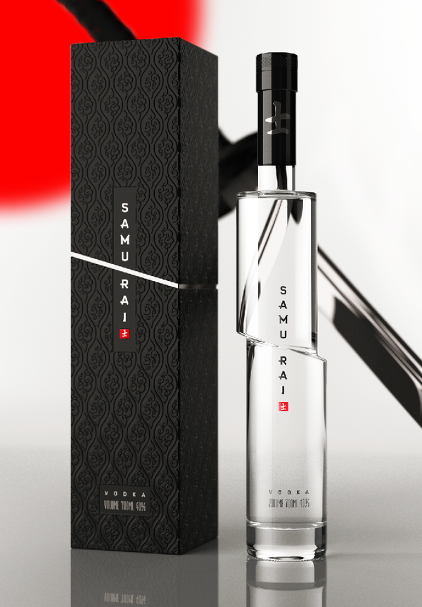
Reddit is currently going wild for a bottle of Vodka. The ingenious design for Samurai Vodka doesn't take much explaining – it looks as though a samurai sword has sliced straight through it. But like all the best examples of packaging design, it's both simple and striking.

Sadly, it turns out the design, created by Arthur Schreiber, is simply a concept. And it seems Samurai isn't even a real brand of Vodka. But that hasn't stopped the brilliant design going viral online – for the umpteenth time since it appeared on Behance in 2009.

"This is incredible," One Redditor comments, while another adds, "Yep, I want this on my shelf right now." Naturally, a few nitpickers have commented that the top half of the bottle should sit lower, since gravity would make it slide downwards. I can't say I've sliced enough bottles to know for sure, so I'm just going to enjoy the clever design.
Indeed, it might be a concept, but it's better than plenty of official packaging designs we've seen lately – not least Coca-Cola's messy new look. Inspired to create a render of your own? Check out our guide to the best 3D modelling software.
Read more:
- Looks like my biggest iPhone 14 design fear might come true
- The best graphic design software
- Viral TikTok video exposes the fruity side of Haribo's Maoam ...
Get the Creative Bloq Newsletter
Daily design news, reviews, how-tos and more, as picked by the editors.

Thank you for reading 5 articles this month* Join now for unlimited access
Enjoy your first month for just £1 / $1 / €1
*Read 5 free articles per month without a subscription

Join now for unlimited access
Try first month for just £1 / $1 / €1

Daniel John is Design Editor at Creative Bloq. He reports on the worlds of design, branding and lifestyle tech, and has covered several industry events including Milan Design Week, OFFF Barcelona and Adobe Max in Los Angeles. He has interviewed leaders and designers at brands including Apple, Microsoft and Adobe. Daniel's debut book of short stories and poems was published in 2018, and his comedy newsletter is a Substack Bestseller.
