Russia's new tourist identity inspired by avant-garde art
The new suprematist art-inspired branding uses geometric shapes.
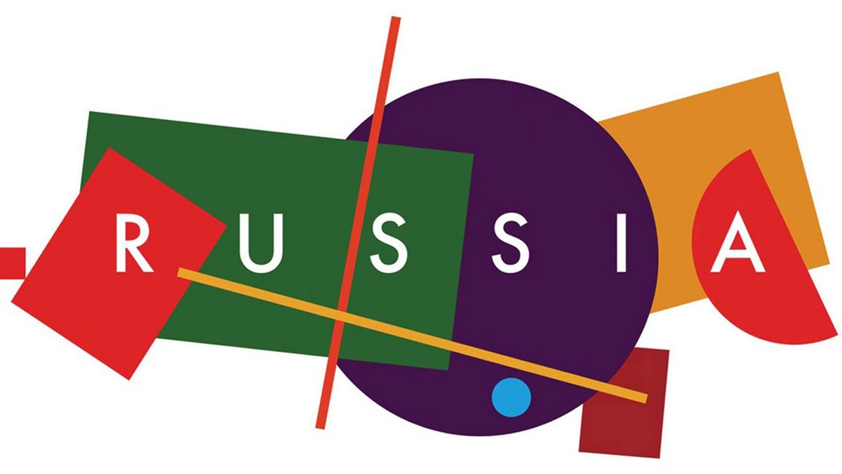
How do you sum up the world's largest country in a piece of branding? That was the challenge faced by Russia's tourist board, which wanted a new identity that would draw travellers and tourists to the country. Its solution, inspired by suprematist art, was a geometric design that could swap out different elements.
Accompanied by the slogan "the whole world within Russia", the new Russian tourism logo depicts Russia with a group of 10 brightly coloured shapes that represent different regions in the country.
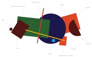
A team of five designers from four Russian agencies – namely Suprematika, Plenum, Artonika and Art.Lebedev – are behind the identity.
The logo itself takes its lead from the avant-garde art movement Suprematism, which relies on communicating artistic feeling rather than an accurate depiction of objects. Often this sees a subject take the form of abstract shapes.
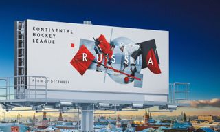
Thanks to its size and diverse population, Russia can mean different things depending on who you talk to. To reflect this flexibility, the design is open to adaptation by changing out a shape in favour of a photograph or object.
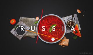
This is a really clever way of representing lots of different facets of Russia while keeping the design and message consistent at the same time.
For example, to communicate Russia's varied landscape, photographs of mountains, forests and volcanoes can be brought together using the format of the shapes.
Get the Creative Bloq Newsletter
Daily design news, reviews, how-tos and more, as picked by the editors.
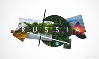
As Egor Myznik, creative director at Plenum strategic marketing agency, says on the Russia brand website: "What can be easier than describing your home country? In an instant, you come up with tons of significant things that you are proud of: food, art, nature, people, events.
"The toughest part is to describe so many things and keep it clear and simple at the same time. The created concept elegantly solves this problem, and on top of that gives a lot of freedom in visual system development."
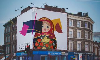
The identity was chosen as the winner of a competition held by the Federal Agency for Tourism of the Russian Federation and the Association of Branding Companies of Russia.
Launched way back in 2015, the competition was open to submissions from anyone. It saw 480 logos and 600 slogans pitched for consideration before the winning design was chosen from a shortlist of 10 in a public vote.
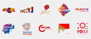
Art historians could debate all day about whether or not this an accurate use of Suprematism. After all the shapes, while abstract, do sort of follow the sprawling boundaries of the country once you know that's what they stand for. But these people should keep in mind that this is a tourism campaign, not a curated exhibition.
This abstract, avant-garde approach is a welcome change of pace to run of the mill tourism branding that relies on recognisable landmarks or flags. The new identity is original, distinctive, and turns people on to an art movement that the country is famous for. What's not to love?
Related articles:

Thank you for reading 5 articles this month* Join now for unlimited access
Enjoy your first month for just £1 / $1 / €1
*Read 5 free articles per month without a subscription

Join now for unlimited access
Try first month for just £1 / $1 / €1
Dom Carter is a freelance writer who specialises in art and design. Formerly a staff writer for Creative Bloq, his work has also appeared on Creative Boom and in the pages of ImagineFX, Computer Arts, 3D World, and .net. He has been a D&AD New Blood judge, and has a particular interest in picture books.
Related articles
-

-
-

-
