Fan's Russian Simpsons intro is too grim for TV
This alternative title sequence is a far cry from Springfield.

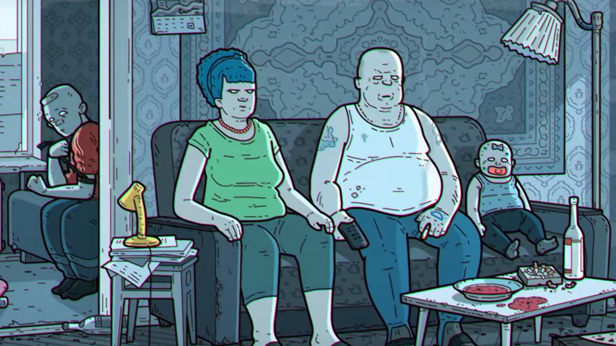
When it first aired, The Simpsons was a groundbreaking piece of subversive pop culture. But even in its heyday the show never went as far as this fan's dark version of the programme's intro, which sees the famous family reimagined as downtrodden citizens in a rather depressing-looking Russia.
Thanks to its never-ending repeats, The Simpsons intro is probably one of the most well-known TV title sequences of all time. This makes it a perfect vehicle for parody, as viewers will be able to draw comparisons between imitations and the real deal.
This clip though, created by YouTube animator Lazy Square, takes things to a grim new level. Each beat of the title sequence is followed, but everything's off.
The contrast can be seen immediately. Gone are the distinctive silhouettes that were Simpsons creator Matt Groening's shortcut to good character design. Instead, Marge's tall beehive is tied down, and the jagged outlines of Lisa and Maggie are replaced with utilitarian, close-cropped haircuts.
The vibrant colours of Springfield are also gone, Marge berates the cashier in a dank convenience store, and Lisa is threatened by armed policemen for blowing her sax. Check it out below.
There are plenty of little details that will make you re-watch this video. Is that Bart getting beaten up by bullies in the beginning? And just where does Lisa disappear to in the end? As far as fan films go, this one is bleak.
Of course, the programme itself never shied away from taking a pop at Russia. Who could forget the scene where Lenin bursts out of his mausoleum growling "must, crush, capitalism"? Or the Eastern European version of Itchy and Scratchy, called Worker and Parasite?
Get the Creative Bloq Newsletter
Daily design news, reviews, how-tos and more, as picked by the editors.
However, The Simpsons has also come under fire in recent years for its stereotypical depiction of different ethnicities, such as the Kwik-E-Mart's tireless manager, Apu. Even a fumbled apology didn't get the show off the hook in the eyes of some fans.
So does this violent parody also cross the line? It's hard to tell from comments, most of which are written in Cyrillic characters. But if the 'like' bar is anything to go by (currently it stands at 32,000 thumbs up to 2,000 thumbs down), it looks like Lazy Square has hit a home run.
Related articles:

Thank you for reading 5 articles this month* Join now for unlimited access
Enjoy your first month for just £1 / $1 / €1
*Read 5 free articles per month without a subscription

Join now for unlimited access
Try first month for just £1 / $1 / €1
Dom Carter is a freelance writer who specialises in art and design. Formerly a staff writer for Creative Bloq, his work has also appeared on Creative Boom and in the pages of ImagineFX, Computer Arts, 3D World, and .net. He has been a D&AD New Blood judge, and has a particular interest in picture books.
