The Royal Astronomical Society gets a mesmerising new logo
Johnson Banks has delivered the RAS' first new logo since 1820.

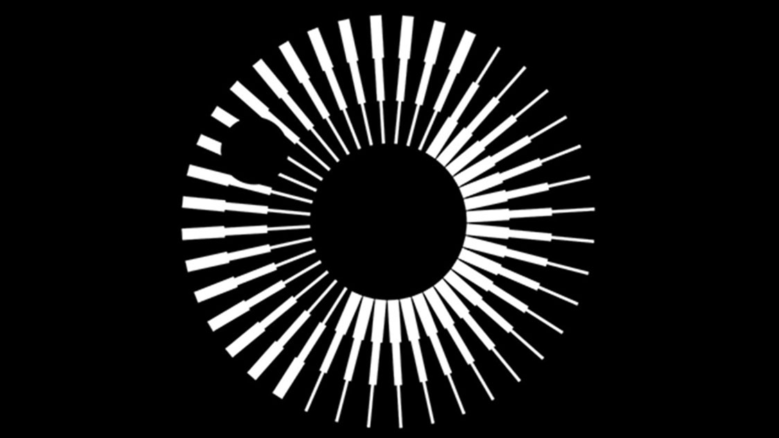
The Royal Astronomical Society is celebrating its 200th birthday this year, and is marking the occasion with a rebrand that includes a redesign of its logo – the first logo overhaul since the society was founded back in 1820.
Johnson Banks is responsible for the new look, which is a huge departure from the previous incarnation and certainly brings the society hurtling into a new era. Let's take a look at the new version (check out our logo design post for all you need to know about creating new logos).
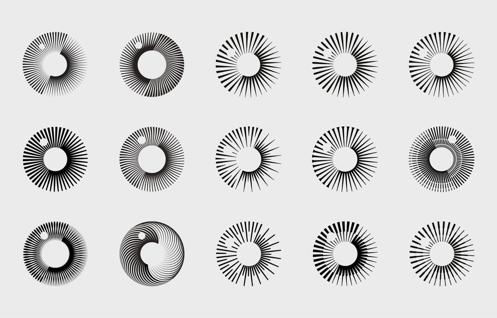
Based on the RAS' motto: 'Let whatever shines be observed', Johnson Banks says that the celestial symbol can be interpreted in different ways. The repeated stepped spokes (which, when observed in the universe, are thought to be radial fingers of light) make up a rotating emblem that's reminiscent of a sun, planet or moon – reflective of RAS' focus on the universe.
The small black, moving dot looks like a sun spot, or an orbiting moon. In a further astronomical touch, the symbol is tilted 23.5 degrees to mirror how the Earth is tilted from the plane of its orbit around the sun. The positioning of the typography allows the symbol to shine above it, like a celestial body above the Earth.

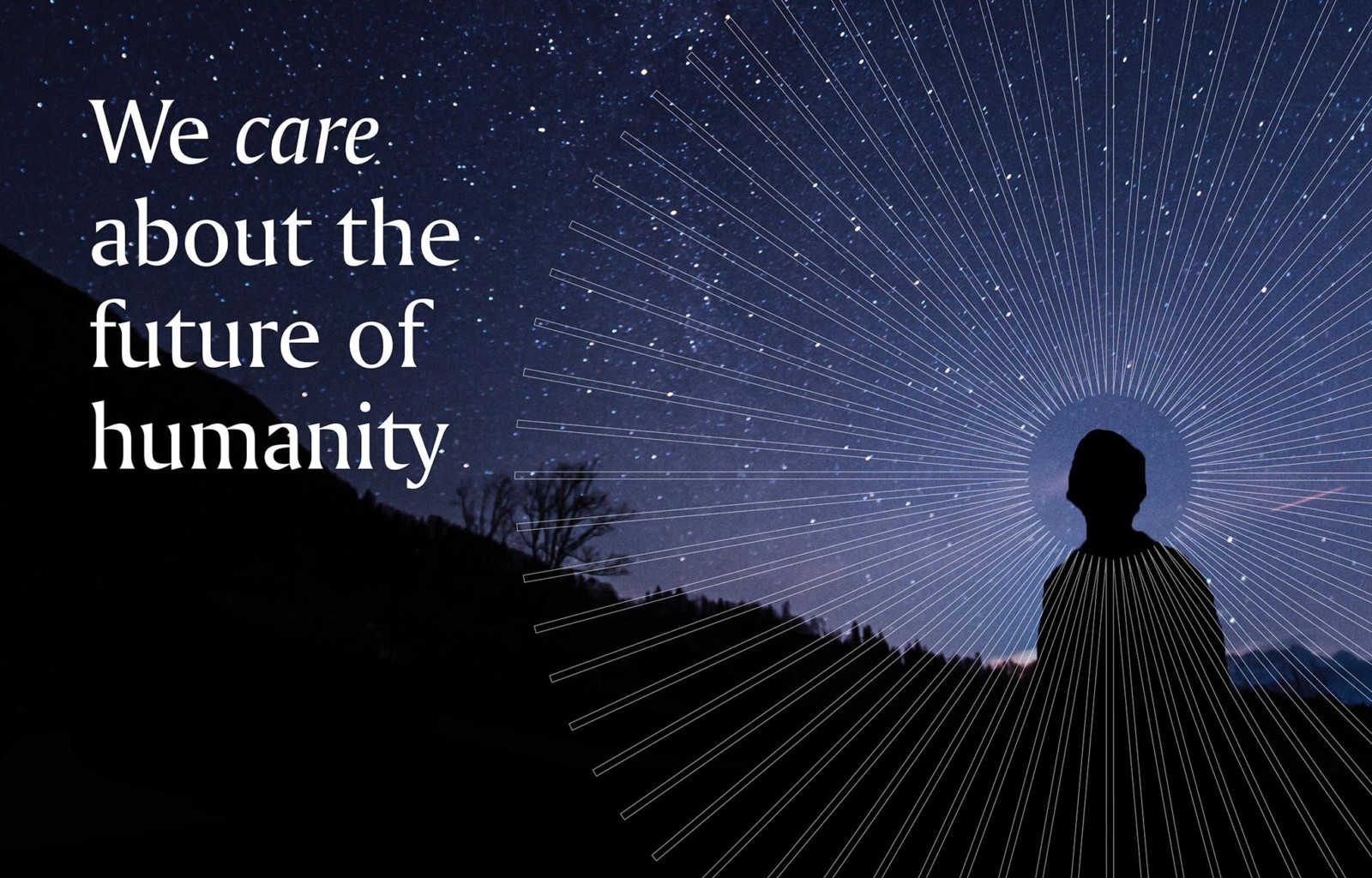
Accompanying material is made up of images of the planets, sun and geological formations, and the imagery has a base colour palette of black, white and grey. The picture below also includes a nod to the logo design with the halo of light circling the head of a young person gazing at the stars.

The new look aims to appeal to attract a younger and more diverse membership. And according to Johnson Banks, the brand-new logo and accompanying imagery better reflects the purpose of the RAS, which is to "to explore our planet and the Universe around us and to share its learning for the benefit of society".

The old logo (above) included an engraving of the telescope designed by Sir William Herschel, the society's first president. But it was cluttered, meaning it didn't reproduce well in a small size – or on a screen. The connotations of the old-style telescope also didn't convey the potential that comes with the current and future exploration of space.
Get the Creative Bloq Newsletter
Daily design news, reviews, how-tos and more, as picked by the editors.
We think the new design is sleek, technical and future-proof while managing to retain character. While this redesign is yet another scaling back of a fussy logo – a trend that has prompted pros to ask if branding has become boring – this one manages not to feel flat or lacking in character.
Read more:

Thank you for reading 5 articles this month* Join now for unlimited access
Enjoy your first month for just £1 / $1 / €1
*Read 5 free articles per month without a subscription

Join now for unlimited access
Try first month for just £1 / $1 / €1

Georgia is lucky enough to be Creative Bloq's Editor. She has been working for Creative Bloq since 2018, starting out as a freelancer writing about all things branding, design, art, tech and creativity – as well as sniffing out genuinely good deals on creative technology. Since becoming Editor, she has been managing the site and its long term strategy, helping to shape the diverse content streams CB is known for and leading the team in their own creativity.
