Stunning Rolls-Royce rebrand is a detail-driven triumph
Blending the luxury and contemporary.
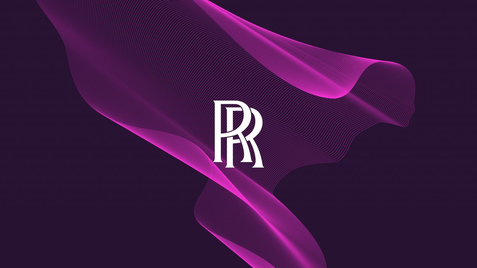
Luxury car brand Rolls-Royce has rolled out a brand new identity, including a redesign of its iconic emblem. As part of an evolution from car manufacturer to "the world's leading house of luxury," the company is promoting its Spirit of Ecstasy figurine to its main logo, while the 'RR' monogram takes a back seat.
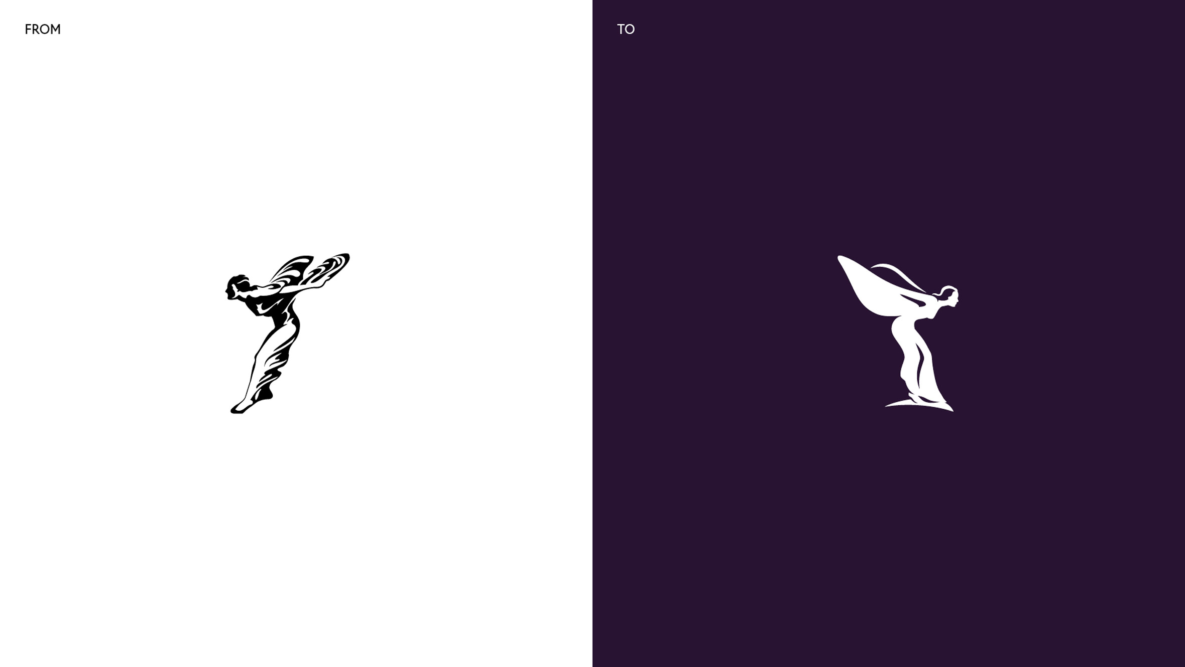
Designed by Pentagram, the new Spirit of Ecstasy symbol (below) has been flipped to face the right, with details pared back to allow a bolder and more minimal design. The new symbol was designed with digital in mind, as the former was "too complex". For more iconic designs, take a look at our best logos of all time.
While the Spirit of Ecstasy ornament has adorned the bonnet of every Rolls-Royce since 1911, the company's identity itself has until now been led by the 'RR' monogram (below). While the monogram remains unchanged (and will still appear on "collateral" material), the Spirit of Ecstasy will replace it as the company's main symbol – designed to embody "beauty, luxury, style and perfection".

The Spirit of Ecstasy logo is certainly a bolder and more contemporary design than the traditional monogram, but there's no denying that the latter is instantly recognisable (which, as these car logos hilariously drawn from memory prove, isn't always the case). "It would feel strange if it suddenly looked a little bit different, since it's so valued and recognisable," Pentagram's Marina Willer explains in a press release. It will be interesting to see if the Spirit of Ecstasy remains as iconic away from the car bonnet.
In a news post introducing the rebrand, Rolls-Royce says the new identity is intended to resonate with a younger demographic, with the age of its clients having recently "decreased significantly to an average of just 43". As well as the more digital-friendly logo, Pentagram also created a more abstract and fluid "expression" of the symbol (below), designed to add "a cutting-edge aura to the new visual identity".
5/5 The Spirit of Ecstasy Expression. A wholly new visual treatment of the Spirit of Ecstasy with its cutting-edge aura. The Expression will become a distinctive and recognisable element of the marque's visual language, a key signifier of a House of Luxury. pic.twitter.com/WE9FKR4VXUAugust 25, 2020
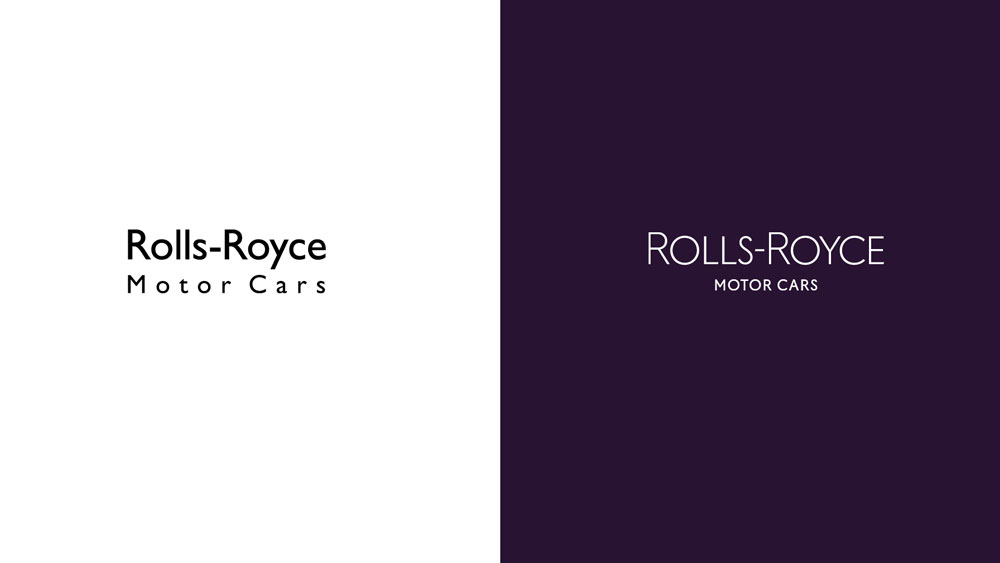
The company's typeface has also been updated. Replacing the previous Gill Sans is the thinner Riviera Nights, which features additionally crafted and bezelled letters. The wordmark (below) is now all upper-case, while the kerning of 'motor cars' has been drastically reduced. We're big fans of the crisp new typeface, which is not only more contemporary, but also manages to convey that all-important sense of luxury with its delicate lines and subtle details (such as the slanted ends of the letters 'L' and 'E').
It's refreshing to see that, unlike other car brands such as BMW or Nissan, Rolls-Royce hasn't simply opted to join the flat design party with a 2D version of its existing logo. From subtle typeface updates to the new logo, this is a comprehensive, detail-oriented rebrand, which successfully carries the company's sense of luxury into the digital age. Like its recent rebrands for Fisher-Price and Blood Cancer UK, this is another hit from Pentagram.
Get the Creative Bloq Newsletter
Daily design news, reviews, how-tos and more, as picked by the editors.
Read more:

Thank you for reading 5 articles this month* Join now for unlimited access
Enjoy your first month for just £1 / $1 / €1
*Read 5 free articles per month without a subscription

Join now for unlimited access
Try first month for just £1 / $1 / €1

Daniel John is Design Editor at Creative Bloq. He reports on the worlds of design, branding and lifestyle tech, and has covered several industry events including Milan Design Week, OFFF Barcelona and Adobe Max in Los Angeles.
