Ingenious road safety poster is a hit online
Sometimes the old ones are the best.

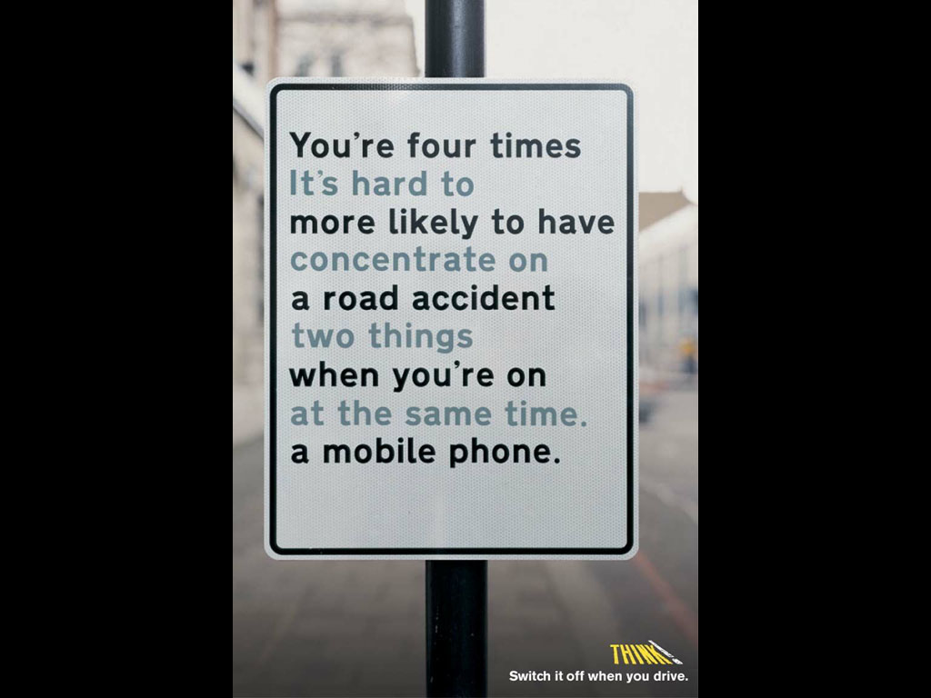
We see plenty of brilliant print ads, and the best examples are often designed to make the viewer double-take. That's certainly the case with this brilliant road safety ad, which, at first glance, makes absolutely no sense. Which is exactly the point.
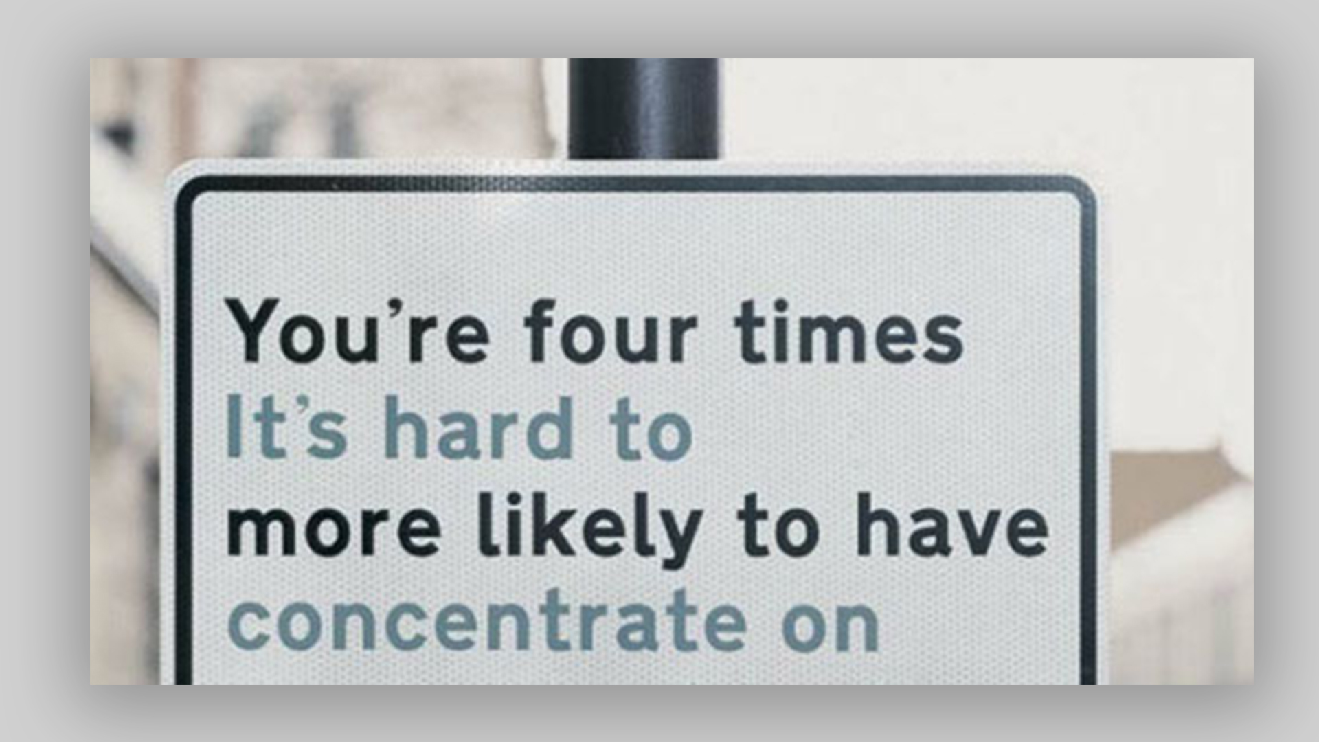
Designed to discourage drivers from mobile phone use at the wheel, the ad depicts a road sign featuring two sentences interweaved together – making it difficult to focus on either. (Looking for more inspiration? Check out the best print ads of all time).

The two sentences on the fictional sign read, "You're four times more likely to have a road accident when you're on a mobile phone", and, "It's hard to concentrate on two things at the same time." And, yep, if you drove past the sign, you'd be pretty baffled. As many have pointed out, that sounds like a hazard in itself – but don't worry, this isn't a real road sign.
The poster was created by Think!, which runs the UK's government's road safety campaigns. And, believe it or not, the ad originates from all the way back in 2002 – when mobile phones were much less 'smart' (read: distracting). Created by AMV BBDO, it feels more pertinent today than ever. "Now that's good," one Redditor comments, while another adds, "I was ready to call this a crappy design until I saw what the other colour said. It's actually genius."
From this brilliant lockdown-themed Kit-Kat poster to that genius Norwegian Airlines ad, we've seen some brilliant print design over the last few months. Want to create an ad of your own? Check out our guide on how to download InDesign.
Read more:
- Download Photoshop: How to try Photoshop with Creative Cloud
- Apple's iPhone 14 Pro could beat the 13 Pro in one key area
- Adobe Illustrator tutorials: 41 lessons to boost your skills
Get the Creative Bloq Newsletter
Daily design news, reviews, how-tos and more, as picked by the editors.

Thank you for reading 5 articles this month* Join now for unlimited access
Enjoy your first month for just £1 / $1 / €1
*Read 5 free articles per month without a subscription

Join now for unlimited access
Try first month for just £1 / $1 / €1

Daniel John is Design Editor at Creative Bloq. He reports on the worlds of design, branding and lifestyle tech, and has covered several industry events including Milan Design Week, OFFF Barcelona and Adobe Max in Los Angeles.
