Here's how your favourite websites would have looked in the 90s
The nostalgia is strong with this one.
Perhaps it's something to do with the 18 months we've all had, but it seems nostalgia is the order of the day right now. We've seen all manner of retro comebacks in the tech and design worlds lately – and this might be the most delightful yet.
90s web design will never not be charming, so it was only a matter of time before someone rendered some of today's most popular websites in a vintage (read: pixelated) style. If you're looking for some more contemporary inspiration, check out our favourite website templates.
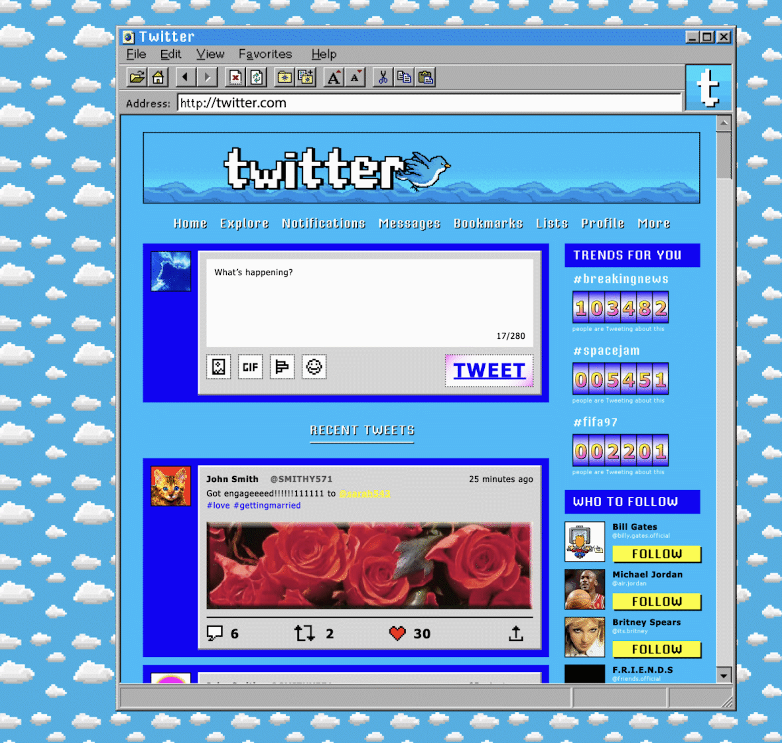
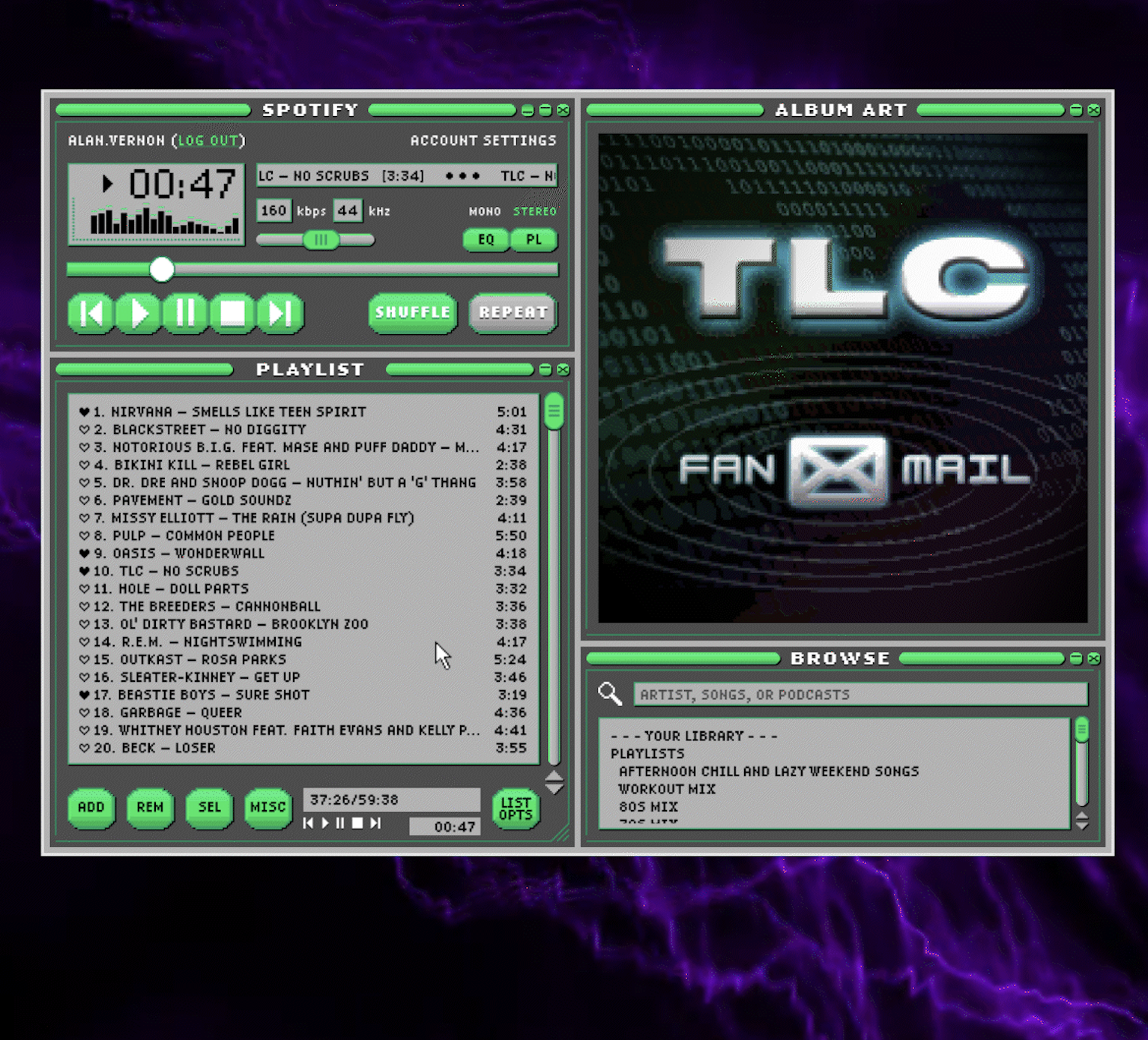
Website builder Zyro has envisioned Twitter, WhatsApp, YouTube and more as 90s websites, and the result is a nostalgic treat. Repeating pattern backgrounds? Check. An obscene amount of windows? Check. A ridiculous amount of animated gifs? Oh yes.
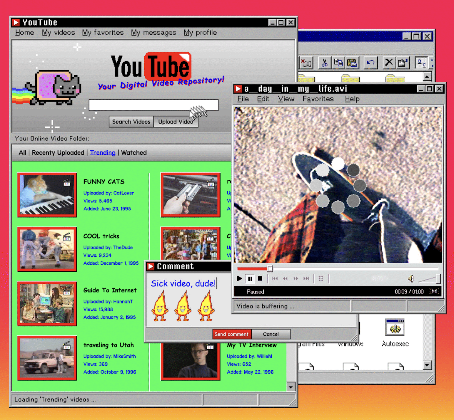
One of our favourite examples has to be Spotify (below). Complete with psychedelic background, the grungey interface is a far cry from the sleek, clean interfaces of today – and is giving us no shortage of Winamp vibes.
The Zyro team has even imagined each website or app as a 90s-style floppy disk, complete with outrageously realistic artwork. The nostalgia here is too much. Too much!
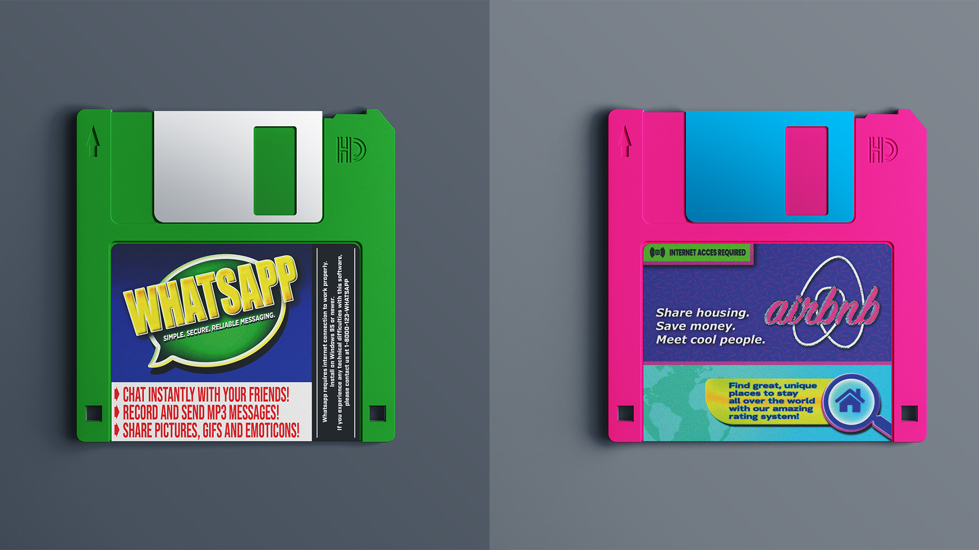
From this virtual iPod on your iPhone to that iOS 4 recreation, it's clear that the internet is yearning for simpler times right now. And if we're honest, we're not surprised. If you're inspired to create a web design of your own, check out the best web design tools available right now.
Read more:
Get the Creative Bloq Newsletter
Daily design news, reviews, how-tos and more, as picked by the editors.

Thank you for reading 5 articles this month* Join now for unlimited access
Enjoy your first month for just £1 / $1 / €1
*Read 5 free articles per month without a subscription

Join now for unlimited access
Try first month for just £1 / $1 / €1

Daniel John is Design Editor at Creative Bloq. He reports on the worlds of design, branding and lifestyle tech, and has covered several industry events including Milan Design Week, OFFF Barcelona and Adobe Max in Los Angeles. He has interviewed leaders and designers at brands including Apple, Microsoft and Adobe. Daniel's debut book of short stories and poems was published in 2018, and his comedy newsletter is a Substack Bestseller.
