Renault has a new logo (but no one seems to have noticed)
Flat design falls flat.

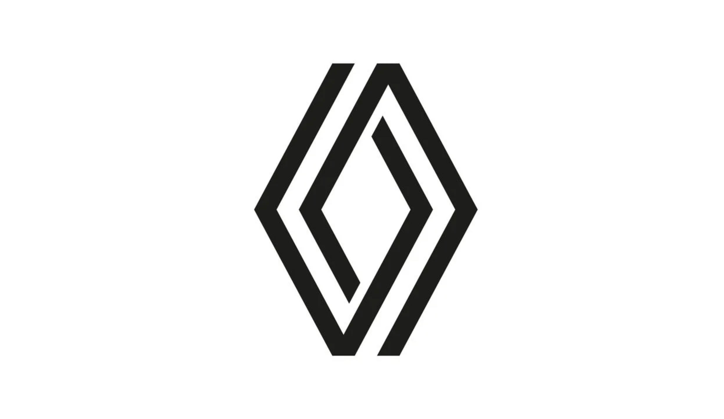
Most brands introduce their new logos with a flurry of press, a fanfare or (at the very least) a tweet. But Renault recently sneaked out a brand-new design (above) for its iconic Rhombus, and it's gone largely unnoticed.
In fact, the car brand first previewed its updated retro-style logo in January, in a blink-and-you'll-miss-it concept ad for the upcoming Renault 5 EV. It has just been spotted again in an advertising campaign set to hit screens soon – this time for the Zoé E-Tech. But the retro-inspired, simpler design has been barely commented on by Renault itself. An unusual strategy, not often used by brands with the best logos.

Much like with Peugeot's recent logo change, Renault has ditched its signature shiny silver and moved to a monochrome emblem straight out of the flat design handbook. It's an angular affair, which pairs up well with the new Peugeot lion – a potential consideration for the two brands, which are now linked together as part of the Stellantis group. Shame that Stellantis didn't get the style memo when it adopted what could be the worst logo ever.
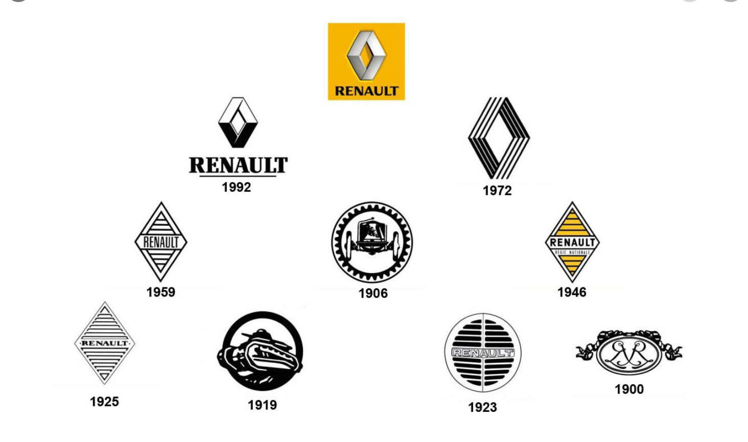
The flattened logo sets the brand up well for the future because it can be backlit by the electric car that will be so integral to the future of the industry. Much like Peugeot, though, Renault drew on a past design to create the new one – the four-line 1972 version of the rhombus (below).

So how has it been received? Well, there's relatively little chat right now, but the opinions we sniffed out aren't super-convinced – perhaps conveying much of the negative feeling towards the current onslaught of flat design (designers are not loving the trend, as our recent post shows). Is the logo a little too simple?
It's still wild to me that this is the way of design now, even when I prefer it. I always enjoy imagining the reactions of people "back then" if I were to propose today's simple/clean design rather than this silver design that was first accepted. Would they think it's lazy? https://t.co/GDJbUmwZSAMarch 3, 2021
Graphic Design is my passion.. but not their. https://t.co/opESpPraC6March 4, 2021
Welcome to the flat design generation... https://t.co/KuKFPwVeH4March 3, 2021
And there's more than one comparison to Umbro.
On dirait le logo de Umbro tourner à 90° pic.twitter.com/VuPEk1L6kBMarch 3, 2021
Renault's whole line will carry the new emblem from 2022, with the group reportedly "gradually exchanging" the old emblem for the new one – across all channels including print, social and on the actual cars (of course). This strategy is less akin to the roar of a petrol engine and more the low hum of the electric cars it will adorn – and it's certainly unusual.
Get the Creative Bloq Newsletter
Daily design news, reviews, how-tos and more, as picked by the editors.
The silent rollout of the new rhombus couldn't be further away from the over-the-top ridiculousness of the recent reveal of Kia's new logo and, to be perfectly honest, we're not sure which we prefer.
Read more:

Thank you for reading 5 articles this month* Join now for unlimited access
Enjoy your first month for just £1 / $1 / €1
*Read 5 free articles per month without a subscription

Join now for unlimited access
Try first month for just £1 / $1 / €1

Georgia is lucky enough to be Creative Bloq's Editor. She has been working for Creative Bloq since 2018, starting out as a freelancer writing about all things branding, design, art, tech and creativity – as well as sniffing out genuinely good deals on creative technology. Since becoming Editor, she has been managing the site and its long term strategy, helping to shape the diverse content streams CB is known for and leading the team in their own creativity.
