These rejected Shining posters by Saul Bass are wonderfully spooky
And feature messages from director Stanley Kubrick.

The Shining is one of the most famous horror movies of all time and its poster, designed by Saul Bass, is equally as iconic. But what if we told you that there were a number of rejected posters for the Kubrick classic.
A handful of posters designed by Saul Bass for Stanley Kubrick's movie The Shining have resurfaced online just in time for Halloween. The posters, spotted at a London exhibition back in 2019, feature a range of Shining-related designs as well as handwritten notes by Kubrick himself. In the small collection of posters, you can see the similarities between the potential designs and the final design. If you think you can design a poster as iconic as some of Bass', then why not check out our roundup of the best poster makers and have a go yourself.
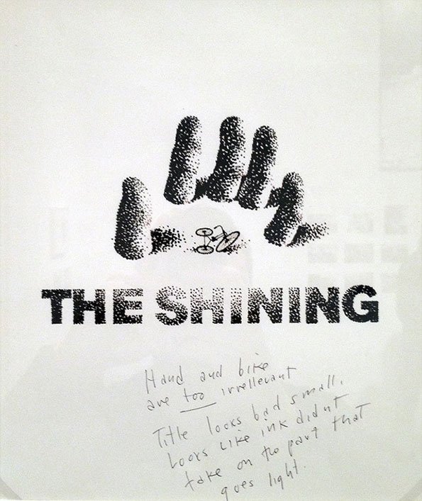
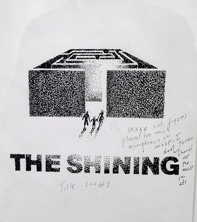
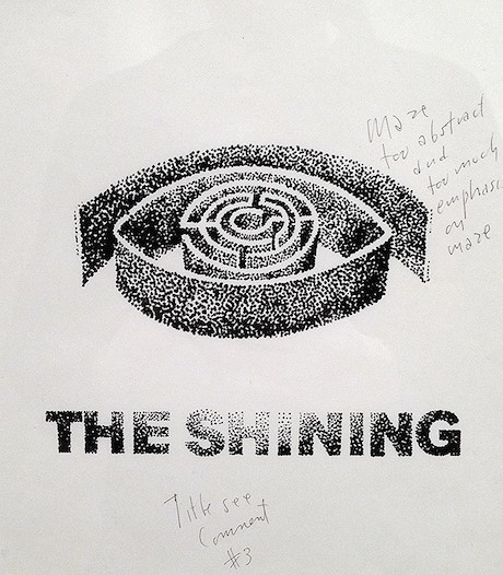
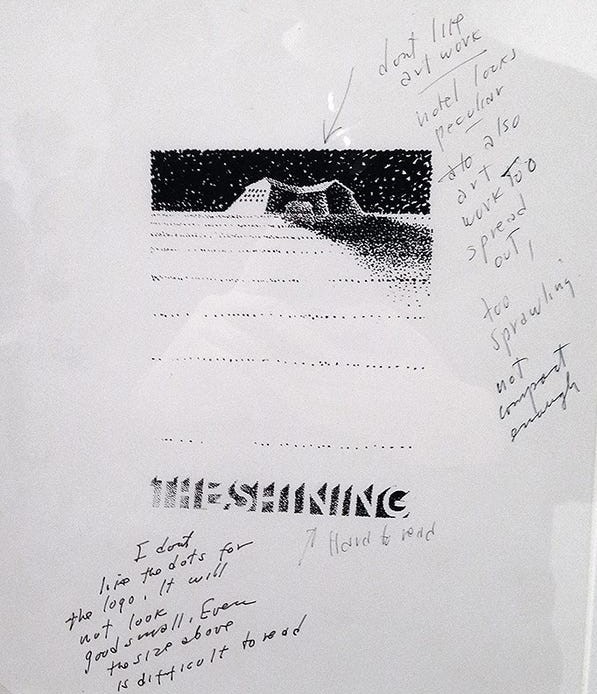
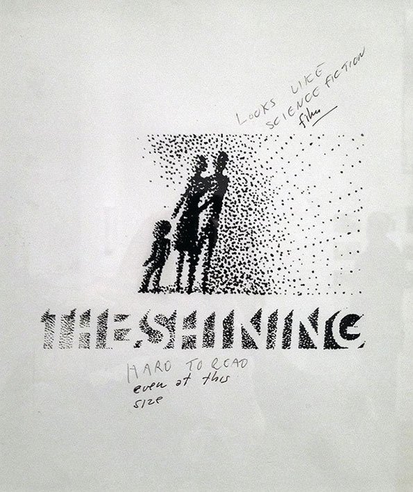
Alongside the handful of rejected designs, you can see a number of handwritten notes by Kubrick himself, which point out why the poster resulted in being rejected. Some say that some of Bass' designs included drawings that were "irrelevant" or "hard to read".
The posters were on show at a Stanley Kubrick exhibition at the Design Museum in London back in 2019. According to the Design Museum, Bass designed over 300 different potential posters for Kubrick before he was satisfied with the iconic poster of the terrifying pointillism face in the lettering of the word 'The' (see below.)
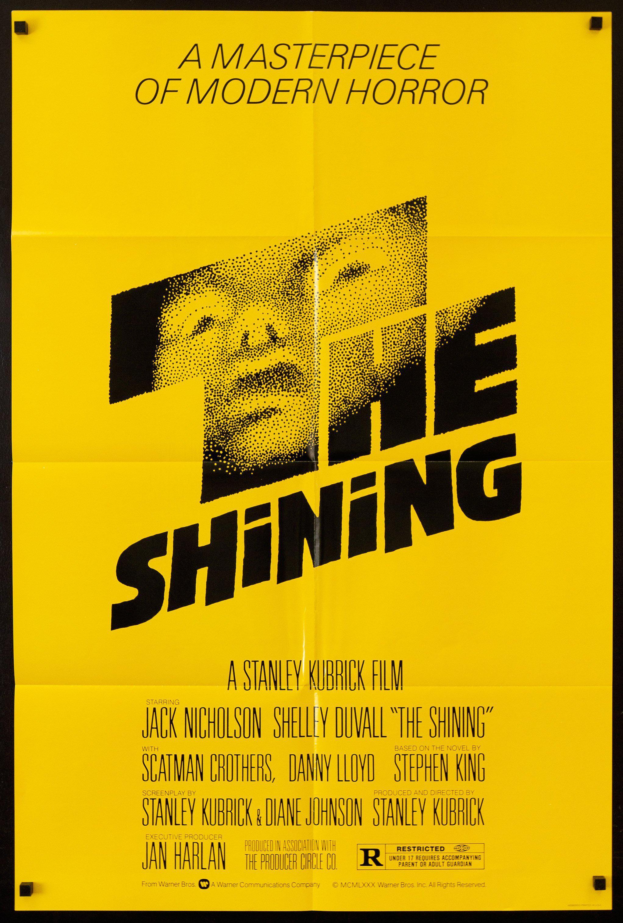
We love all the rejected designs but can see why Kubrick chose the one we recognise today. With its incredible design that captures such a threatening expression, it's a simple yet effective poster. Not to mention the genius use of blank space that creates a sense of terror and a supernatural aura which keeps perfectly in theme with the movie.
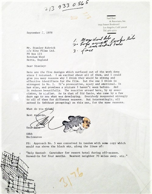
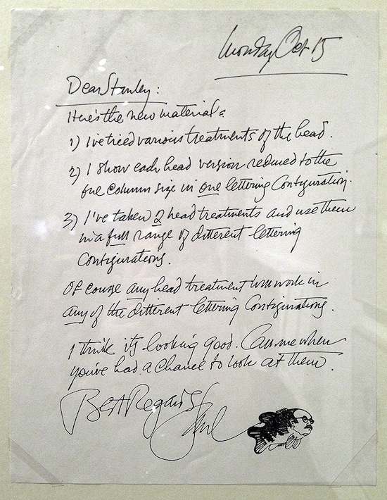
The exhibition also had letters from Saul Bass to Stanley Kubrick (see below.) In the letters, Bass explains some of the designs and talks about the changes he has made to the designs to cater to Kubricks demands. The entire collection of posters and letters are an interesting insight into Bass' workflow and Kubrick's commanding character that helped him direct so many influential movies.
The rejected designs have recently resurfaced again on Twitter and have been dividing users. While some love the designs, others are not as keen.
Get the Creative Bloq Newsletter
Daily design news, reviews, how-tos and more, as picked by the editors.
Pour one out for Saul and his rejected Maze drawings 😔May 8, 2020
Love seeing the development of design & Kubrick running his meticulous attention to detail through absolutely every element. This is how you go one step further & produce genuine quality 🙌🏽May 8, 2020
I want a poster out of the 1st one!May 8, 2020
We love the designs though and reckon that they would look brilliant framed and hung (even if they are a little bit spooky.) If you are looking for some more poster inspiration then why not check out our roundup of the most inspirational posters?
Read More:
- Turns out Muhammad Ali was also a $1M contemporary artist
- New Canva logo is a triumph
- Steve Jobs tribute is a nostalgic tour of Apple tech

Thank you for reading 5 articles this month* Join now for unlimited access
Enjoy your first month for just £1 / $1 / €1
*Read 5 free articles per month without a subscription

Join now for unlimited access
Try first month for just £1 / $1 / €1

Amelia previously worked as Creative Bloq’s Staff Writer. After completing a degree in Popular Music and a Master’s in Song Writing, Amelia began designing posters, logos, album covers and websites for musicians. She covered a range of topics on Creative Bloq, including posters, optical illusions, logos (she's a particular fan of logo Easter eggs), gaming and illustration. In her free time, she relishes in the likes of art (especially the Pre-Raphaelites), photography and literature. Amelia prides herself on her unorthodox creative methods, her Animal Crossing island and her extensive music library.
