Can you guess the brand from these reimagined logos? (Because we couldn't)
These sure aren't the originals.
You might be able to recreate your favourite brand logos from memory, or rattle off their taglines, but could you recite big brands' mission statements? We'd be impressed if you could – most mission statements aren't exactly known for being snappy.
Drawing on this, one recent study asked artists and designers from around the world to create company logos based on brands' mission statements. What they didn't know was that these were the "missions" of some of the top brands in the world, with some of the best logos ever.
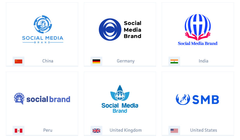
The logos they created are a mixed bunch, with many of them a far cry from the brands' actual logos. Can you guess the original logos of the interpretations below? The social media brand logos below are based on the following mission statement:
"We empower people to build communities, feel connected to others around the globe, and come together to make positive change in the world. We are all connected, and in order to end poverty, disease, help the environment, and spread freedom and tolerance, as well as end terrorism, we have to do it together, globally."

This one is Facebook – interesting that they are all blue.
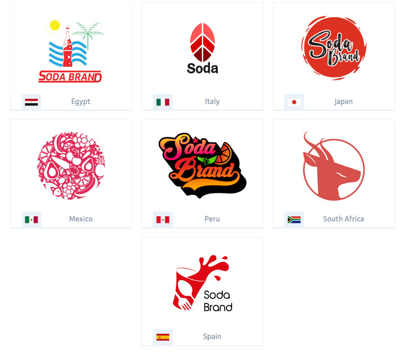
What about the one below? What soda brand could the designers have redrawn? The mission statement includes: "We aim to keep people around the world refreshed and make a difference."

Yet again, the colour palette seems to have been influenced by the brand they designers didn't know they were drawing: Coca-Cola. Or perhaps they guessed they were drawing these big brands, and were influenced by them?
Get the Creative Bloq Newsletter
Daily design news, reviews, how-tos and more, as picked by the editors.
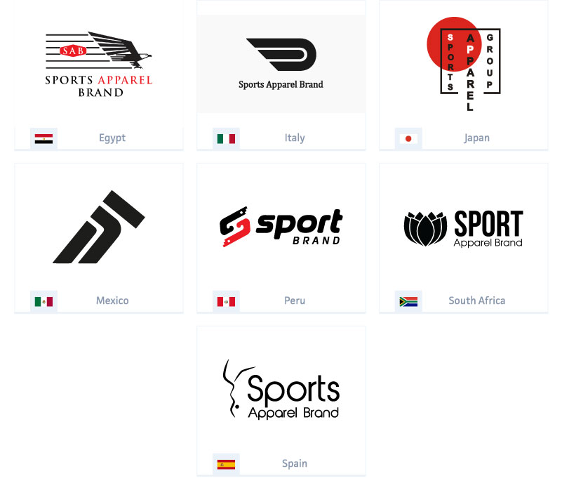
The next logo was drawn based on its "mission to inspire athletes around the world and help them innovate".

This one arguably might have been a number of sports brands, but it was actually Nike. The black used suggests that the colour has become associated with sports branding.
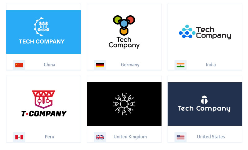
The next one was a reimagining of a tech company – its statement includes: "We believe our company is here solely for the purpose of making great products".

With that statement, it could've been any number of tech companies, but it was Apple. The designers' reimaginings of the Apple logo were a little more random, with no uniform colour and a range of interpretations. We like the United Kingdom's version, which brings to mind an interconnected web.
You can read more about the study over on the Best SEO Companies website.
If you're searching for your own ideas for a logo, then don't miss our guide to finding logo inspiration.
Read more:

Thank you for reading 5 articles this month* Join now for unlimited access
Enjoy your first month for just £1 / $1 / €1
*Read 5 free articles per month without a subscription

Join now for unlimited access
Try first month for just £1 / $1 / €1

Rosie Hilder is Creative Bloq's Deputy Editor. After beginning her career in journalism in Argentina – where she worked as Deputy Editor of Time Out Buenos Aires – she moved back to the UK and joined Future Plc in 2016. Since then, she's worked as Operations Editor on magazines including Computer Arts, 3D World and Paint & Draw and Mac|Life. In 2018, she joined Creative Bloq, where she now assists with the daily management of the site, including growing the site's reach, getting involved in events, such as judging the Brand Impact Awards, and helping make sure our content serves the reader as best it can.
