Artist gives famous logos an awesome neon makeover
Are these chrome redesigns better than the originals?
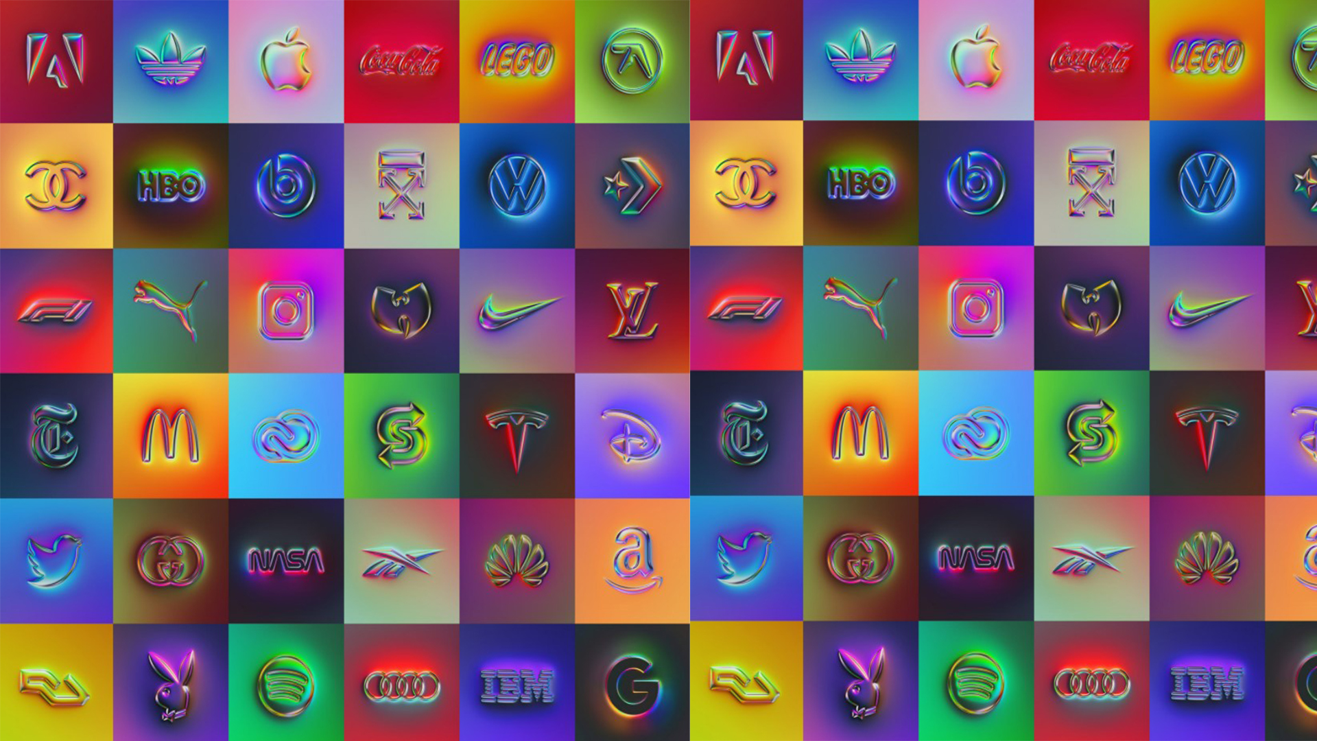
It's no secret that we love a well-designed logo here at Creative Bloq, and these amazing reimagined designs are no exception. Sporting a chrome effect, these are the world's most famous logos like you've never seen them before.
One artist has redesigned the logos for a number of famous brands, from Apple to Nasa to McDonald's to Twitter. The designs have had a very modern chrome-style makeover which transforms the original logos into a sleek 3D design. The new logos now sport a range of psychedelic colours, making them incredibly eye-catching and fun. If you fancy having a go at designing your own logo, make sure you check out our 15 golden rules of logo design.
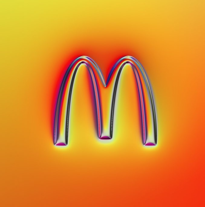
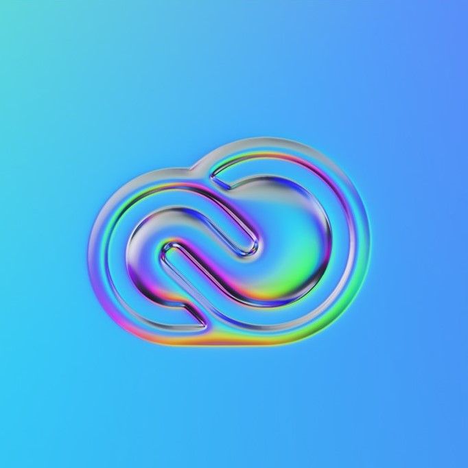
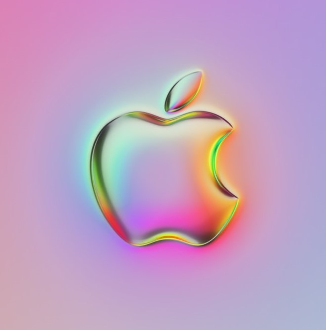
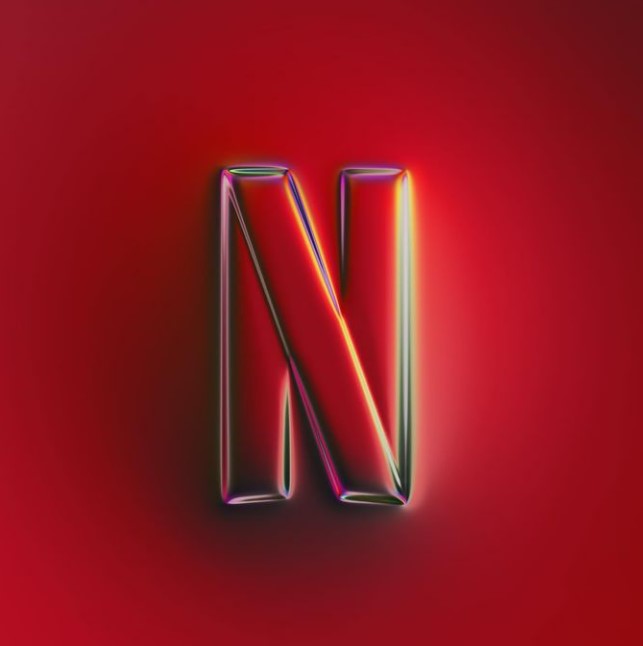
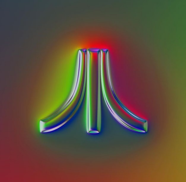
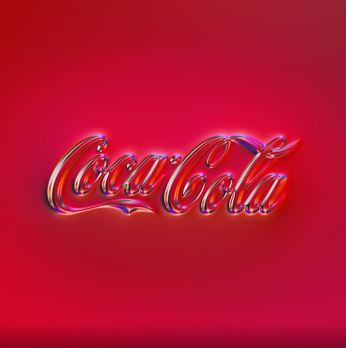
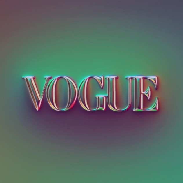
The project started as a challenge for artist Martin Naumann to redesign 36 famous logos but has since transgressed into a 100 logo project following the popularity of the designs online. Naumann said on his Behance project page, "I tried to create my own interpretation of the individual logotypes - inspired, but mostly deviating from the brand guidelines."
The artist goes on to describe the style of the redesign as an "overblown form of neumorphism, which is characterized by its holographic chrome textures." If you're wondering what neumorphism is, have a look at our article.
With over 20k followers on Instagram, Naumann has built a wide fan base and his posts get plenty of comments. One user commented on the Instagram post of the F1 redesign, "love the holographic feel to this!" and another commented on Naumann's Adobe redesign, "Dude I've been binging off your art and I love it!"
A post shared by Martin Naumann (@mnaumanndesign)
A photo posted by on
A post shared by Martin Naumann (@mnaumanndesign)
A photo posted by on
Over on Twitter, one user asked, "How come I want to lick these?" And while we don't fancy having a bite, we definitely think that these redesigns are super cool. The colour schemes and chrome effect are incredibly satisfying. Perhaps the big brands should be changing their logos to these designs instead of this TikTokker's hilarious rebranding that is sweeping the web.
If you are hoping to design your own logos, make sure you read through our guide on logo typography, or why not check out our roundup of the most memorable logos to spark inspiration?
Get the Creative Bloq Newsletter
Daily design news, reviews, how-tos and more, as picked by the editors.
Read More:
- Awesome new James Bond poster reveals the best ever 007 outfits
- Jessica Rabbit's controversial makeover has fans divided
- Will the iPhone 14 look radically different to the iPhone 13?

Thank you for reading 5 articles this month* Join now for unlimited access
Enjoy your first month for just £1 / $1 / €1
*Read 5 free articles per month without a subscription

Join now for unlimited access
Try first month for just £1 / $1 / €1

Amelia previously worked as Creative Bloq’s Staff Writer. After completing a degree in Popular Music and a Master’s in Song Writing, Amelia began designing posters, logos, album covers and websites for musicians. She covered a range of topics on Creative Bloq, including posters, optical illusions, logos (she's a particular fan of logo Easter eggs), gaming and illustration. In her free time, she relishes in the likes of art (especially the Pre-Raphaelites), photography and literature. Amelia prides herself on her unorthodox creative methods, her Animal Crossing island and her extensive music library.
