Real-life renders of animated bedrooms are strangely disappointing
Proof that animation makes everything more magical.
The cool thing about animation is that while the elements of a story may feel familiar – perhaps the characters are human, and live in the sort of houses we recognise – the animated format allows us to suspend our disbelief. Things happen in cartoons that wouldn't happen in real life. And largely, as an audience, we'll happily accept that.
And when designers are creating sets for their character designs (see our character design tips for advice on crafting your own), they can also forget the practicalities of interior design. On an animated set, it doesn't matter if the bed frame looks like it cost big bucks, or whether a shelf would in reality be able to hold that many books, or whether it's really practical to live in a tree. As long as it looks good and works in the animation, it's all gravy.
With this in mind, Budget Direct and NeoMam Studios have come up with realistic renders of what six well-known animated TV bedrooms would look like in real life. And the results are a bit of a mixed bag. Most are oddly disappointing: real life sure is dull.
Let's take a look – click the arrows to compare the 3D render with the original animated bedroom. And if you're after more on TV houses, then see this artist's illustrations of TV home floor plans.
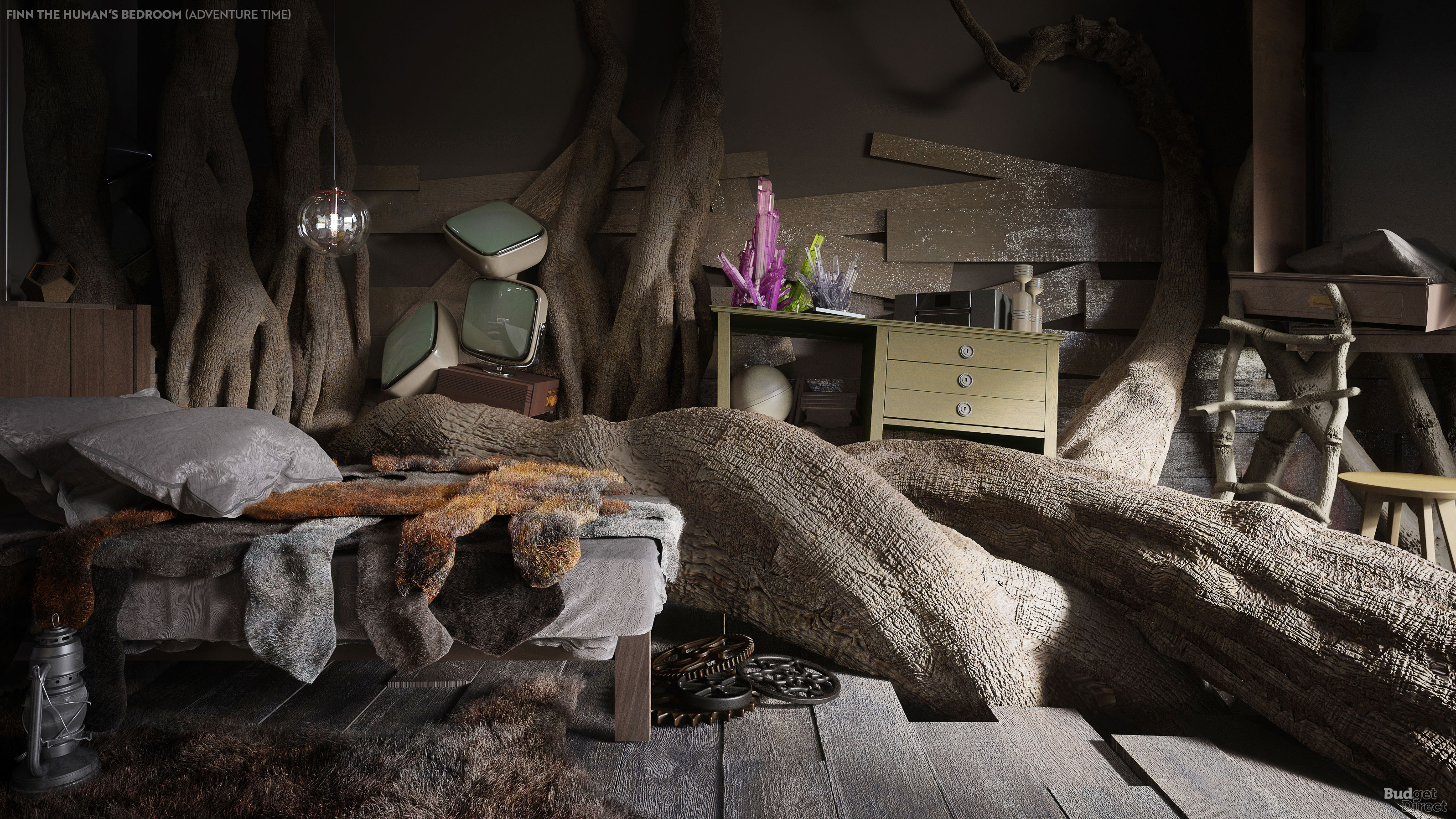
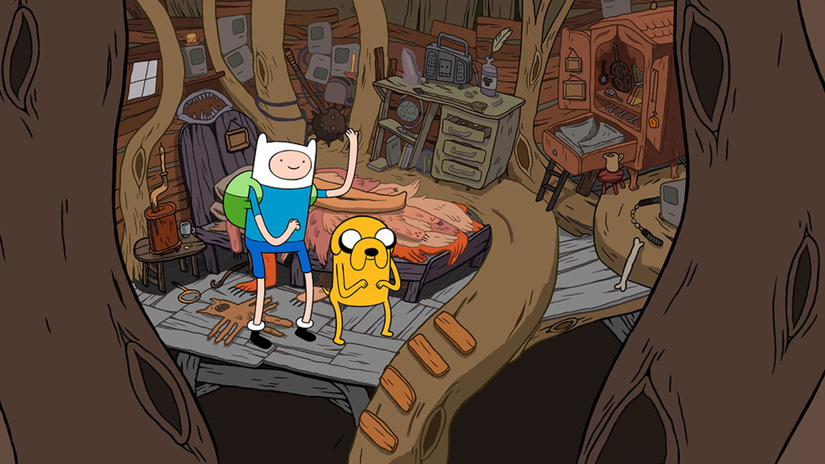
First up, Finn the Human from Adventure Time has had his bedroom made into a lifelike render, and it really doesn't look very nice. It probably would be a bit dingy living in a tree, now that we think about it.
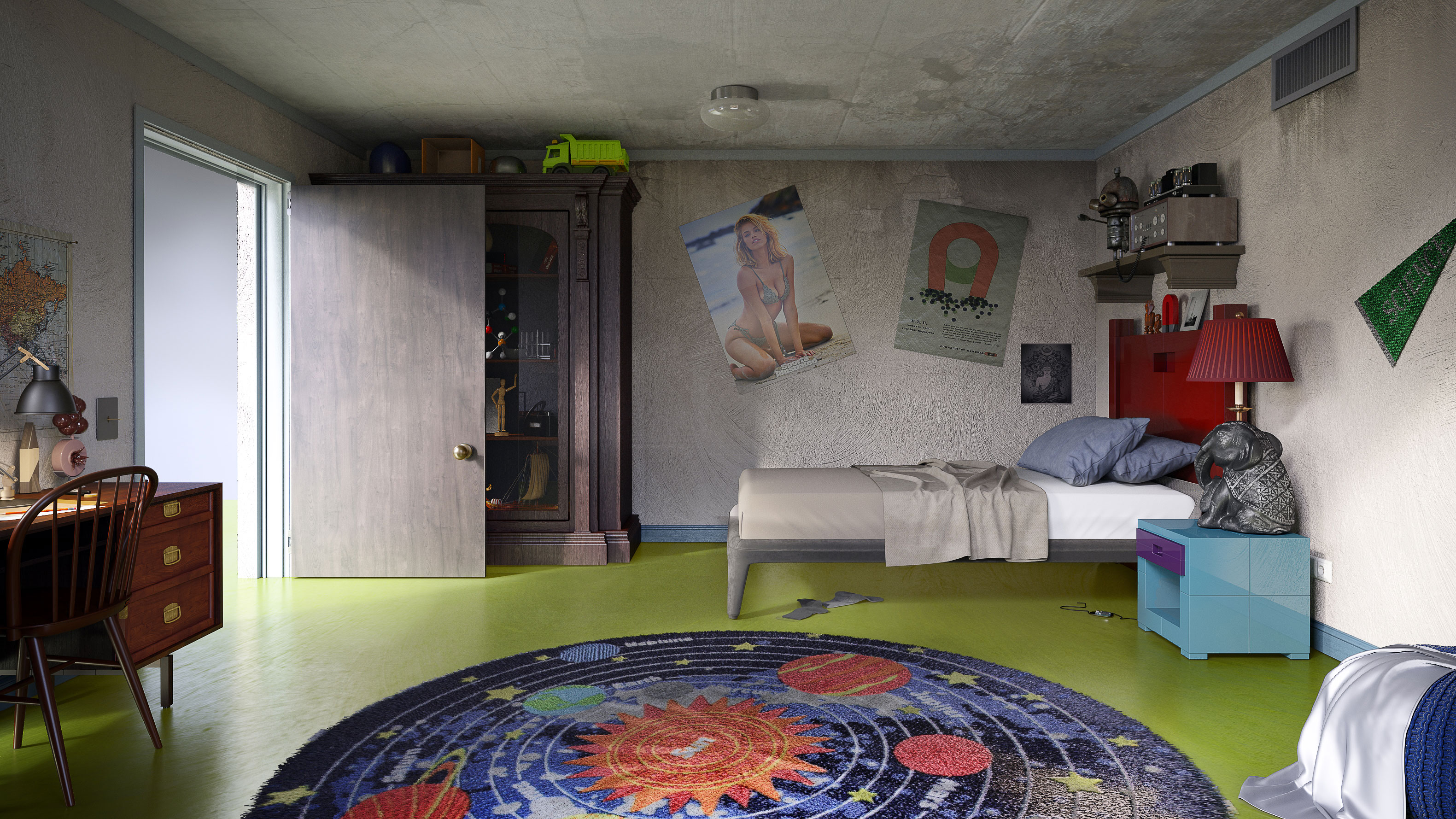
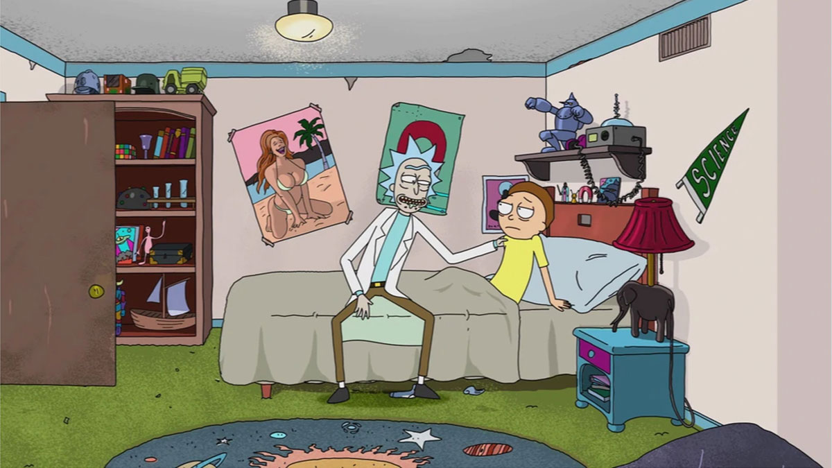
Morty's bedroom in Rick and Morty was never the most inviting of spaces. The walls are a bit cracked, the posters are hung wonky, but somehow in the cartoon, it works. In real life, it looks like any other teenage bedroom – although we do still like the rug. And how have we only just noticed that the carpet is green?
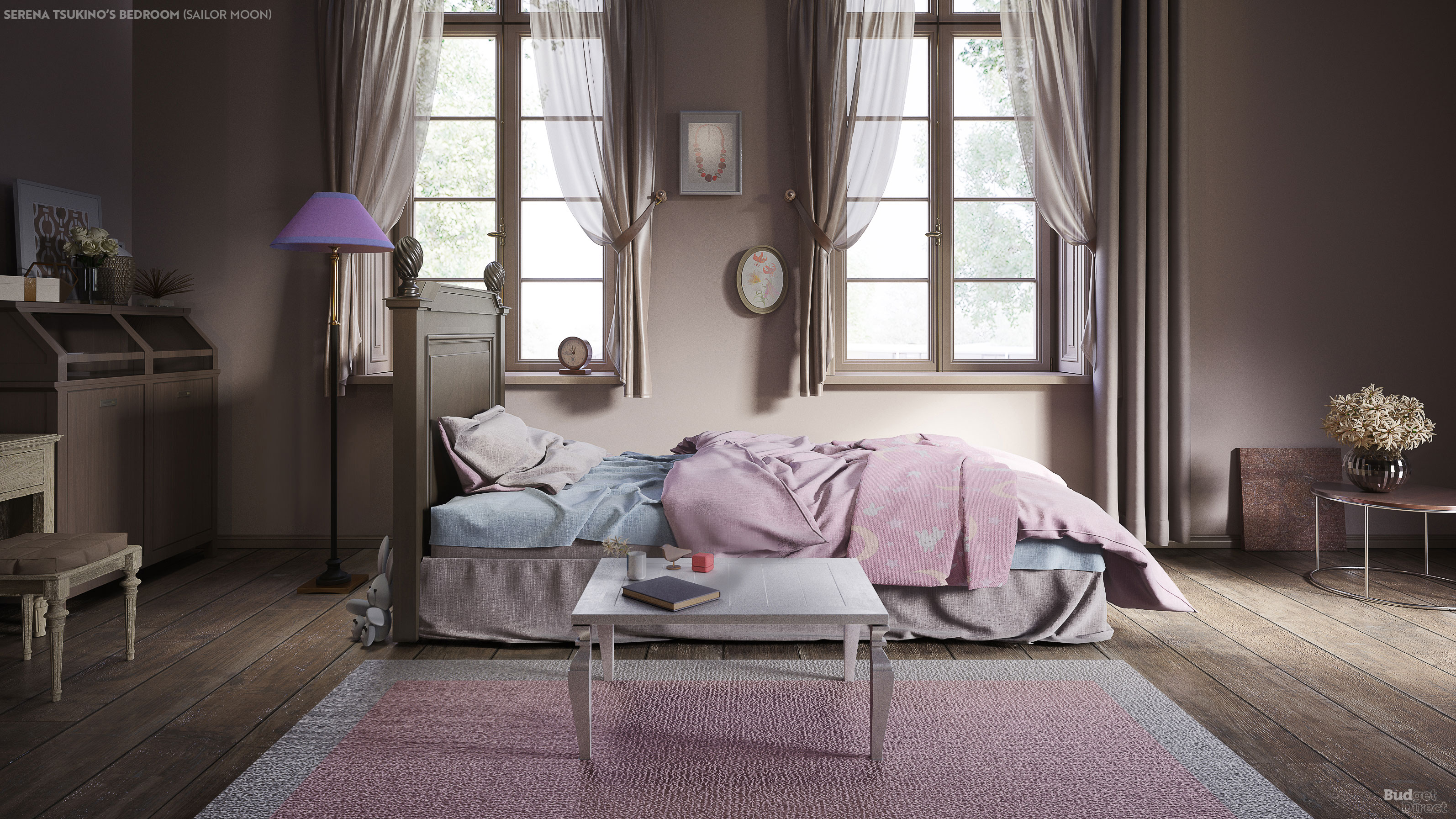
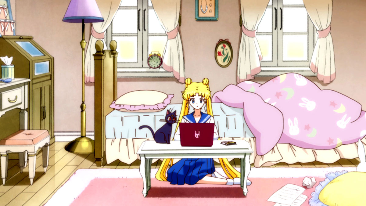
In the manga series Sailor Moon, Serena Tsukino's bedroom is a fun pink haven. In real life, it looks kind of normal... dowdy even. Although from an interior design point of view, we do quite like those curtains. (See how to draw manga if you'd like to create your own manga world.)
Get the Creative Bloq Newsletter
Daily design news, reviews, how-tos and more, as picked by the editors.
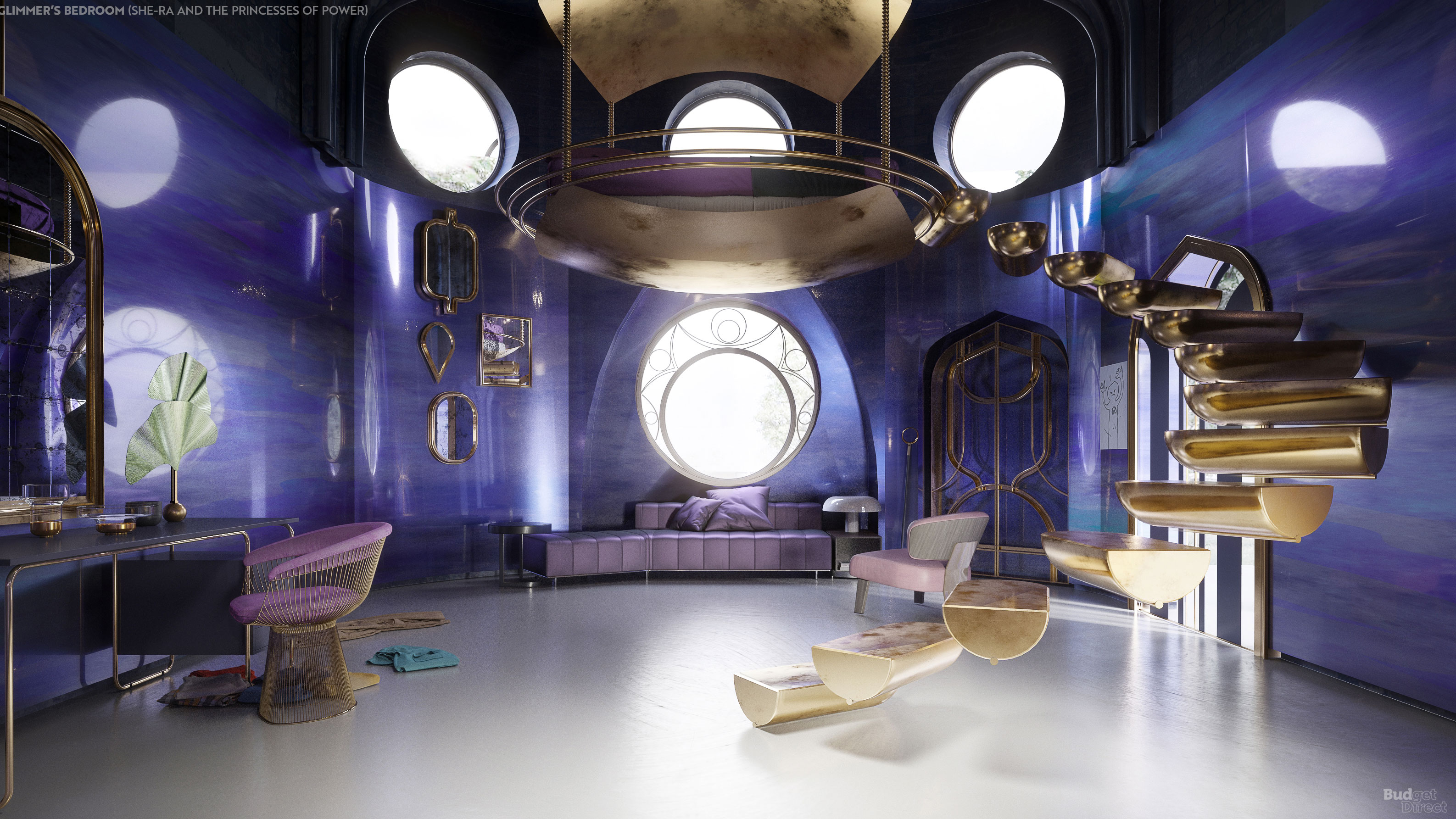
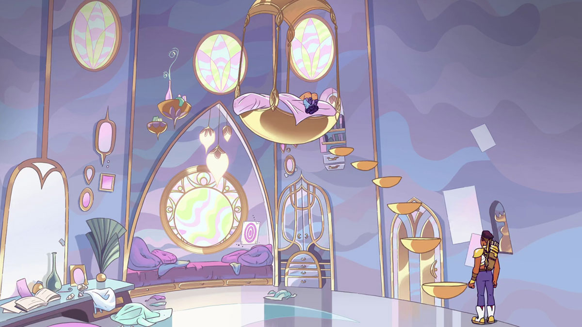
Perhaps our favourite is the reimagining of Glimmer's room in She-Ra and the Princess of Power. Here, some of the elements that make the room magical, such as the floating staircase, have been transformed over to the render.
Perhaps in order for animated sets to feel impressive in real life, they need the more outlandish and unreal elements of cartoons. Or perhaps it really is just all about colours and lighting.
See the whole series of animated TV bedrooms brought to life over at Budget Direct Home Insurance's site.
Read more:

Thank you for reading 5 articles this month* Join now for unlimited access
Enjoy your first month for just £1 / $1 / €1
*Read 5 free articles per month without a subscription

Join now for unlimited access
Try first month for just £1 / $1 / €1

Rosie Hilder is Creative Bloq's Deputy Editor. After beginning her career in journalism in Argentina – where she worked as Deputy Editor of Time Out Buenos Aires – she moved back to the UK and joined Future Plc in 2016. Since then, she's worked as Operations Editor on magazines including Computer Arts, 3D World and Paint & Draw and Mac|Life. In 2018, she joined Creative Bloq, where she now assists with the daily management of the site, including growing the site's reach, getting involved in events, such as judging the Brand Impact Awards, and helping make sure our content serves the reader as best it can.
