The PS5 logo we all wanted is here
Is this concept logo design better than the original?

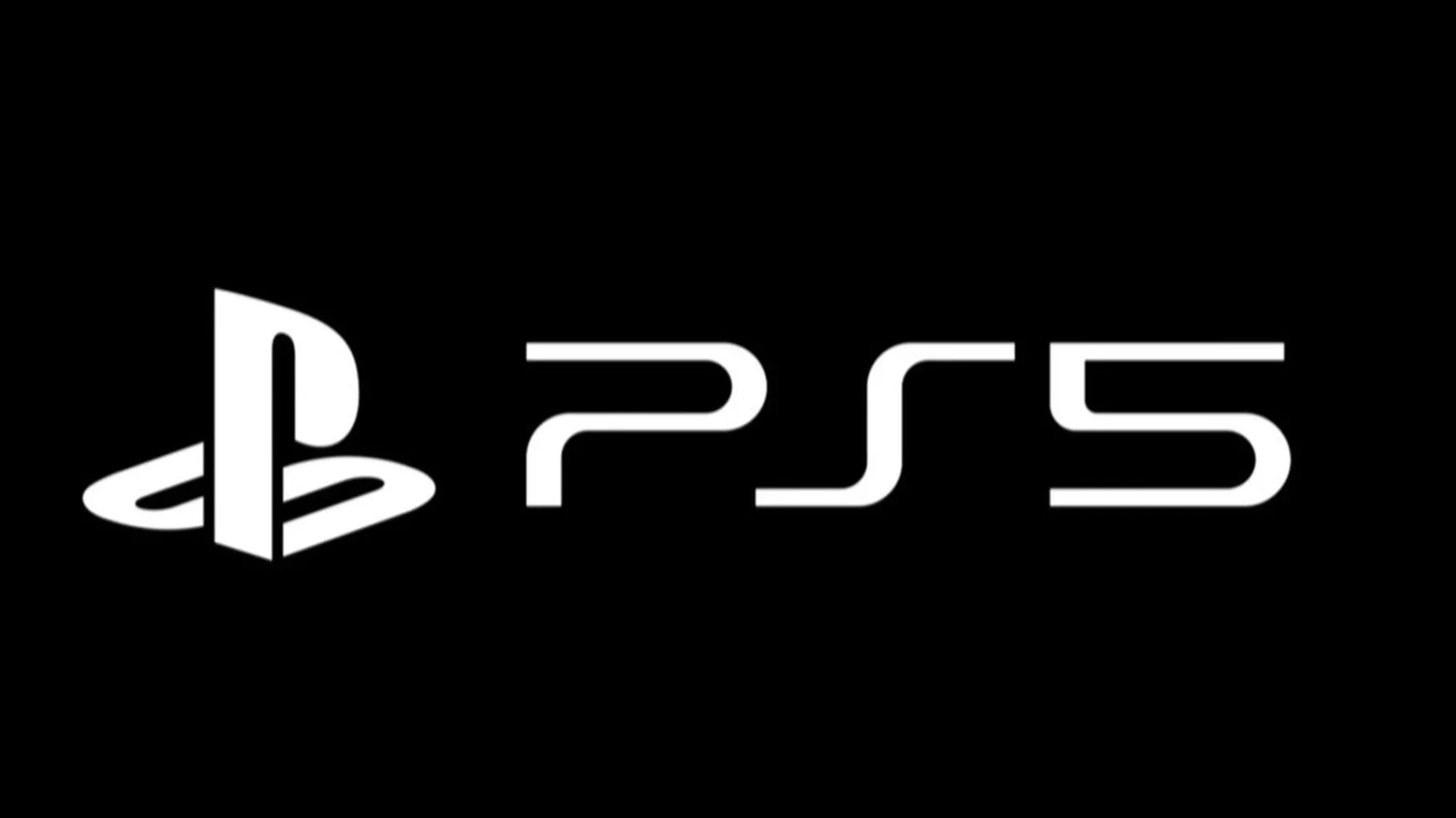
The PS5 logo (above) has been one of this year's most controversial logos, even though on the face of it, it doesn't look particularly offensive. It's essentially the same as the PS4 logo, but with a different number.
Since the marque for the PlayStation 5 was revealed at CES 2020, countless designers, gamers and logo-lovers have called out Sony for being lazy, with many suggesting that the electronics giant simply couldn't be bothered to come up with a new logo.
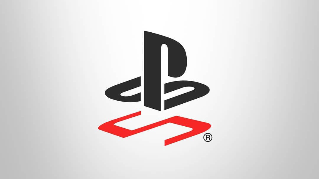
And of course, where there is logo anger, there are also countless creatives who try and improve the logo with their own creations (if you want to give it a go, read our logo design guide first). We've seen various new takes on the PlayStation 5 logo, as well as a neat video speculating about how it came to be, but probably our favourite concept is the one by Bosslogic (below).

Bosslogic's concept takes the 'PlayStation' part of the logo, the intertwined 'P' and 'S' and riffs on it, adding a '5' as a sort of shadow, which echoes the shape of the 's' above. The beauty of this concept logo is that it gives people what they are looking for: a new PlayStation 5 logo that differentiates the console from previous iterations. It probably wouldn't be so effective for the PS4, for example, and that is no bad thing. The use of the red rather than sticking with stark black and white also adds a certain something.
Bosslogic's concept logo got a lot of love on Instagram, with many suggesting that it is actually better than the original logo.
PS5, can't wait for E3! Bosslogic
A photo posted by @bosslogic on Jan 8, 2020 at 5:18am PST
Others praised it for its original and simple form, and then there were the usual arguments about whether or not the original logo was any good, and whether it needed to be changed at all.
Overall, we don't think people should get too hung up on whether the original logo 'needs' changing or not. Concept logos are a great way for creatives to really consider what works and what doesn't about a logo, and then come up with their own take. It's all good practice for creative briefs. If, like us, you love a good concept design, check out these radical redesigns of famous logos or this minimalist concept for card game UNO.
Get the Creative Bloq Newsletter
Daily design news, reviews, how-tos and more, as picked by the editors.
You can also see more concepts and art from Bosslogic on his Instagram page.
Read more:

Thank you for reading 5 articles this month* Join now for unlimited access
Enjoy your first month for just £1 / $1 / €1
*Read 5 free articles per month without a subscription

Join now for unlimited access
Try first month for just £1 / $1 / €1

Rosie Hilder is Creative Bloq's Deputy Editor. After beginning her career in journalism in Argentina – where she worked as Deputy Editor of Time Out Buenos Aires – she moved back to the UK and joined Future Plc in 2016. Since then, she's worked as Operations Editor on magazines including Computer Arts, 3D World and Paint & Draw and Mac|Life. In 2018, she joined Creative Bloq, where she now assists with the daily management of the site, including growing the site's reach, getting involved in events, such as judging the Brand Impact Awards, and helping make sure our content serves the reader as best it can.
