Is this hidden PS5 design the coolest gaming Easter egg ever?
Gamers are only just spotting it.

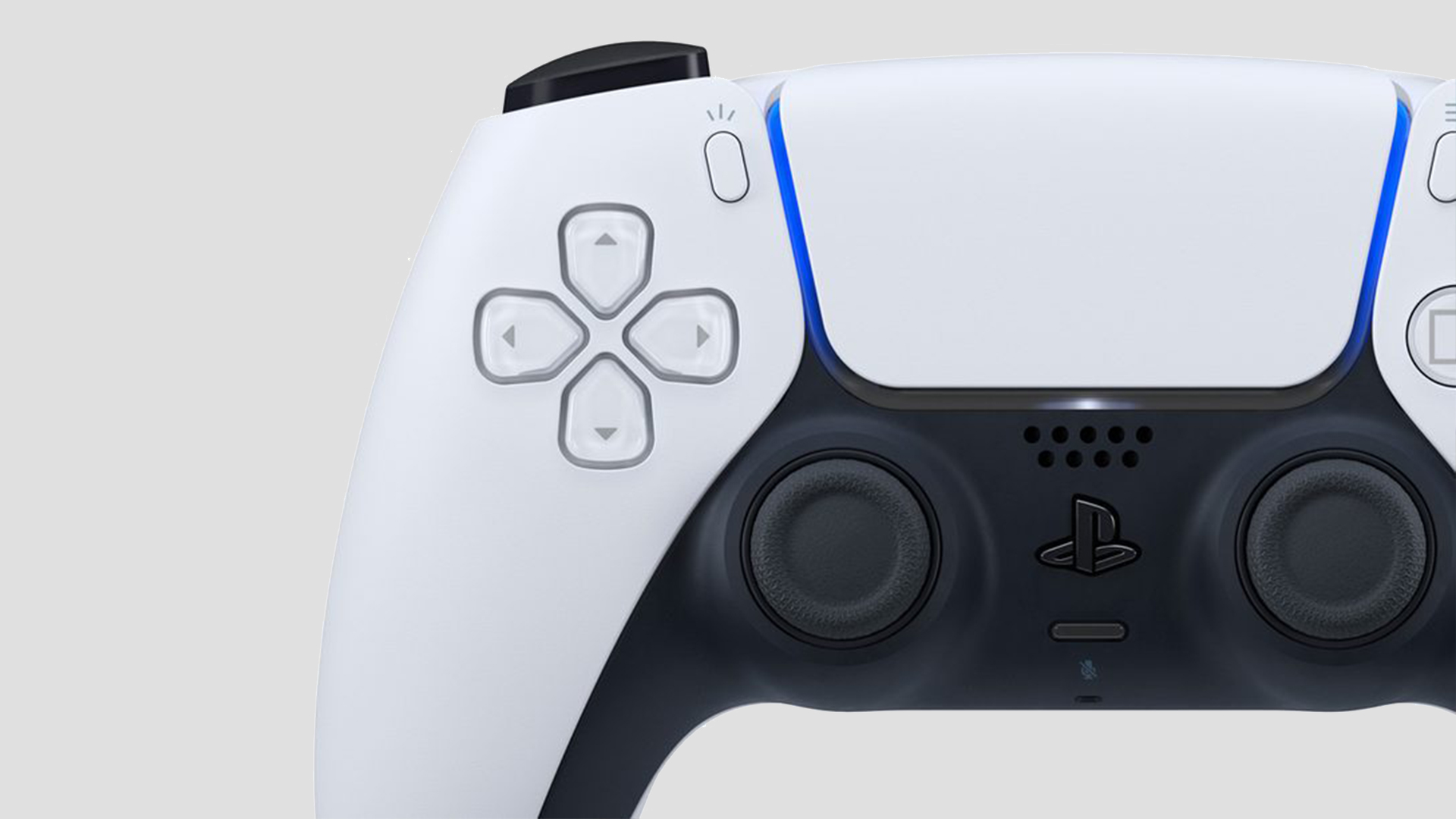
Anyone who's been lucky enough to get hold of a PlayStation 5 in the last few months will have had plenty of time to come to terms with the console's controversially gigantic design. But new users are also spotting a delightful design Easter egg on the PS5's controller – and now Sony has stepped in to explain how it came about.
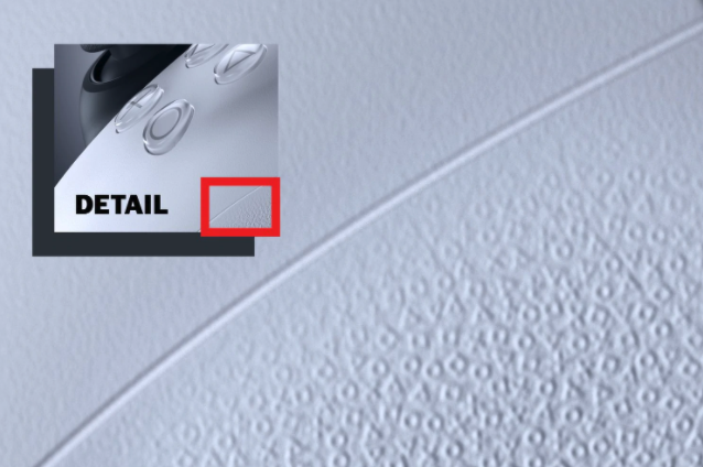
The DualSense controller's texture is made up of thousands of PlayStation symbols (40,000 to be precise), with the tiny triangles, circles, crosses and squares piled on top of each other to create Sony's most grippable controller yet. (Here's where to buy a PS5 if you want to experience it for yourself.)

Look closely at the DualSense controller, and you'll spot the tiny symbols all over the rubbery surface. While we weren't initially enamoured by the controller's design, this is certainly a charming visual Easter egg for fans. "My intention was to hide something like an Easter egg or something that the player can find after they buy a PlayStation 5," Sony's senior art director Yujin Morisawa told The Washington Post.
Well, it seems players are certainly finding it. Now that some lucky folk have had chance to pore over the console's every detail, Twitter is filled with gamers sharing their delight at Sony's design treat:
YYYOOOO the grip on the PS5 dualsense controller is made out of their button symbols.....holy shit!! pic.twitter.com/j8l4HyH7GLDecember 6, 2020
I’m just now discovering that the texture on the grips of the #DualSense is actually tiny sacred symbols. Mind blown! 🤯 #PlayStation5 pic.twitter.com/MwPRu0mYzNNovember 20, 2020
The fact that the rougher parts of PS5 body and controllers have tiny □ △ × ○ symbols on them 🤯January 3, 2021
Btw the PS5 has a texture on the back of the controller that’s THE LITERAL BUTTON SYMBOLS and that is the most insane detail (I can recall) I’ve ever seen on a console pic.twitter.com/igT7h7L7IUDecember 22, 2020
And now, Sony has shed some light on how it achieved the effect. Morisawa recently told The Verge that the entire design was painstakingly sketched out by hand, to give it an organic quality. Several prototypes were tested to find the right balance: "good-looking, textured enough to be comfortable and non-slip, but not so sandpaper-rough that it’d hurt your hands over a lengthy gaming session".
One of the most challenging considerations was how many layers of symbols to use (too many could mean too rough, too few could mean too slippy). In the end, Sony opted for two layers, stacked on top of each other in a seemingly random configuration.
While we're still not overly sold on the PS5's overall design language, we're loving this fun visual Easter egg. Like Sony's brilliant marketing stunt in London last year, it's a charming nod to perhaps the PlayStation franchise's most iconic asset: those four symbols.
Get the Creative Bloq Newsletter
Daily design news, reviews, how-tos and more, as picked by the editors.
You might have to wait a tad longer to finally get hold of the wildly popular console (who knows, though – you might get lucky), but there are plenty of incredible options out there if you want to start gaming today. Check out the best Nintendo Switch games available now, and take a look at more great games console offers below.
Read more:

Thank you for reading 5 articles this month* Join now for unlimited access
Enjoy your first month for just £1 / $1 / €1
*Read 5 free articles per month without a subscription

Join now for unlimited access
Try first month for just £1 / $1 / €1

Daniel John is Design Editor at Creative Bloq. He reports on the worlds of design, branding and lifestyle tech, and has covered several industry events including Milan Design Week, OFFF Barcelona and Adobe Max in Los Angeles. He has interviewed leaders and designers at brands including Apple, Microsoft and Adobe. Daniel's debut book of short stories and poems was published in 2018, and his comedy newsletter is a Substack Bestseller.
