Polaroid rebrand is an instant pick-me-up
Brand history is celebrated with a colour explosion.

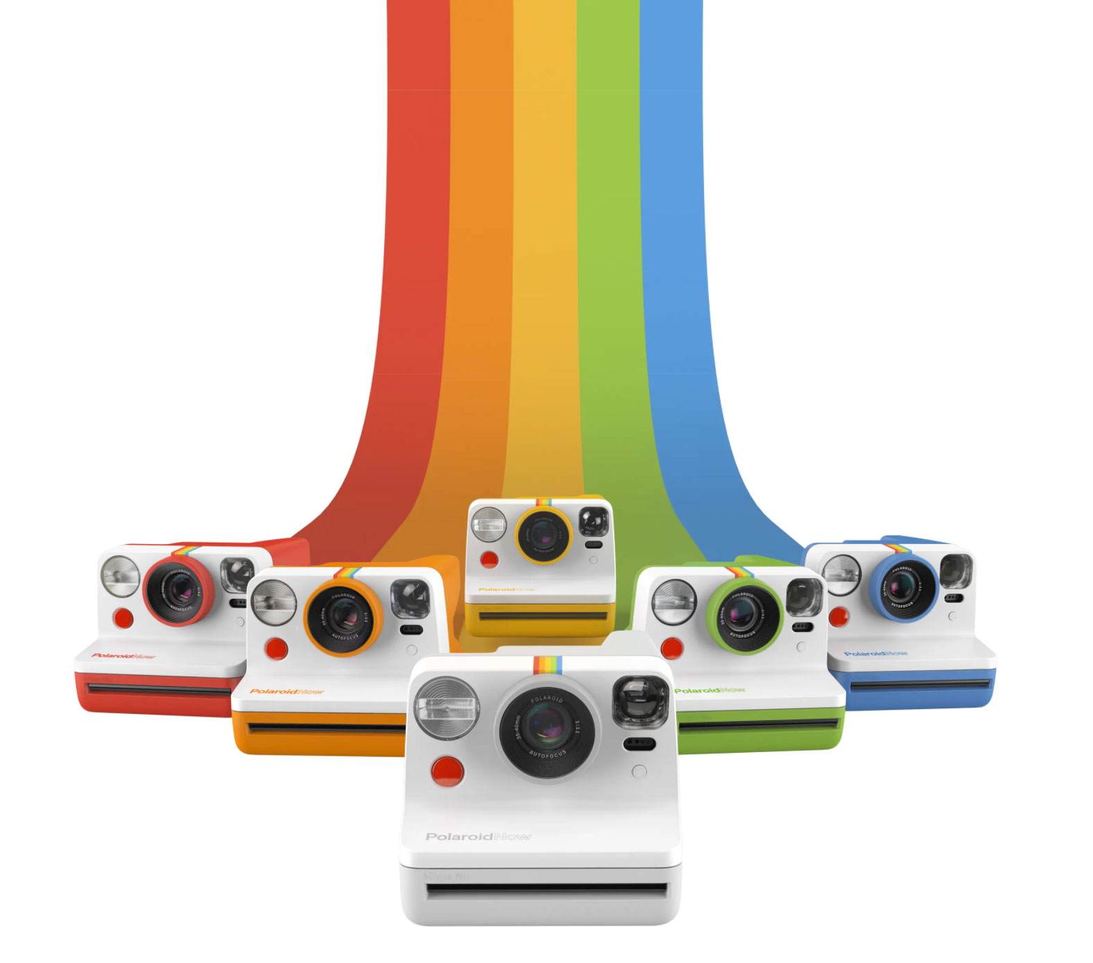
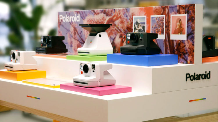
Polaroid has reclaimed its original name and drawn on its previous visual identity in a rebrand that sees the instant film pioneer come full circle. Though you may not have noticed the existence of Polaroid Originals in the first place, this arm of the brand is officially no more. The entire company has now unified, in an explosion of colour, under the flagship brand name: Polaroid. To mark the occasion there's also a new camera, the Polaroid Now.
The Polaroid Originals brand was created in 2017 when Netherlands-based group The Impossible Dream merged with Polaroid. This branch of the business continued to manufacture instant cameras, while Polaroid itself pursued non-camera related products. The rebrand aims to "give clarity to people" by unifying the brand under a singular identity that has analogue cameras at its heart. And the whole thing is a rainbow-filled explosion of cheerfulness we can't stop looking at.
Need a new camera? Check out our pick of the best cameras for creatives. Or if you want to improve your photos, try our tips to boost your photography skills.

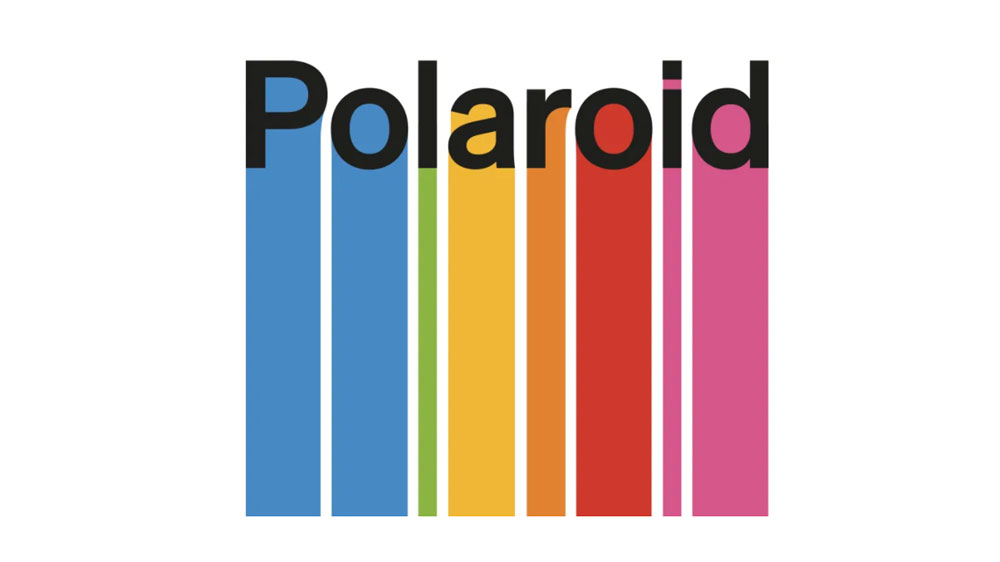
The new designs feature a dripping series of five-colour rainbow stripes under the Polaroid wordmark (which retains the original typography), plus a rainbow swooping down for the new cameras to bounce off.
The rainbow spectrum iconography has been a core part of all Polaroid branding since the 1970s, (apart from a brief spell in the '90s when things went monochrome), and the Originals brand retained it, albeit in a somewhat minimalist version. But the new, unified Polaroid branding embraces the rainbow at a whole new level.
"As this new decade marks a new chapter in the Polaroid story, it’s a moment for us to celebrate that heritage, while keeping our sights set on the future," says Polaroid CEO Oskar Smolokowski. "The new identity for 2020 reflects this, boldly reclaiming the colour spectrum as uniquely Polaroid."

The Polaroid Now is an analogue camera for the modern age, with an improved autofocus system, longer battery life and accurate flash. Polaroid's renewed focus on the instant camera has repositioned the brand for a new era, tapping into the instant gratification modern consumers crave.
Get the Creative Bloq Newsletter
Daily design news, reviews, how-tos and more, as picked by the editors.
Polaroid has acknowledged the timing of the rebrand launch, and plans to play a "meaningful role" during the Covid-19 crisis. The company wants to work with its supportive online community through its channels, to create content and share ideas to keep the creative vibe alive. And let's be honest, all that colour certainly helps bring a bit of cheer.
Unlike recent logo redesigns from BMW and Nissan, Polaroid's makeover isn't all about going flat, which is quite refreshing. This celebration of brand heritage has a cool retro vibe that also feels totally up-to-date. You can check out the video above for Polaroid's logo evolution.
Read more:

Thank you for reading 5 articles this month* Join now for unlimited access
Enjoy your first month for just £1 / $1 / €1
*Read 5 free articles per month without a subscription

Join now for unlimited access
Try first month for just £1 / $1 / €1

Georgia is lucky enough to be Creative Bloq's Editor. She has been working for Creative Bloq since 2018, starting out as a freelancer writing about all things branding, design, art, tech and creativity – as well as sniffing out genuinely good deals on creative technology. Since becoming Editor, she has been managing the site and its long term strategy, helping to shape the diverse content streams CB is known for and leading the team in their own creativity.
