So apparently these new Pokémon character designs are unacceptable
Gamers can be hard to please.
Gamers are notoriously hard to please, but with botched releases like GTA Remastered and Cyberpunk 2077 becoming worryingly common in recent years, there've been some legitimate complaints. That said, this latest controversy is a little, um, over the top.
Nintendo has just announced Pokémon Scarlet and Violet, marking the 9th generation of Pokémon games. But while most fans are busy discussing the three new starter creatures, a few are unhappy about the character design of the new human trainers.
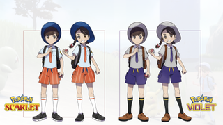
According to Kotaku, fans have called the characters “ugly” and even “too realistic.” Which seems a little unfair to us – what's not to like? They're just a pair of bright-eyed young trainers, right? Well, it seems those eyes might be the problem.
Whereas all previous trainers feature vertical oval eyes, the two new characters' are much more rounded – even circular. Now, we told you this doesn't seem a huge deal to us, but judging from the response on Twitter, plenty of users aren't happy about it. Many have compared the new characters to Studio Ghibli designs (problem?), and feel that the expressive quality of those taller eyes has been abandoned.

The only tbink i don’t like is how the trainer models look in the game they look like not Pokémon like a spin off I wish they kept the normal eyes 😭😭 they look like dollsFebruary 27, 2022
"How do you look at the cold dead eyes of the protagonists and say it looks good?" One user tweets, while another adds, "The circular eyes + the blush REALLY separate these from the typical Pokemon trainer design styling They look like Ghibli (which would be cool) but crossed with those dolls that your grandma has a few too many of in a scary room."
So there we have it, the slight rounding of some eyes is enough to upset some gamers. Then again, character design can be a contentious topic – who can forget the furore surrounding the Green M&M's new outfit last month? Oh, and the fact that Master Chief's helmet is a few pixels off-centre in the latest Halo entry. Told you gamers can be picky.
Read more:
Get the Creative Bloq Newsletter
Daily design news, reviews, how-tos and more, as picked by the editors.

Thank you for reading 5 articles this month* Join now for unlimited access
Enjoy your first month for just £1 / $1 / €1
*Read 5 free articles per month without a subscription

Join now for unlimited access
Try first month for just £1 / $1 / €1

Daniel John is Design Editor at Creative Bloq. He reports on the worlds of design, branding and lifestyle tech, and has covered several industry events including Milan Design Week, OFFF Barcelona and Adobe Max in Los Angeles.
